Confidence intervals with frequencies
Source:../vignettes/ConfidenceIntervals.Rmd
ConfidenceIntervals.RmdProbably the most useful tools for data analysis is a plot with suitable error bars (Cousineau, Goulet, & Harding, 2021). In this vignette, we show how to make confidence intervals for frequencies
Theory behind Confidence intervals for Frequencies
For frequencies, ANOFA does not lend itself to confidence intervals. Hence, we decided to use Clopper & Pearson (1934) pivot technique. This technique returns stand-alone confidence intervals on a proportion, that is, an interval which can be used to compare an observed proportion to a theoretical value. In order to compare an observed proportion to another proportion, it is necessary to adjust the wide (see Cousineau et al., 2021). Further, because we want an interval for frequencies, we multiply the proportion by the total number of data \(N\).
Herein, we use the Leemis & Trivedi (1996) method which provides an analytical solution based on the Fisher’s \(F\) distribution. It is based on \(n\), the observed frequency in a given cell, \(N\), the total number of observations, and \(1-\alpha\), the confidence level (typically 95%). It is given by
\[\hat{\pi}_{\text{low}}=\left( 1+\frac{N-n+1}{n F_{1-\alpha/2}(2n,2(N-n+1)} \right)^{-1} < {\pi} < \left( 1+\frac{N-n}{(n+1) F_{\alpha/2}(2(n+1),2(N-x)}\right)^{-1} =\hat{\pi}_{\text{high}}\]
This interval width is then multiply by \(N\) with \(\{n_{\text{low}}, n_{\text{high}} \} = N \, \times\, \{ \hat{\pi}_{\text{low}}, \hat{\pi}_{\text{high}} \}\) so that we obtain an interval on frequencies rather than on probabilities.
Finally, the width of the intervals are adjusted for difference and correlations using:
\[n_{\text{low}}^* = \sqrt{2} \sqrt{2}(n-n_{\text{low}})+n\]
\[n_{\text{high}}^* = \sqrt{2} \sqrt{2}(n_{\text{high}}-n)+n\]
The lower and upper length are adjusted separately because this interval may not be symmetrical (equal length) on both sides of the observed frequency \(n\).
This is it.
Complicated?
Well, not really:

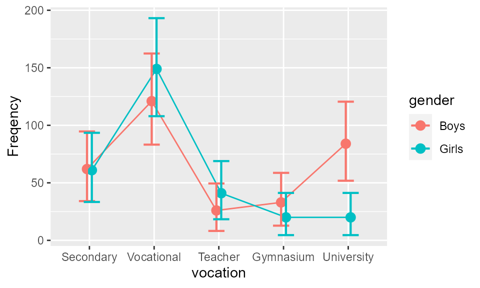
Figure 1. The frequencies of the Light & Margolin, 1971, data as a function of aspiration for higher education and as a function of gender. Error bars show difference-adjusted 95% confidence intervals.
You can select only some factors for plotting, with e.g.,
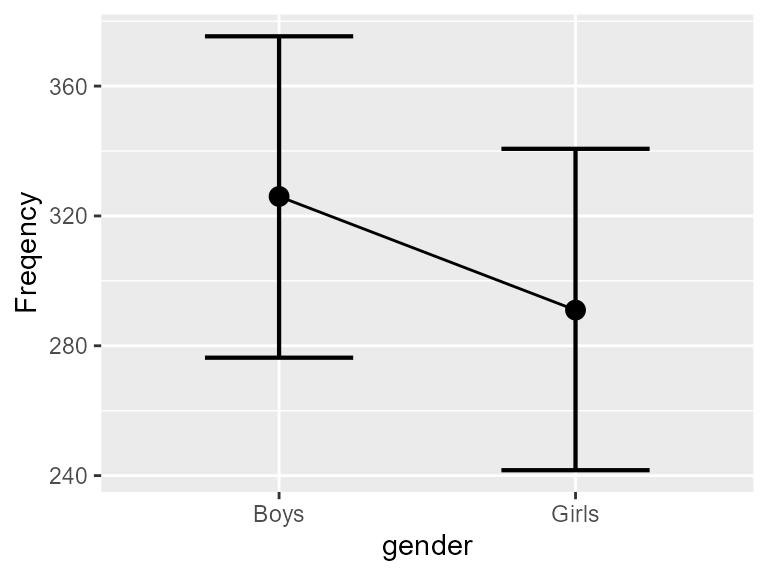
anofaPlot(w, obsfreq ~ gender) 
Figure 2. The frequencies of the Light & Margolin, 1971, data as a function of gender. Error bars show difference-adjusted 95% confidence intervals.
Because of the interaction gender \(\times\) vocational aspiration, the overall difference between boys and girls is small. Actually, they differ only in their aspiration to go to the university (recall that these are 1960s data…).
As is the case with any ggplot2 figure, you can
customize it at will. For example,

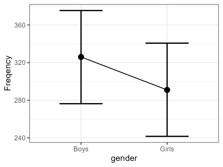
Figure 3. Same as Figure 2 with some customization.
Here you go.