Confidence intervals with proportions
Source:vignettes/C-ConfidenceIntervals.Rmd
C-ConfidenceIntervals.RmdProbably the most useful tools for data analysis is a plot with suitable error bars (Cousineau, Goulet, & Harding, 2021). In this vignette, we show how to make confidence intervals for proportions.
Theory behind Confidence intervals for proportions
For proportions, ANOPA is based on the Anscombe transform . This measure has a known theoretical standard error which depends only on sample size :
Consequently, when the groups’ sizes are similar, homogeneity of variances holds.
From this, we can decomposed the total test statistic into a component for each cell of the design. We thus get
in which is the theoretical standard error based only on , and is the desired confidence level (often .95). The use of a score ensues from the fact that the theoretical variance is known.
This technique returns stand-alone confidence intervals, that is, intervals which can be used to compare the proportion to a fixed point. However, such stand-alone intervals cannot be used to compare one proportion to another proportion (Cousineau et al., 2021). To compare an observed proportion to another observed proportion, it is necessary to adjust them for pair-wise differences (Baguley, 2012). This is achieved by increasing the wide of the intervals by .
Also, in repeated measure designs, the correlation is beneficial to improve estimates. As such, the interval wide can be reduced when correlation is positive by multiplying its length by , where is a measure of correlation in a matrix containing repeated measures (based on the unitary alpha measure).
Finally, the above returns confidence intervals for the transformed scores. However, when used in a plot, it is typically more convenient to plot proportions (ranging from 0 to 1) rather than Anscombe-scores (ranging from 0 to 1.57). Thus, it is possible to rescale the vertical axis using the inverse Anscombe transform and be shown proportions.
This is it.
Complicated?
Well, not really:

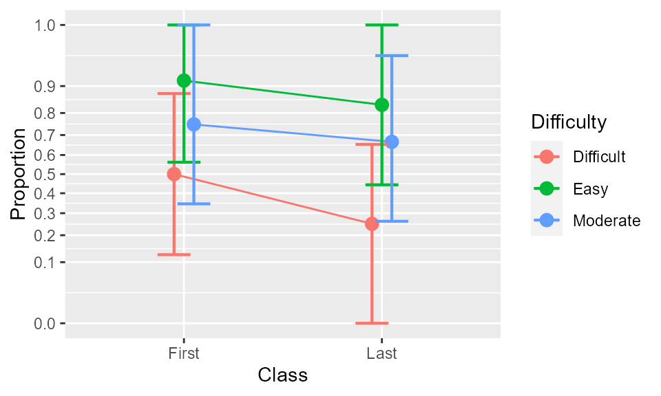
Figure 1. The proportions as a function of class and Difficulty. Error bars show difference-adjusted 95% confidence intervals.
Because the analyses summary(w) suggests that only the
factor Difficulty has a significant effect, you may select
only that factors for plotting, with e.g.,
anopaPlot(w, ~ Difficulty ) 
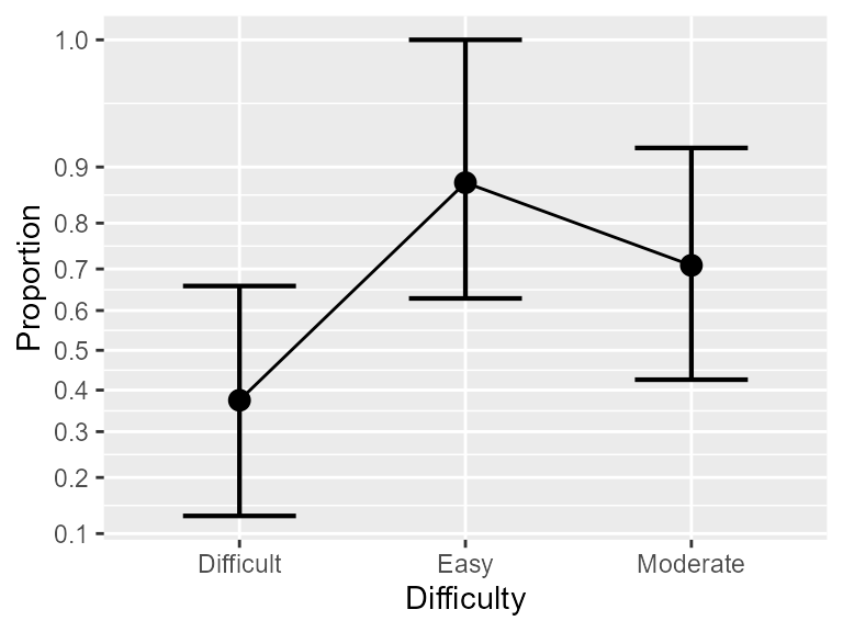
Figure 2. The proportions as a function of Difficulty only. Error bars show difference-adjusted 95% confidence intervals.
As is the case with any ggplot2 figure, you can
customize it at will. For example,
library(ggplot2)
anopaPlot(w, ~ Difficulty) +
            theme_bw() +  # change theme
            scale_x_discrete(limits = c("Easy", "Moderate", "Difficult")) #change order
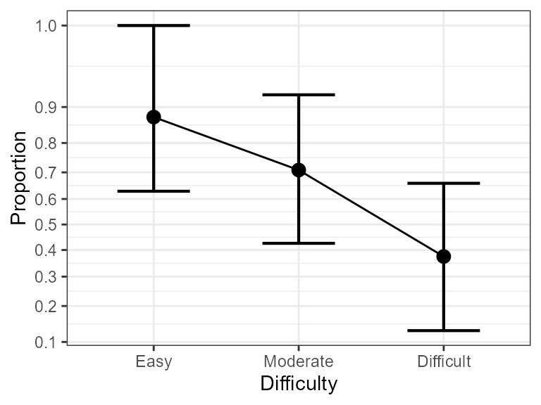
Figure 3. Same as Figure 2 with some visual improvements.
As you can see from this plot, Difficulty is very significant, and the most different conditions are Easy vs. Difficult.
Here you go.