Creating a plot involves reading raw data and compiling these into
summary statistics. This step is handled by superb
transparently. The second, more involving step, however is to customize
the plots so that it looks appealing to the readers.
In this vignette, we go rapidly over superb
functionalities. Instead, we provide worked-out examples producing fully
customized plots. We proceed with examples taken from scientific
articles. The first example produces a rain-drop plot, the second a bar
plot whose origin is not zero.
In the following, we need the following libraries:
## Load relevant packages
library(superb)             # for superbPlot
library(ggplot2)            # for all the graphic directives
library(gridExtra)          # for grid.arrange
If they are not present on your computer, first upload them to your
computer with install.packages("name of the package").
Figure 2 of Hofer, Langmann, Burkart and Neubauer, 2022.
In their study, Hofer, Langmann, Burkart, & Neubauer (2022) examined who is the best judges of one’s abilities. Examining self-ratings vs. other-ratings in six domain, they found out that we are not always the best judges. They present in their Figure 2 a rain-cloud plot (Allen, Poggiali, Whitaker, Marshall, & Kievit (2019)) illustrating the ratings.
In what follow, we discuss how this plot could be customized after
its initial creation with superb.
As the six domains are within-subject ratings, the data must be composed of 6 columns (at least, there can be additional columns; they won’t be illustrated herein). In case you do not have such data, the following subsection generates mock data.
Generating mock data
We generate two sets of mock data from six sets of means and standard deviations:
Astats <- data.frame(
    MNs = c(6.75, 6.00, 5.50, 6.50, 8.00, 8.75),
    SDs = c(2.00, 3.00, 3.50, 3.50, 1.25, 1.25)
)
dtaA <- apply(Astats, 1,
    function(stat) {rnorm(100, mean=stat[1], sd=stat[2])}
)
dtaA <- data.frame(dtaA)
colnames(dtaA) <- c("Verbal", "Numerical", "Spatial", "Creativity", "Intrapersonal", "Interpersonal")

Bstats <- data.frame(
    MNs = c(3.33, 3.00, 2.50, 3.00, 2.75, 3.50),
    SDs = c(0.25, 0.50, 0.66, 0.50, 0.25, 0.25)
)
dtaB <- apply(Bstats, 1,
    function(stat) {rnorm(100, mean=stat[1], sd=stat[2])}
)
dtaB <- data.frame(dtaB)
colnames(dtaB) <- c("Verbal", "Numerical", "Spatial", "Creativity", "Intrapersonal", "Interpersonal")
The datasets are data.frames called dtaA
and dtaB. Their columns names are the dependent variables,
e.g., “Verbal”, “Numerical”, “Spatial”, “Creativity”, “Intrapersonal”,
“Interpersonal”.
Making the top-row plot
For convenience, we make lists of the desired colors and labels we want to appear on the x-axis:
mycolors <- c("seagreen","chocolate2","mediumpurple3","deeppink","chartreuse4", "darkgoldenrod1")
mylabels <- c("Verbal", "Numerical", "Spatial", "Creativity", "Intrapersonal", "Interpersonal")
We are ready to make the plot with the desired adjustments:
pltA <- superb(
    crange(Verbal, Interpersonal) ~ ., # no between-subject factors
    dtaA,                       # plot for the first data set...
    WSFactors   = "Domain(6)",  # ...a within-subject design with 6 levels
    adjustments = list(
        purpose = "difference", # we want to compare means
        decorrelation = "CM"    # and error bars are correlated-adjusted
    ),
    plotLayout  = "raincloud",

    # the following (optional) arguments are adjusting some of the visuals
    pointParams    = list(size = 0.75),
    jitterParams   = list(width =0.1, shape=21,size=0.05,alpha=1), # less dispersed jitter dots,
    violinParams   = list(trim=TRUE, alpha=1),                     # not transparent,
    errorbarParams = list(width = 0.1, linewidth=0.5)              # wider bars, thicker lines.
)
pltA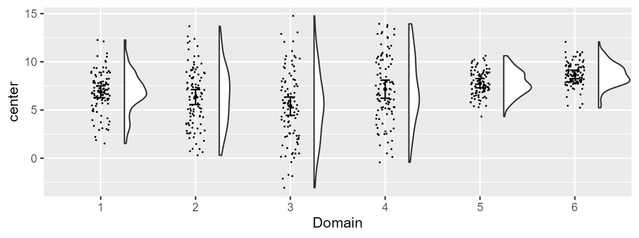
Figure 2, preliminary version
As seen, this plot is a standard, colorless, plot. It contains all that is needed; it is just plain drab and the labels are generic ones (on the vertical axis and on the horizontal axis).
Adding a color layer to the plot
Using superb, if there is only one factor, superb will
consider that it is the one on the x-axis and there is therefore no
other layers in the plot. This is why the current plot is colorless.
It is possible, post-hoc, to indicate that we wish additional layers in the plot.
In the present, we want to add the fill and the
color of dots layers. These layers are to be “connected” to
the sole factor in the present example (that is, Domain).
Consequently, the x-axis labels, the fill color and the dot color are
all redondant information identifying the condition.
To do this, simply add an aesthetic graphic directive to
pltA with:

Figure 2, version with colors
Adding graphic directives for fine-tuning the plot
We can customize any superb plot by adding graphic
directives one-by-one using the operator +, or we can
collect all the directives in a list, and add this list once. As we have
two plots with mostly the same directives, we use this second
approach.
Typically, a plot is customized by picking a theme. The default
theme_bw() is grayish, so we move to
theme_classic(). We also customize specific aspects of this
theme with theme() directives.
These changes are all collected within the list
commonstyle below:
commonstyle <- list(
    theme_classic(),                             # It has no background, no bounding box.

    # We customize this theme further:
    theme(axis.line=element_line(linewidth=0.50), # We make the axes thicker...
        axis.text = element_text(size = 10),      # their text bigger...
        axis.title = element_text(size = 12),     # their labels bigger...
        plot.title = element_text(size = 10),     # and the title bigger as well.
        panel.grid = element_blank(),             # We remove the grid lines
        legend.position = "none"                  # ... and we hide the side legend.
    ),

    # Finally, we place tick marks on the units
    scale_y_continuous( breaks=1:10 ),

    # set the labels to be displayed
    scale_x_discrete(name="Domain", labels = mylabels),

    # and set colours to both colour and fill layers
    scale_discrete_manual(aesthetic =c("fill","colour"), values = mycolors)
)
We also changed the vertical scale (tick marks at designated
positions) and the horizontal scale with names on the tick marks (sadly,
superb replaces them with consecutive numbers…) and colors
to fill the clouds (fill) and their borders
(colour) as well as the rain drop colors.
Examining this plot with the commonstyle added, we
get
finalpltA <- pltA + aes(fill = factor(Domain), colour = factor(Domain)) +
    commonstyle +                           # all the above directive are added;
    coord_cartesian( ylim = c(1,10) ) +     # the y-axis bounds are given ;
    labs(title="A") +                       # the plot is labeled "A"...
    ylab("Self-worth relevance")            # and the y-axis label given.
finalpltA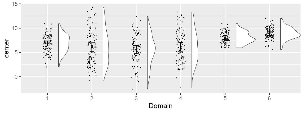
Figure 2, final version
Making the second row of the figure
We do exactly the same for the second plot. We just change the data
set to dtaB and in the last graphic directives, using
options tailored specifically to this second data set (smaller y-axis
range, different label, etc.):
pltB <- superb(
    crange(Verbal, Interpersonal) ~ ., # no between-subject factors
    dtaB,                       # the second data set...
    WSFactors = "Domain(6)",    # ...a within-subject design with 6 levels
    adjustments = list(
        purpose = "difference", # we want to compare means
        decorrelation = "CM"    # and error bars are correlated-adjusted
    ),
    plotLayout   = "raincloud",
    # the following (optional) arguments are adjusting some of the visuals
    pointParams  = list(size = 0.75),
    jitterParams = list(width =0.1, shape=21,size=0.05,alpha=1), # less dispersed jitter dots,
    violinParams = list(trim=TRUE, alpha=1,adjust=3),            # not semi-transparent, smoother
    errorbarParams = list(width = 0.1, linewidth=0.5)                 # wider bars, thicker lines.
)
finalpltB <- pltB + aes(fill = factor(Domain), colour = factor(Domain)) +
    commonstyle +                           # the following three lines are the differences:
    coord_cartesian( ylim = c(1,5) ) +      # the limits, 1 to 5, are different
    labs(title="B") +                       # the plot is differently-labeled
    ylab("Judgment certainty")              # and the y-axis label differns.
finalpltB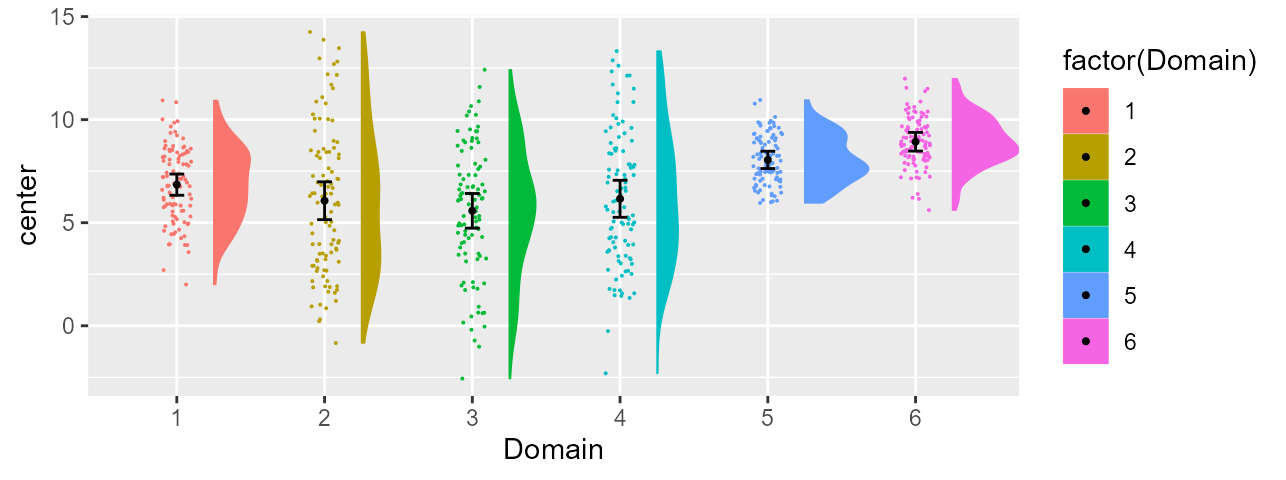
Figure 2, bottom row
Combining and saving both plots
Finally, we assemble the two plots together
finalplt <- grid.arrange(finalpltA, finalpltB, ncol=1)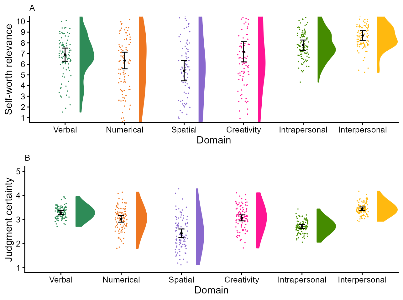
Figure 2, final version
It can be saved with high-resolution if desired with
ggsave( "Figure2.png",
    plot=finalplt,
    device = "png",
    dpi = 320,          # pixels per inche
    units = "cm",       # or "in" for dimensions in inches
    width = 17,         # as found in the article
    height = 13
)
That’s it!
Figure 2 of Ma and Abrams, 2023.
In their study, Ma & Abrams (2023) examined whether participants can suppress attentional deployment under unpredictable visual distractor attributes. They found for the first time that observers can indeed suppress salient, unique colored, distractors even if the color was not known before hand.
To proceed, first get to the authors’ OSF https://osf.io/r52db and
follow the instructions to obtain the dataframe
cleandata.
Because response times (RTs) were recorded in second, we convert them to milisecond:
cleandata$absentrt = cleandata$absentrt*1000
cleandata$presentrt = cleandata$presentrt*1000
As a check, here is the first six lines of that data frame:
head(cleandata)## subject absentrt presentrt absentacc presentacc
## 1 201 906.9648 880.5836 0.984375 0.9843750
## 2 202 750.1645 722.7798 0.937500 0.9921875
## 3 203 814.3321 717.3632 0.953125 0.9765625
## 4 204 985.0208 908.4251 0.984375 0.9921875
## 5 205 927.9098 859.6929 0.875000 0.9375000
## 6 206 962.0722 848.8763 0.859375 0.9140625Please select the colors desired for the bars:
mycolors = c("black","lightgray")In addition to the above libraries, we also need the
scales library so that we can modify the vertical axis of
the plot. Indeed, bar charts by default start at zero, but for the
present data (response times and mean accuracies), a scales which does
not start from zero is more appropriate. We then create a shift
transformation function with a non-zero start
:
library(scales)     # for a translated scale using trans_new()

shift_trans = function(d = 0) {
  scales::trans_new("shift", transform = function(x) x - d, inverse = function(y) y + d)
}
We’re all set! We are ready to make the first plot, here RTs, as a function of the presence or absence of the colored distractor. Because (a) we want to compare the bars, we use difference-adjusted confidence intervals; (b) the data were collected in a within-subject design, we use a correlation-adjusted confidence intervals.
# defaults are means with 95% confidence intervals, so not specified
pltA <- superbPlot( cleandata,
    WSFactors = "target(2)",
    variables = c("absentrt", "presentrt"),
    adjustments = list(
        purpose = "difference",
        decorrelation = "CM"),
    plotLayout  = "bar",
    errorbarParams = list(colour = "gray35", width = 0.05)
)
## superb::FYI: The HyunhFeldtEpsilon measure of sphericity per group are 1.000
pltA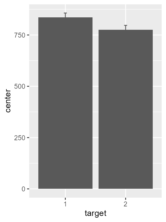
Figure 1, preliminary version
As this is the default, the vertical axis starts at zero. Let’s add
the shift_trans scale, limit the range to 720-900, and show
breaks on every 20 units:
# attached the shifted scale to it
pltA <- pltA + scale_y_continuous(
    trans = shift_trans(720),      # use translated bars
    limits = c(720,919),           # limit the plot range
    breaks = seq(720,900,20),      # define major ticks
    expand = c(0,0) )              # no expansions over the plotting area
pltA
Figure 2, version with adequate vertical scale
We can do better: changing the default fonts, remove the legend, etc. We store these graphic directives in a list because the same are used for the accuracy plot:
ornaments <- list(
    theme_classic(base_size = 14) + theme( legend.position = "none" ),
    aes(width = 0.5, fill = factor(target), colour = factor(target) ),
    scale_discrete_manual(aesthetic =c("fill","colour"), values = mycolors),
    scale_x_discrete(name="Color Singleton\nDistractor", labels = c("Absent","Present"))
)
pltA <- pltA + ornaments + ylab("Reaction time (ms)")
pltA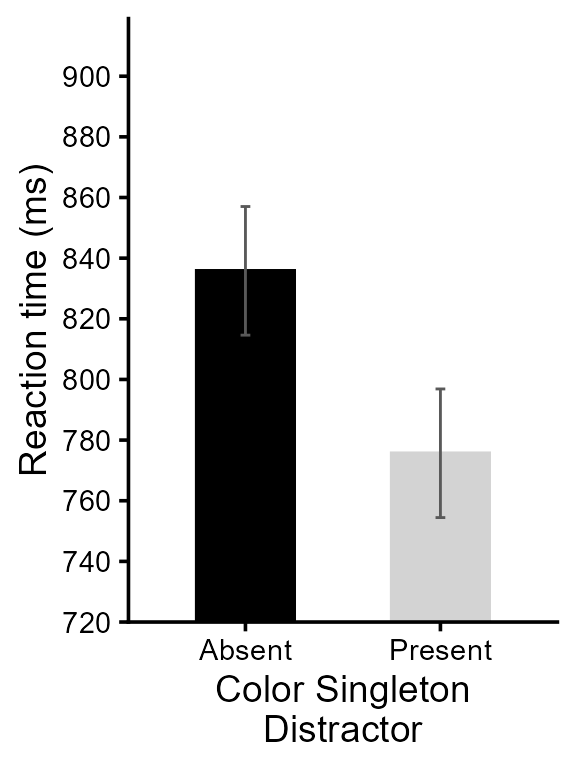
Figure 3, version with theme and details adjusted
Finally, we put an indication regarding the significant result:
pltA <- pltA + showSignificance( c(1,2), 870, -8,
    "Singleton presence\nbenefit, p < .001",
    segmentParams = list(linewidth = 1))

# this is it! Check the result
pltA
Figure 4, final version for RTs
No need to go over all the details for the mean accuracy plot. We do all the steps in a single command:
pltB <- superbPlot( cleandata,
    WSFactors = "target(2)",
    variables = c("absentacc", "presentacc"),
    adjustments = list(
        purpose = "difference",
        decorrelation = "CM"),
    plotLayout  = "bar",
    errorbarParams = list(colour = "gray35", width = 0.05)
) +
scale_y_continuous(
    trans = shift_trans(0.9),           # use translated bars
    limits = c(0.9, 1.0),               # limit the plot range
    breaks = seq(0.90, 1.00, 0.01),     # define major ticks
    expand = c(0,0) ) +                 # remove empty space around plotting surface
ornaments +
ylab("Accuracy (proportion correct)") +
showSignificance( c(1,2), 0.985, -0.005,
    "Singleton presence\nbenefit, p = .010",
    segmentParams = list(linewidth = 1) )
## superb::FYI: The HyunhFeldtEpsilon measure of sphericity per group are 1.000## superb::FYI: All the groups' data are compound symmetric. Consider using CA or UA.
# this is it! Check the result
pltB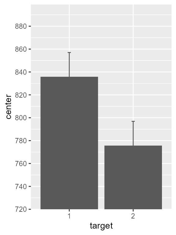
Figure 5, final version for mean accuracies
Put the two plots side-by-side and save your work!
finalplt <- grid.arrange(pltA, pltB, ncol=2)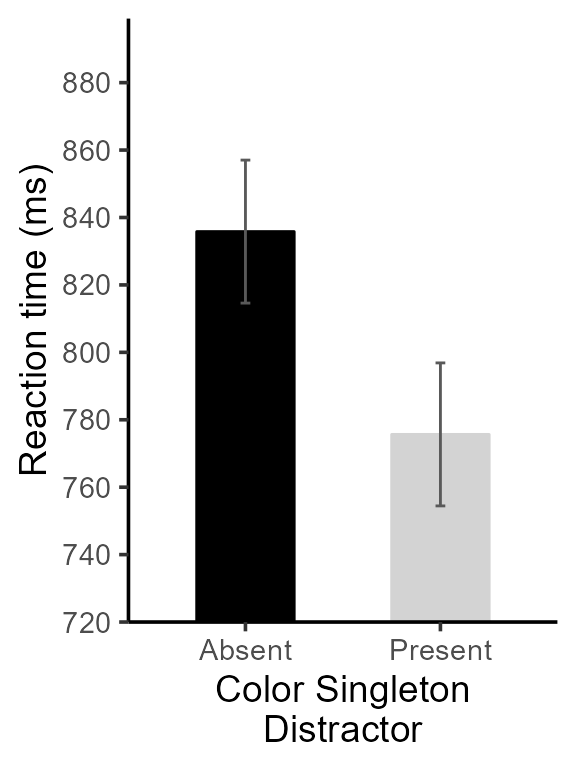
Figure 6, final version
#ggsave( "Figure2b.png",
#    plot=finalplt,
#    device = "png",
#    dpi = 320,          # pixels per inche
#    units = "cm",       # or "in" for dimensions in inches
#    width = 20,         # as found in the article
#    height = 15
#)
Regarding the information provided by superb:
## superb::FYI: The HyunhFeldtEpsilon measure of sphericity per group are  1.000
## superb::FYI: All the groups' data are compound symmetric. Consider using CA.
note that with only two repeated measures, sphericity is always met
(Epsilon = 1.00) so nothing to do with this comment. Compound symmetry
is a weaker form of the sphericity assumption. When compound symmetry is
met, you can decorrelate the data using either CM or
CA. You won’t see much differences between the two
techniques, so you may as well ignore this comment.
Enjoy!