How to plot frequencies along with confidence intervals using
superb
Many studies collect data that are categorized according to one or some factors. For example, it is possible to categorize a sample of college students based on their gender and on their projects after college is finished (go to university, get a job, etc.). Here, there are two “factors”: gender and plans post studies. The measure for each participant is in which of the “cells” the participant is categorized. Typically, the data are summarized as frequencies, that is, the count of participants in each of the various combinations of the factor levels. For two classification factors, the data are said to be two-way classfication data, or to form a contingency table. Nothing prevent from having more than 2 factors, e.g., a three-way classification data.
Although frequencies are often given in a table, these tables provides very little insight with regards to trends. It is far more adviseable to illustrate the frequencies using a plot showing the count in each levels of the factors. However, to be truly informative, such a plot should be accompanied with error bars such as the confidence interval. Herein, we show how this can be done.
We adopted an approach based on the pivot method developed by Clopper & Pearson (1934). This method is given in an analytic form in Leemis & Trivedi (1996). Such confidence intervals are commonly non-symmetrical around the estimate; they are also exact or conservative, in which case the length of the interval tends to be too long when the frequencies are small (Chen, 1990).
Given the total sample size in all the cells, each observed frequency in a given cell is used to get lower and upper confidence bounds around the proportion with the formula: in which denotes the % quantile of an distribution and the desired coverage of the interval, often 95%. The interval is then used as a % confidence interval of the observed frequency which can be used to compare one frequency to an expected or theoretical frequency. Such an unadjusted confidence interval is termed a stand-alone confidence interval (Cousineau, Goulet, & Harding, 2021).
As more commonly, we wish to compare an observed frequency to another
observed frequency, a difference-adjusted confidence interval
is sought. To obtain a difference-adjusted confidence interval, it is
required to multiply the interval width by 2,
where the asterisk denotes
difference-adjusted confidence interval limits. Thus, the interval
is the difference-adjusted
%
confidence interval (Baguley, 2012). The
difference-adjusted confidence intervals allow comparing the frequencies
pairwise rather than to a theoretical frequency.
Why multiply the stand-alone CI length by 2?
The reason for the multiplication by 2 is two-fold. First, to obtain a difference-adjusted confidence interval (CI), it is necessary to multiply the CI width by (under the assumption of homogeneous variance). Second, as the total must necessarily be equal to , the observed frequencies are correlated and this correlation equals where is the number of class. As this CI is meant for pair-wise comparisons, is replaced by 2 in this formula, resulting in a second, correlation-based, correction of . As usual, both corrections to the CI width are multiplicative.
One illustration
To illustrate the method on a real data set, we enter the data set found in Light & Margolin (1971). The data counts the number of teenagers based (first factor) on their gender an on (second factor) their educational vocation (the type of studies they want to complete in the future). The sample is composed of 617 teens. To generate the dataset, we use the following:
dta <- data.frame(
    vocation = factor(unlist(lapply(c("Secondary","Vocational","Teacher","Gymnasium","University"), function(p) rep(p,2))),
                    levels = c("Secondary","Vocational","Teacher","Gymnasium","University")),
    gender  = factor(rep(c("Boys","Girls"),5), levels=c("Boys","Girls")),
    obsfreq   = c(62,61,121,149,26,41,33,20,84,20)
)
The function factor uses the argument
levels to specify the order in which the items are to be
plotted; otherwise, the default order is alphabetic order.
If you have the data in a file, it is actually a lot more easier to import the file!
Here are the data in extenso:
dta## vocation gender obsfreq
## 1 Secondary Boys 62
## 2 Secondary Girls 61
## 3 Vocational Boys 121
## 4 Vocational Girls 149
## 5 Teacher Boys 26
## 6 Teacher Girls 41
## 7 Gymnasium Boys 33
## 8 Gymnasium Girls 20
## 9 University Boys 84
## 10 University Girls 20To have a quick-and-dirty plot, just display the raw counts with no error bars
library(superb)
library(ggplot2)

plt1 <- superb(
    obsfreq ~ vocation + gender,
    dta,
    statistic = "identity",                     # the raw data as is
    errorbar  = "none",                         # no error bars
    # the following is for the look of the plot
    lineParams     = list( linewidth = 1.0)          # thicker lines as well
)
plt1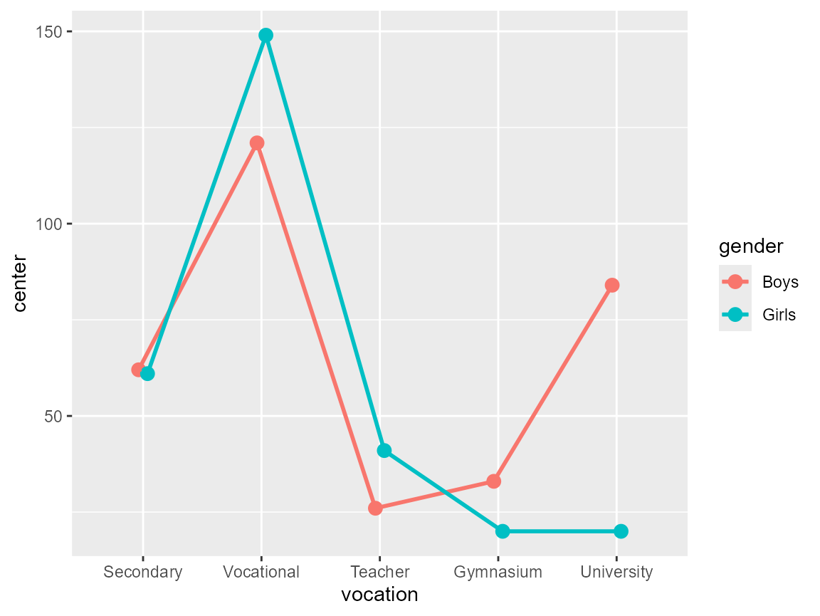
Figure 1: A quick-and-dirty plot
Define the confidence interval function
First, we need the summary function that computes the frequency. This is actually the datum stored in the data frame, so there is nothing to compute.
count <- function(x) x[1]Second, we need an initalizer that will fetch the total sample size and dump it in the global environment for later use:
init.count <- function(df) {
    totalcount <<- sum(df$DV)
}
Third and lastly, we compute the confidence interval limits using Clopper & Pearson (1934) approach using the Leemis & Trivedi (1996) analytic expression:
CI.count <- function(n, gamma=0.95) {
    N <- totalcount

    # Clopper & Pearson CI from Leemis & Trivedi, 1996
    plow <- (1+(N-n+1)/((n+0)*qf(1/2-gamma/2,2*(n+0),2*(N-n+1))))^(-1)
    phig <- (1+(N-n+0)/((n+1)*qf(1/2+gamma/2,2*(n+1),2*(N-n+0))))^(-1)

    # convert to CI on counts
    nlow <- totalcount * plow
    nhig <- totalcount * phig

    # increase width for difference- and correlation-adjustments
    2 * c( nlow[1]-n[1], nhig[1]-n[1] ) + n[1]
}
This is it! All the statistical functions needed to make the plot are in place.
Make a count plot with confidence intervals
plt2 <- superb(
    obsfreq ~ vocation + gender,
    dta,
    statistic = "count",                                 # the function defined above
    errorbar  = "CI",                                    # its CI define above
    # the following is for the look of the plot
    errorbarParams = list( width =0.5, linewidth =0.75 ),# have thicker error bars
    lineParams     = list( linewidth = 1.0)                   # thicker lines as well
)
plt2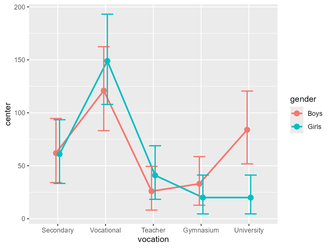
Figure 2: A complete plot
The plot is drab so let’s add some ornaments to it:
ornate <- list(
    xlab("Educational vocation"),                      # label on the x-axis
    ylab("Observed frequency"),                        # label on the y-axis
    theme_bw(base_size = 16),                          # black and white theme
    scale_x_discrete(guide = guide_axis(n.dodge = 2))  # unalign labels
    # etc. anything accepted by ggplots can be added.
)
plt3 <- plt2 + ornate
plt3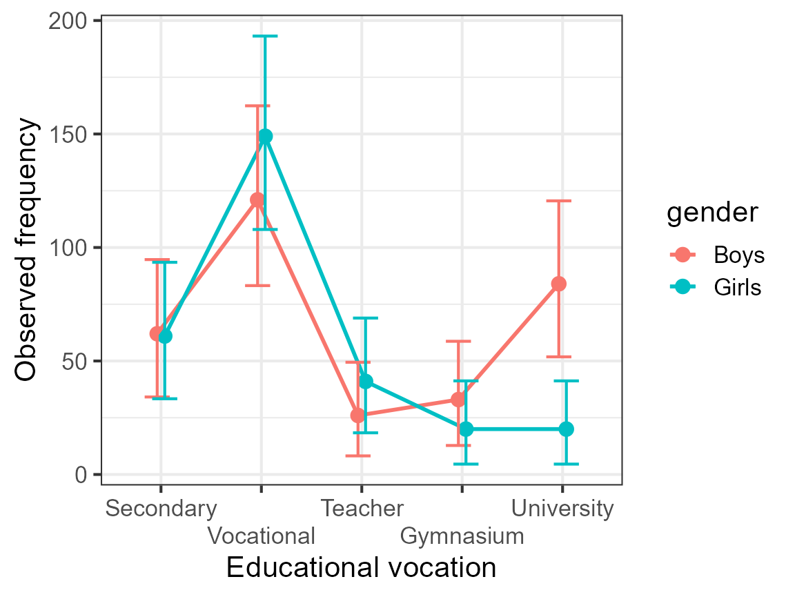
Figure 3: An ornated plot
The benefit of the plot
If you look at the plot, it becomes readily apparent that the boys and the girls had (in the 1960s) the same educational aspirations. The only exception is with regards to attending university where girls where fewer to have this aspiration.
Now return to the data listed above, and tell me if you had noticed that. Most certainly not. Tables are terribly inefficient tools to convey trends whereas plots are ideal to that end. When combined with a decent measure of error (here, the confidence interval), it is fairly easy to decide if the trends are reliable or accidental.
Are we sure?
The plot with difference-adjusted confidence interval is a very reliable tool to make inference-by-eye. In doubt however, go run the exact test. In the present case, we performed an ANOFA (Analysis of Frequency datA; Laurencelle & Cousineau (2023)). It shows that the interaction is highly significant; subsequent simple effect analyses show that this is indeed the university aspiration that triggered that interaction.
ANOFA table:
| df | ||||
|---|---|---|---|---|
| Total | 266.8894 | 9 | ||
| Aspiration (A) | 215.0163 | 4 | 214.6684 | < 0.0001 |
| Gender (B) | 1.9865 | 1 | 1.9849 | 0.1589 |
| A B | 49.8867 | 4 | 49.5554 | < 0.0001 |
Decomposition of the interaction and the Aspiration effects:
| Simple effect | df | |||
|---|---|---|---|---|
| Gender within Secondary school | 0.0081 | 1 | 0.0081 | 0.9282 |
| Gender within Vocational training | 2.9089 | 1 | 2.9078 | 0.0881 |
| Gender within Teacher college | 3.3868 | 1 | 3.3855 | 0.0658 |
| Gender within Gymnasium | 3.2214 | 1 | 3.2201 | 0.0727 |
| Gender within University | 42.3478 | 1 | 42.3307 | <0.0001 |
In summary
Frequencies, a.k.a. counts, can be displayed with appropriate confidence intervals without any problem. They are just another regular dependent variable in the researcher’s toolkit.