Herein we provide the full code to realize Figures 1 to 4 that
illustrate the article describing the superb framework
(Cousineau, Goulet, & Harding, 2021).
These figures are based on ficticious data sets that are provided with
the package superb (dataFigure1 to
dataFigure4).
Before we begin, we need to load a few packages, including
superb of course:
## Load relevant packages
library(superb)             # for superbPlot
library(ggplot2)            # for all the graphic directives
library(gridExtra)          # for grid.arrange
If they are not present on your computer, first upload them to your
computer with install.packages("name of the package").
Making Figure 1
The purpose of Figure 1 is to illustrate the difference in error bars
when the purpose of these measures of precision is to perform pair-wise
comparisons. It is based on the data from dataFigure1,
whose columns are
head(dataFigure1)## id grp score
## 1 1 1 117
## 2 2 1 103
## 3 3 1 113
## 4 4 1 101
## 5 5 1 104
## 6 6 1 114where id is just a participant identifier,
grp indicate group membership (here only group 1 and group
2), and finally, score is the dependent variable.
The first panel on the left is based on stand-alone confidence intervals and is obtained with :
plt1a <- superb( score ~ grp,
            dataFigure1,
            plotLayout   = "line" )
plt1a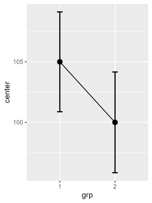
Figure 1a. Left panel of Figure 1.
Note that these stand-alone error bars could have been
obtained by adding the argument
adjustments = list(purpose = "single") but as it is the
default value, it can be omitted.
The default theme to ggplots is not very
attractive. Let’s decorate the plot a bit! To that end, I collected some
additional ggplot directives in a list:
ornateBS <- list(
    xlab("Group"),
    ylab("Attitude towards class activities"),
    scale_x_discrete(labels = c("Collaborative\ngames", "Unstructured\nactivities")), #new!
    coord_cartesian( ylim = c(70,130) ),
    geom_hline(yintercept = 100, colour = "black", linewidth = 0.5, linetype=2),
    theme_light(base_size = 10) +
    theme( plot.subtitle = element_text(size=12))
)
so that the first plot, with these ornaments and a title, is:
plt1a <- plt1a + ornateBS + labs(subtitle="(stand-alone)\n95% CI")
plt1a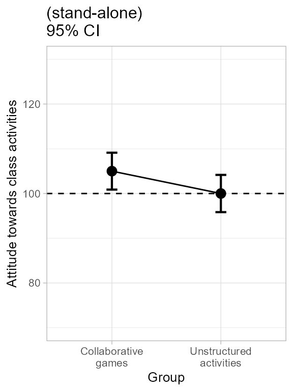
Figure 1b. Decorating left panel of Figure 1.
The second plot is obtained in a simar fashion with just one additional argument requesting difference-adjusted confidence intervals:
plt1b <- superb( score ~ grp,
            dataFigure1,
            adjustments  = list(purpose = "difference"), #new!
            plotLayout   = "line" )
plt1b <- plt1b + ornateBS + labs(subtitle="Difference-adjusted\n95% CI")
plt1b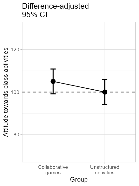
Figure 1c. Making and decorating central panel of Figure 1.
Finally, the raincloud plot is obtained by changing the
plotLayout argument:
plt1c <- superb(
            score ~ grp,
            dataFigure1,
            adjustments  = list(purpose = "difference"),
            plotLayout   = "raincloud",                         # new layout!
            violinParams = list(fill = "green", alpha = 0.2) ) # changed color to the violin
plt1c <- plt1c + ornateBS + labs(subtitle="Difference-adjusted\n95% CI")
plt1c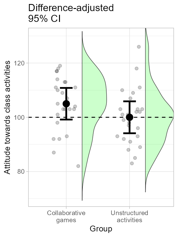
Figure 1d. Making and decorating right panel of Figure 1.
All three plots are shown side-by-side with:
grid.arrange(plt1a, plt1b, plt1c, ncol=3)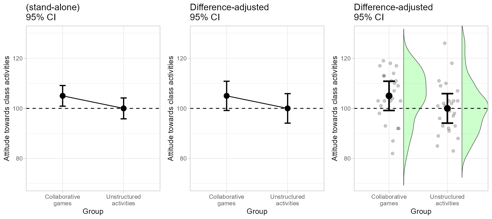
Figure 1. The complete Figure 1.
and exported to a file, with, e.g.:
png(filename = "Figure1.png", width = 640, height = 320)
grid.arrange(plt1a, plt1b, plt1c, ncol=3)
dev.off()
You can change the smooth density estimator (the kernel
function) by adding to the violinParams list the following
attribute: kernel = "rectangular" for example to have a
ragged density estimator.
In the end, which error bars are correct? Remember that the golden rule of adjusted confidence intervals is to look for inclusion: for example, is the mean of the second group part of the possible results suggested by the first group’s confidence interval? yes it is in the central plot. The central plot therefore indicate an absence of signficant difference. The confidence intervals being 95%, this conclusion is statistically significant at the 5% level.
Still not convinced? Let’s do a t test (actually, a Welch
test; add var.equal = TRUE for the regular t test;
Delacre, Lakens, & Leys (2017)):
t.test(dataFigure1$score[dataFigure1$grp==1],
       dataFigure1$score[dataFigure1$grp==2],
       )
##
## Welch Two Sample t-test
##
## data: dataFigure1$score[dataFigure1$grp == 1] and dataFigure1$score[dataFigure1$grp == 2]
## t = 1.7612, df = 47.996, p-value = 0.08458
## alternative hypothesis: true difference in means is not equal to 0
## 95 percent confidence interval:
## -0.7082323 10.7082323
## sample estimates:
## mean of x mean of y
## 105 100There are no significant difference in these data at the .05 level, so that the error bar of a 95% confidence interval should contain the other result, as is the case in the central panel.
Finally, you could try here the Tryon’s adjustments (changing to
adjustments = list(purpose = "tryon")). However, you will
notice no difference at all. Indeed, the variances are almost identical
in the two groups (9.99 vs. 10.08).
Making Figure 2
Figure 2 is made in a similar fashion, and using the same decorations
ornate as above with just a different name for the variable
on the horizontal axis:
ornateWS <- list(
    xlab("Moment"),                                                #different!
    scale_x_discrete(labels=c("Pre\ntreatment", "Post\ntreatment")),
    ylab("Statistics understanding"),
    coord_cartesian( ylim = c(75,125) ),
    geom_hline(yintercept = 100, colour = "black", linewidth = 0.5, linetype=2),
    theme_light(base_size = 10) +
    theme( plot.subtitle = element_text(size=12))
)
The difference in the present example is that the data are from a within-subject design with two repeated measures. The dataset must be in a wide format, e.g.,
head(dataFigure2)## id pre post
## 1 1 105 128
## 2 2 96 96
## 3 3 88 102
## 4 4 80 88
## 5 5 90 83
## 6 6 86 99This makes the left panel:
plt2a <- superb(
            cbind(pre,post) ~ . ,
            dataFigure2,
            WSFactors    = "Moment(2)",
            adjustments  = list(purpose = "single"),
            plotLayout   = "line" )
plt2a <- plt2a + ornateWS + labs(subtitle="Stand-alone\n95% CI")
plt2a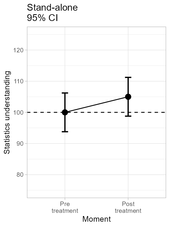
Figure 2a. Making left panel of Figure 2.
… and this makes the central panel, specifying the CA
(correlation-adjusted) decorelation technique:
plt2b <- superb(
            cbind(pre, post) ~ . ,
            dataFigure2,
            WSFactors    = "Moment(2)",
            adjustments  = list(purpose = "difference", decorrelation = "CA"), #new
            plotLayout   = "line" )
## superb::FYI: The average correlation per group is 0.8366
plt2b <- plt2b + ornateWS + labs(subtitle="Correlation and difference-\nadjusted 95% CI")
plt2b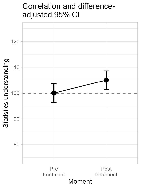
Figure 2b. Making central panel of Figure 2.
As seen, superbPlot issues relevant information
(indicated with FYI messages), here the correlation.
To get a sense of the general trends in the data, we can examine the data participants per participants, joining their results with a line. As seen below, for most participants, the trend is upward, suggesting a strongly reliable effect of the moment:
plt2c <- superb(
            cbind(pre, post) ~ .,
            dataFigure2,
            WSFactors    = "Moment(2)",
            adjustments  = list(purpose = "difference", decorrelation = "CA"),
            plotLayout   = "pointindividualline" )   #new
plt2c <- plt2c + ornateWS + labs(subtitle="Correlation and difference-\nadjusted 95% CI")
plt2c 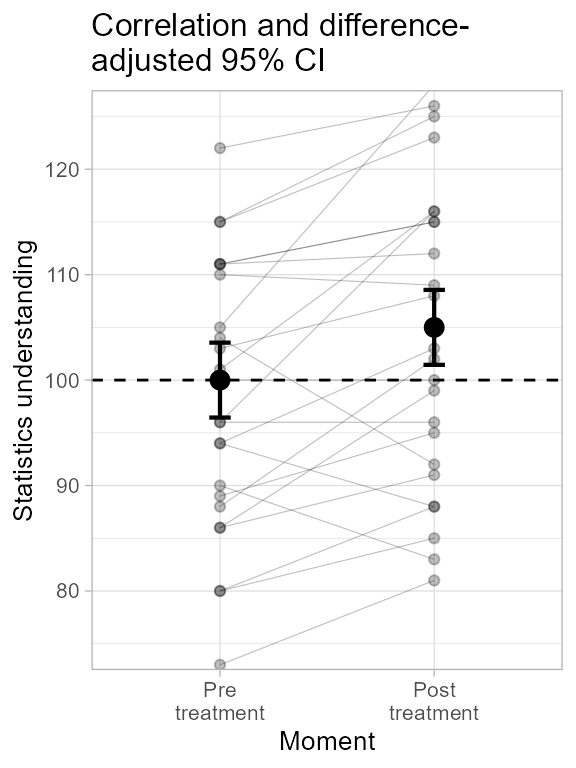
Figure 2c. Making third panel of Figure 2.
Just for the exercice, we also compute the plot of the difference between the scores. To that end, we need different labels on the x-axis and a different range:
ornateWS2 <- list(
    xlab("Difference"),
    scale_x_discrete(labels=c("Post minus Pre\ntreatment")),
    ylab("Statistics understanding"),
    coord_cartesian( ylim = c(-25,+25) ),
    geom_hline(yintercept = 0, colour = "black", linewidth = 0.5, linetype=2),
    theme_light(base_size = 10) +
    theme( plot.subtitle = element_text(size=12))
)
We then compute the differences and make the plot:
dataFigure2$diff <- dataFigure2$post - dataFigure2$pre
plt2d <- superb(
            diff ~ .,
            dataFigure2,
            WSFactor     = "Moment(1)",
            adjustments  = list(purpose = "single", decorrelation = "none"),
            plotLayout   = "raincloud",
            violinParams = list(fill = "green") )  #new
plt2d <- plt2d + ornateWS2 + labs(subtitle="95% CI \nof the difference")
plt2d
Figure 2d. Making right panel of Figure 2.
This last plot does not require decorrelation and is not adjusted for
difference. Decorrelation would not do anything as diff is
a single column; difference-adjustment is inadequate here as the
difference is to be compared to a fix value (namely 0, for zero
improvement)
Assembling all four panels, we get:
grid.arrange(plt2a, plt2b, plt2c, plt2d, ncol=4)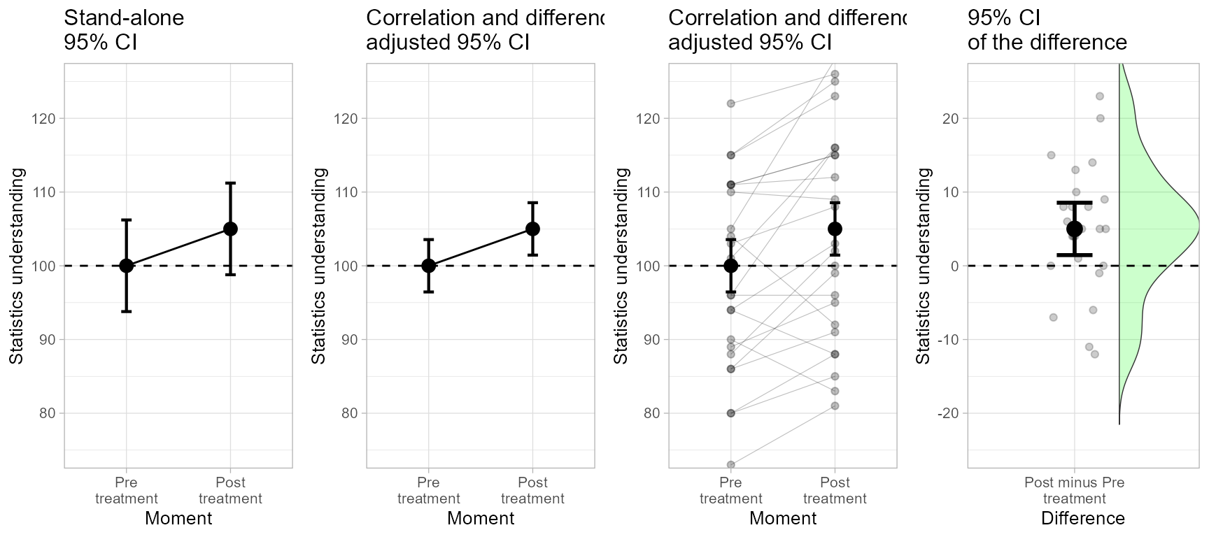
Figure 2. The complete Figure 2.
… which can be exported to a file as usual:
png(filename = "Figure2.png", width = 850, height = 320)
grid.arrange(plt2a, plt2b, plt2c, plt2d,  ncol=4)
dev.off()
Which error bars are depicting the significance of the result most aptly? The adjusted ones seen in the central panel, as confirmed by a t-test on paired data:
t.test(dataFigure2$pre, dataFigure2$post, paired=TRUE)##
## Paired t-test
##
## data: dataFigure2$pre and dataFigure2$post
## t = -2.9046, df = 24, p-value = 0.007776
## alternative hypothesis: true mean difference is not equal to 0
## 95 percent confidence interval:
## -8.552864 -1.447136
## sample estimates:
## mean difference
## -5The confidence interval of one moment does not include the result from the other moment, indicating a significant difference between the two moments.
Making Figure 3
The novel element in Figure 3 is the fact that the participants have been recruited by clusters of participants.
We first adapt the ornaments for this example:
ornateCRS <- list(
    xlab("Group"),
    ylab("Quality of policies"),
    scale_x_discrete(labels=c("From various\nfields", "From the\nsame field")), #new!
    coord_cartesian( ylim = c(75,125) ),
    geom_hline(yintercept = 100, colour = "black", linewidth = 0.5, linetype=2),
    theme_light(base_size = 10) +
    theme( plot.subtitle = element_text(size=12))
)
Then, we get an unadjusted plot as usual:
plt3a <- superb(
    VD ~ grp,
    dataFigure3,
    adjustments   = list(purpose = "single", samplingDesign = "SRS"),
    plotLayout    = "line" )
plt3a <- plt3a + ornateCRS + labs(subtitle="Stand-alone\n95% CI")
plt3a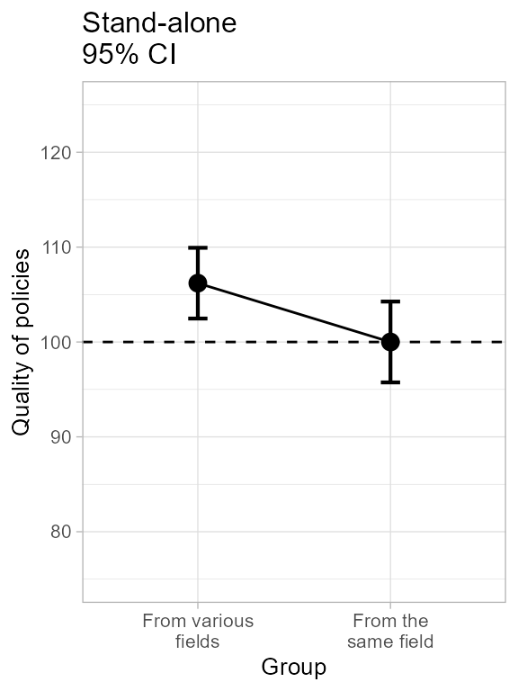
Figure 3a. The left panel of Figure 3.
Here, the option samplingDesign = "SRS" is the default
and can be omitted.
To indicate the presence of cluster-randomized sampling, the
samplingDesign option is set to "CRS" and an
additional information, clusterColumn is indicated to
identify the column containing the cluster membership information:
plt3b <- superb(
    VD ~ grp,
    dataFigure3,
    adjustments   = list(purpose = "difference", samplingDesign = "CRS"), #new
    plotLayout    = "line",
    clusterColumn = "cluster" )                                           #new
## superb::FYI: The ICC1 per group are 0.491 0.204
plt3b <- plt3b + ornateCRS + labs(subtitle="Cluster and difference-\nadjusted 95% CI")
plt3b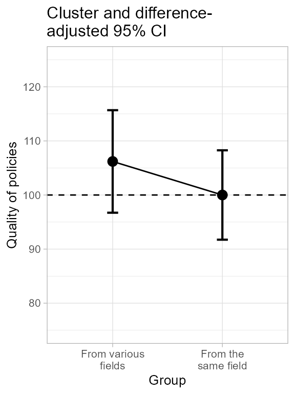
Figure 3b. The central panel of Figure 3.
An inspection of the distribution does not make the cluster structure evident and therefore a raincloud plot is maybe little informative in the context of cluster randomized sampling…
plt3c <- superb(
    VD ~ grp,
    dataFigure3,
    adjustments   = list(purpose = "difference", samplingDesign = "CRS"),
    plotLayout    = "raincloud",
    violinParams  = list(fill = "green", alpha = 0.2),
    clusterColumn = "cluster" )
plt3c <- plt3c + ornateCRS + labs(subtitle="Cluster and difference-\nadjusted 95% CI")
Here is the complete Figure 3:
grid.arrange(plt3a, plt3b, plt3c, ncol=3)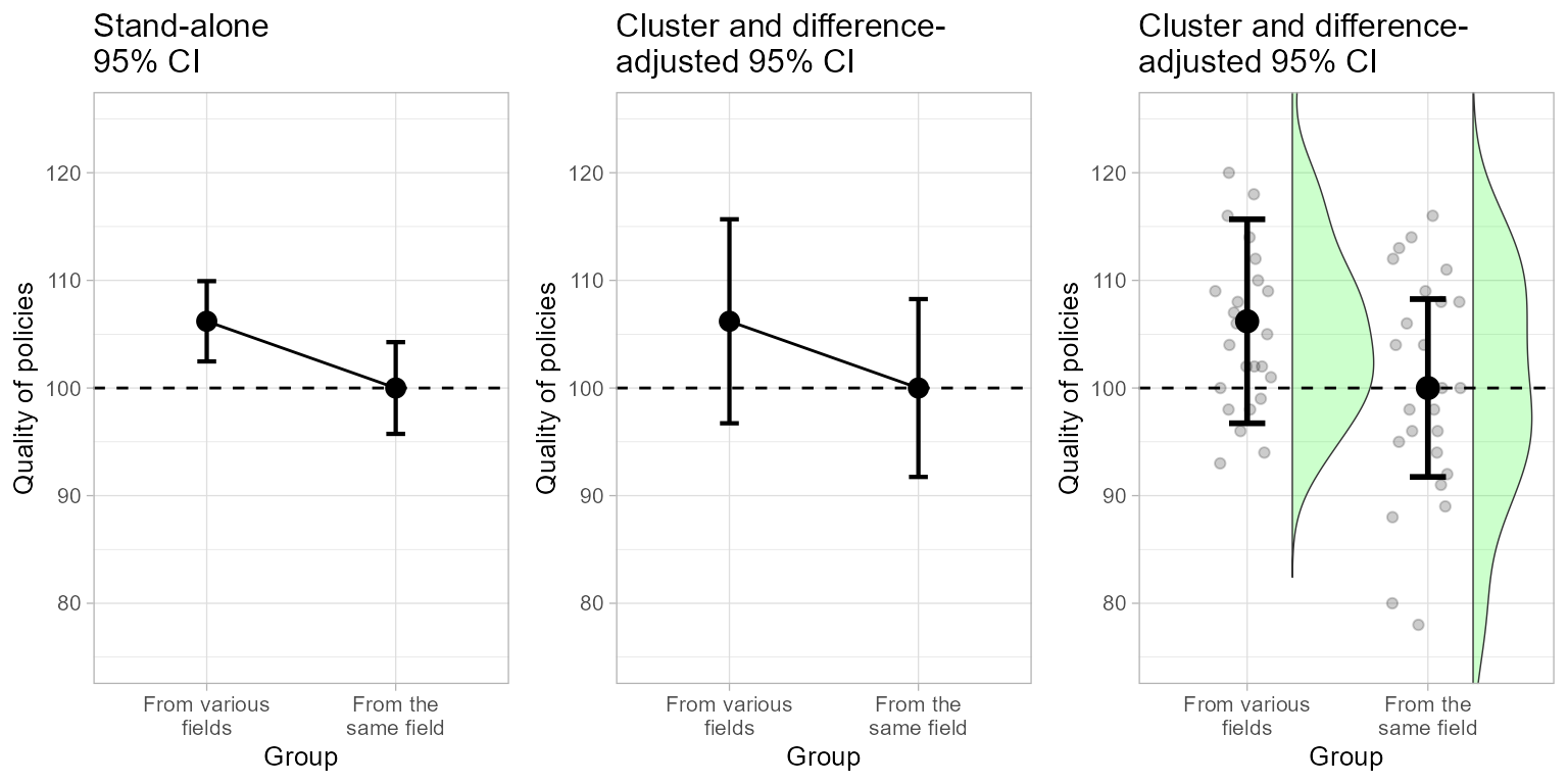
Figure 3. The complete Figure 3.
This figure is saved as before with
png(filename = "Figure3.png", width = 640, height = 320)
grid.arrange(plt3a, plt3b, plt3c, ncol=3)
dev.off()
To make the correct t test in the present case, we need a correction factor called . An easy way is the following (see Cousineau & Laurencelle, 2016 for more)
res    <- t.test( dataFigure3$VD[dataFigure3$grp==1],
                  dataFigure3$VD[dataFigure3$grp==2],
                )
# mean ICCs per group, as given by superbPlot
micc   <- mean(c(0.491335, 0.203857))
# lambda from five clusters of 5 participants each
lambda <- CousineauLaurencelleLambda(c(micc, 5, 5, 5, 5, 5, 5))
tcorrected  <- res$statistic / lambda
pcorrected  <- 1 - pt(tcorrected, 4)

cat(paste("t-test corrected for cluster-randomized sampling: t(",
    2*(dim(dataFigure3)[1]-2),") = ", round(tcorrected, 3),
    ", p = ", round(pcorrected, 3),"\n", sep= ""))
## t-test corrected for cluster-randomized sampling: t(96) = 1.419, p = 0.114As seen, the proper test is returning a coherent decision with the proper error bars.
Making Figure 4
Figure 4 is an illustration of the impact of sampling among a finite population.
ornateBS <- list(
    xlab(""),
    ylab("Metabolic score"),
    scale_x_discrete(labels=c("Response to treatment")), #new!
    coord_cartesian( ylim = c(75,125) ),
    geom_hline(yintercept = 100, colour = "black", linewidth = 0.5, linetype=2),
    theme_light(base_size = 10) +
    theme( plot.subtitle = element_text(size=12))
)
Lets do Figure 4 (see below for each plot in a single figure).
plt4a <- superb(
    score ~ group,
    dataFigure4,
    adjustments = list(purpose = "single", popSize = Inf),
    plotLayout  = "line" )
plt4a <- plt4a + ornateBS + labs(subtitle="Stand-alone\n95% CI")
The option popSize = Inf is the default; it indicates
that the population is presumed of infinite size. A finite size can be
given, as
plt4b <- superb(
    score ~ group,
    dataFigure4,
    adjustments = list(purpose = "single", popSize = 50 ), # new!
    plotLayout  = "line" )
plt4b <- plt4b + ornateBS + labs(subtitle="Population size-\nadjusted 95% CI")
We illustrate the plot along some distribution information with a violin plot:
plt4c <- superb(
    score ~ group,
    dataFigure4,
    adjustments = list(purpose = "single", popSize = 50 ), # new!
    plotLayout  = "pointjitterviolin",
    violinParams = list(fill = "green", alpha = 0.2)  )
plt4c <- plt4c + ornateBS + labs(subtitle="Population size-\nadjusted 95% CI")
Which are reunited as usual:
plt4 <- grid.arrange(plt4a, plt4b, plt4c, ncol=3)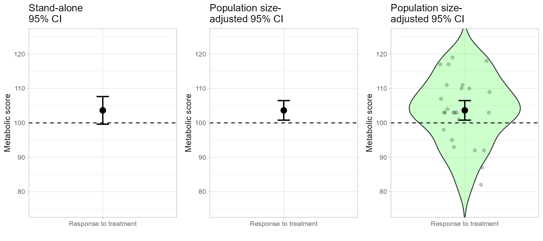
Figure 4. The complete Figure 4.
…and saved with:
png(filename = "Figure4.png", width = 640, height = 320)
grid.arrange(plt4a, plt4b, plt4c, ncol=3)
dev.off()
The corrected t test, performed by adjusting for the proportion of the population examined (see Thompson, 2012), confirms the presence of a significant difference:
res <- t.test(dataFigure4$score, mu=100)
tcorrected <- res$statistic /sqrt(1-nrow(dataFigure4) / 50)
pcorrected <- 1-pt(tcorrected, 24)

cat(paste("t-test corrected for finite-population size: t(",
    nrow(dataFigure4)-1,") = ", round(tcorrected, 3),
    ", p = ", round(pcorrected, 3),"\n", sep= ""))
## t-test corrected for finite-population size: t(24) = 2.644, p = 0.007