Summary plots such as mean plots are typically illustrated in a
cartesian coordinate system. This is a system where the information is
placed on a grid formed from
two orthogonal axes. This system is named in honor of René Descartes who
introduced this system in the middle of the 16th century.
When the indicators on the horizontal axis have a certain reason to be in a certain order, it makes sense to use a flat horizontal axis. However, when the indicators’ order is arbitrary, the incentive to use an horizontal axis is not as strong. An alternative to a cartesian coordinate system is a polar (or radial) coordinate system.
In polar coordinates, the couples are not associated to a specific cell in a grid determined by a left-right position given by and an up-down position given by . Instead, the couples have a location given by an angle given by , and by a radius (distance to the center) given by .
When the points are connected, they can be connected by curves following the curves space. in that case, we call such line plot a polar plot. On the other hand, when the points are connected with straight lines, we call such line plot a radar plot.
An example.
Radar plot was used in a study of aphantasia presented in Delem, Turkben, Cousineau, Cavalli, & Plancher (2024). In that study, a number of indicators (scores) are collected from participants. These indicators have no ordering, measuring verbal abilities, spatial abilities, etc. Once standardized, these indicators are approximately on the same scale and so can be presented in a plot.
( At the end, we generate random scores from 60 participants; this is not central to our presentation).
The following plot shows the results using jittered dots so that we see the individual scores. The data are repeated measures with 5 measurements per participants (the indicators), and given in long format.
superb( DV ~ Indicator, data = dta,
        plotLayout   = "pointlinejitter",
        adjustments = list(purpose = "difference")
    ) + theme_bw() + ylim(0,100) + ylab("Score")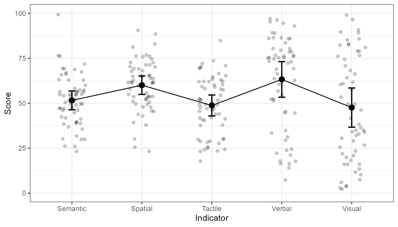
Figure 1. Plot of the 5 indicator variables.
From these indicators, a clustering algorithm identified three distinct profiles. These profiles have different mean score on each indicator variables. As such, the plot can be done again, this time with different colors for each cluster of participants. We get.
superb( DV ~ Indicator + Profile, data = dta,
        plotLayout   = "pointlinejitter",
        adjustments = list(purpose = "difference")
    ) + theme_bw() + ylim(0,100) + ylab("Score")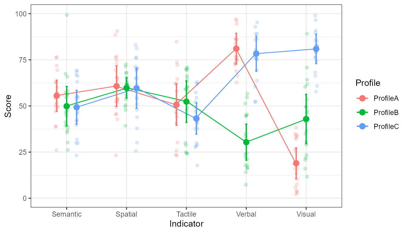
Figure 2. Plot of the 5 indicator variables and the three profiles.
As see, the last indicator shows a wide diversity of scores well captured by the profile in which the participants belong.
Turning the plot into a radar plot
To change the plot into a polar plot, simply change the layout.
Changing from "pointlinejitter" to
"circularpointlinejitter" does the trick:
superb( DV ~ Indicator + Profile, data = dta,
        plotLayout = "circularpointlinejitter"         ## only change!
    ) + theme_bw() + ylim(0,100) + ylab("Score")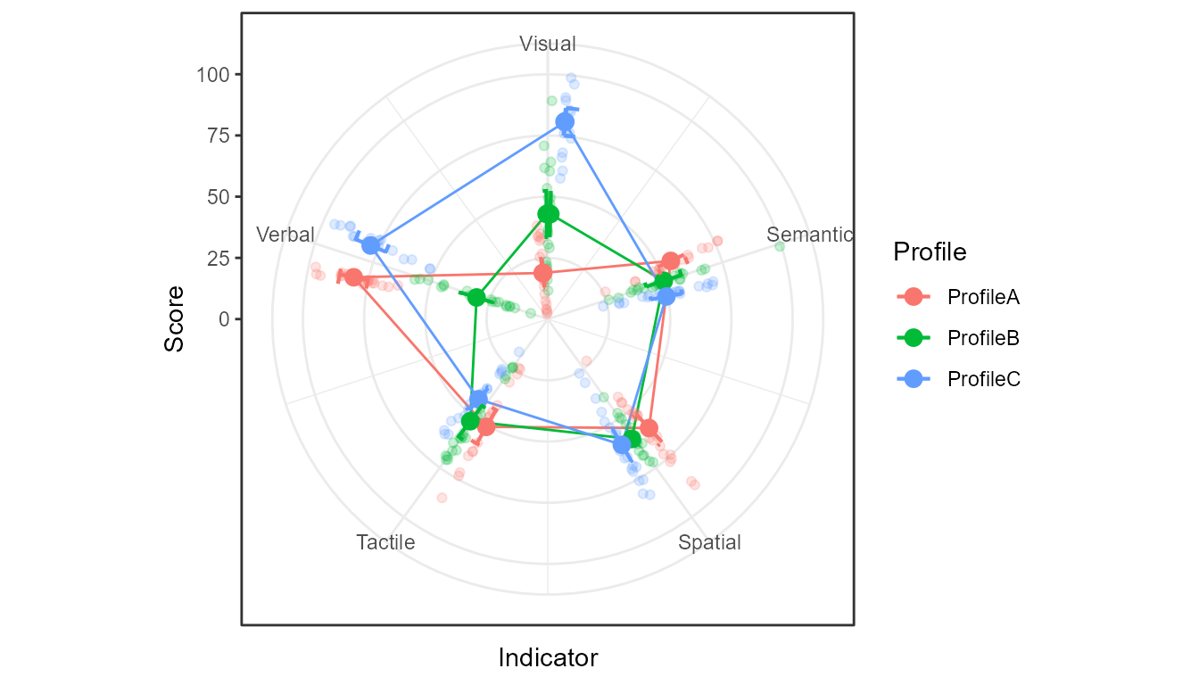
Figure 3. Plot of the 5 indicator variables and the three profiles in polar coordinate.
We can undo the polar coordinate by forcing a cartesian coordinate system with:
superb( DV ~ Indicator + Profile, data = dta,
        plotLayout = "circularpointlinejitter"
    ) + theme_bw() + ylim(0,100) + ylab("Score") +
    coord_cartesian()                                  ## only change!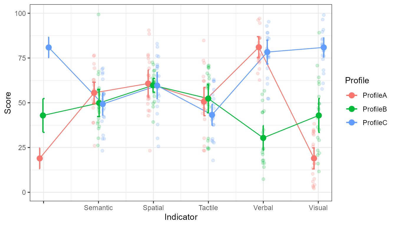
Figure 4. Plot of the 5 indicator variables and the three profiles back in cartesian coordinate.
It helps to see the one critical change: for the loop to close onto itself, an additional set of points are added at 0. It only reproduces the last points (here at Visual). When the plot is folded into a radial system, the first and last points superimpose.
Interpreting the plot
The plot (either radar or cartesian) allow us to see that on three indicator variables, Semantic, Spatial, and Tactile, the three clusters of participants do not differ much. On the Verbal variable, the second profile ProfileB is differing from the other two profiles. Lastly, on the Visual variable, the three profiles have significantly different scores on average.
Customizing the plot
All the plots produced by superb() are ggplot objects
and so it is possible to add additional graphic directives to alter its
look or to add additional geom.
In this code, we inject arguments into the geom_line()
layer with lineParams. Here, we increase the line
thickness. We also make the lines thicker but partially transparant by
injecting linewidth and alpha in the
geom_line() using lineParams. Finally, we also
change the color palette. We can also remove the border around the plot,
font size, etc.
library(RColorBrewer)
superb( DV ~ Indicator + Profile, data = dta,
        plotLayout      = "circularpointlinejitter",
        lineParams     = list(linewidth=1.2, alpha = 0.3 ),
        errorbarParams = list(width=0.3,linewidth=1.2 ),
        jitterParams   = list(size=1,alpha=0.33 ),
    ) + theme_bw() + ylim(0,100) + ylab("Score") +
    theme(panel.border = element_blank(), text = element_text(size = 16) ) +
    scale_color_brewer(palette="Dark2")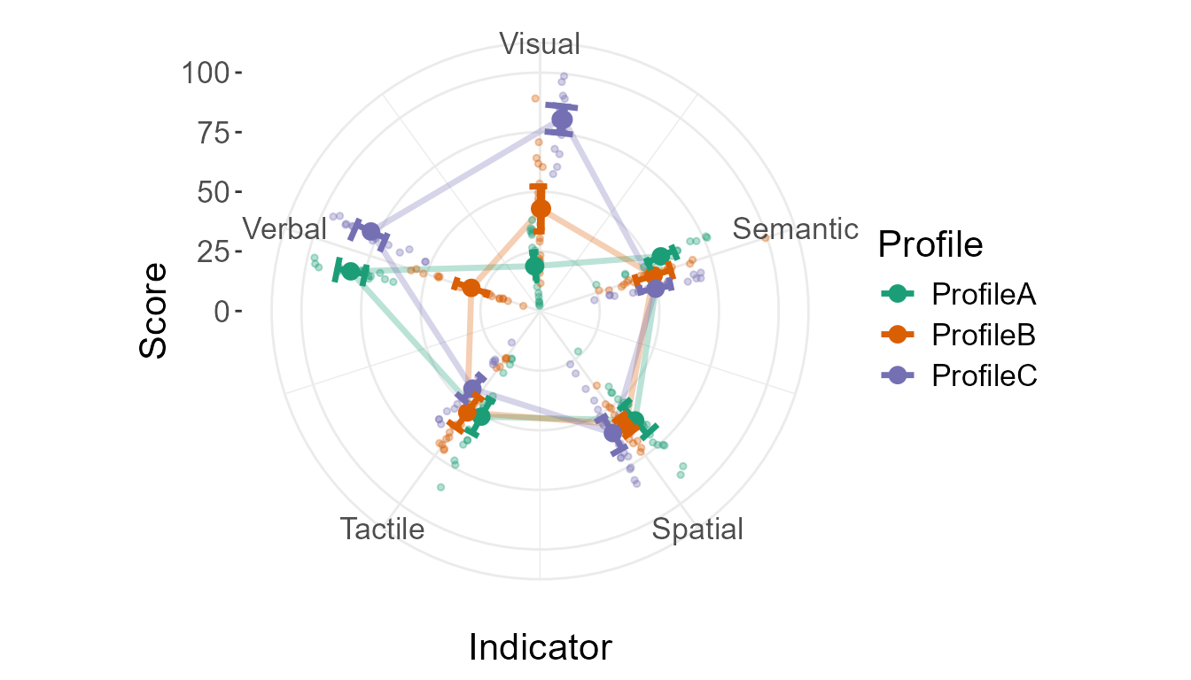
Figure 5. Plot with some customization
Difference adjustments
In all the figures, we did not use the difference adjustment. Recall that this adjustment is needed when the objective of the error bars (or error bands) is to perform comparisons between pairs of conditions.
In the present example, the reader is very likely to perform
comparisons between curves so that the difference adjustment is needed.
Simply add purpose = "difference" in the
adjustments list. You will see that the error bars are now
a bit longer to allow between-variable comparisons.
superb( DV ~ Indicator + Profile, data = dta,
        adjustments    = list(purpose = "difference"), ## new addition
        plotLayout     = "circularpointlinejitter",
        lineParams     = list(linewidth=1.2, alpha = 0.3 ),
        errorbarParams = list(width=0.2,linewidth=1.2 ),
        jitterParams   = list(size=1,alpha=0.33 ),
    ) + theme_bw() + ylim(0,100) + ylab("Score") +
    theme(panel.border = element_blank(), text = element_text(size = 16) ) +
    scale_color_brewer(palette="Dark2")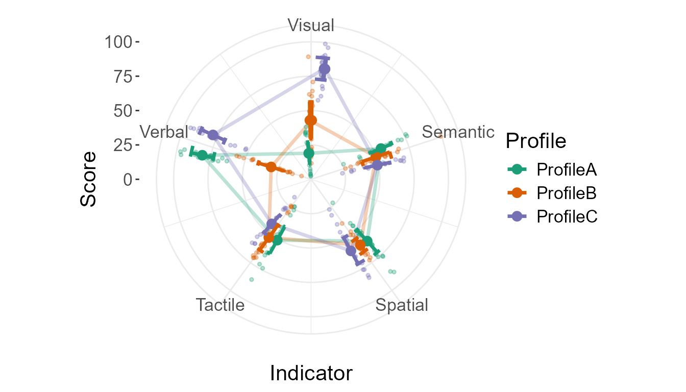
Figure 6. Plot with some difference adjustment
If for any reason, you need to change
scale_x_continuous(), you need to preserve a few arguments
manually, they are
    scale_x_continuous(
            oob = scales::oob_keep,
            limits =   c(0, 0.00001+NUMBER_OF_CATEGORIES ),
            n.breaks = NUMBER_OF_CATEGORIES +1
        )
where here NUMBER_OF_CATEGORIES would be 5 in this
example.
You can also rotate the plot or make it turn in the opposite
direction with the radarParams list, e.g.,
superb( DV ~ Indicator + Profile, data = dta,
        adjustments    = list(purpose = "difference"), ## new addition
        plotLayout     = "circularpointlinejitter",
        lineParams     = list(linewidth=1.2, alpha = 0.3 ),
        errorbarParams = list(width=0.2,linewidth=1.2 ),
        jitterParams   = list(size=1,alpha=0.33 ),
        radarParams    = list( direction = -1, start = 2*pi *4/5)
    ) + theme_bw() + ylim(0,100) + ylab("Score") +
    theme(panel.border = element_blank(), text = element_text(size = 16) ) +
    scale_color_brewer(palette="Dark2")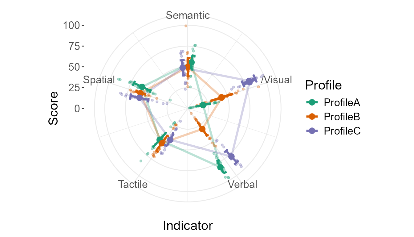
Figure 7. Plot turning counterclockwise
Generating random data
The data used herein have been randomly generated with the
GRD() (Generate Random Data) function included in
superb (quite useful to test plot functions!).
Here, we generated data for three profiles and 5 indicators. The effect are from an interaction between the two factors, adding or removing points on average on the grand mean which is 50.