superbPlot() comes with seven built-in layouts for
plotting your data. However, it is possible to add additional,
custom-made layouts. In this vignette, we present rapidly the existing
layouts, then show how to supplement superb with your own
layouts.
The built-in plot layouts
When calling superbPlot(), you use the
plotLayout = "layout" option to indicate which layout you
wish to use. Internally, superbPlot() is calling a function
whose name is superbPlot."layout"(). For example, with
plotLayout = "line", the plot is actually performed by the
function superbPlot.line().
The seven layout available in superbPlot package are
:
superbPlot.line(): shows the results as points and lines,superbPlot.lineBand(): Shows the confidence intervals as a semi-transparent band rather than with bars.superbPlot.point(): shows the results as points only,superbPlot.bar(): shows the results using bars,superbPlot.pointjitter(): shows the results with points, and the raw data with jittered points,superbPlot.pointjitterviolin(): also shows violin plot behind the jitter points, andsuperbPlot.pointindividualline(): show the results with fat points, and individual results with thin lines,superbPlot.raincloud(): Shows the results with distribution and jitter.
To determine if a certain function is
superbPlot-compatible, use the following function:
superb:::is.superbPlot.function("superbPlot.line")## [1] TRUEwhere you put between quote the name of a function. When devising
your own, custom-made function, it is a good thing to check that it is
superbPlot-compatible.
Illustrating some of the built-in layouts
To get a sense of the currently available layouts, we first generate a dataset composed of randomly generated scores mimicking a 3 2 design with three degrees of Difficulties (as a between-group factor) and two days of testing (as a within-subject factor). It is believed (and simulated) that all two factors have main effets on the scores.
testdata <- GRD(
    RenameDV   = "score",
    SubjectsPerGroup = 25,
    BSFactors  = "Difficulty(3)",
    WSFactors  = "Day(day1, day2)",
    Population = list(mean = 65,stddev = 12,rho = 0.5),
    Effects    = list("Day" = slope(-5), "Difficulty" = slope(3) )
)
head(testdata)
## id Difficulty score.day1 score.day2
## 1 1 1 48.41842 46.48222
## 2 2 1 39.20464 34.13779
## 3 3 1 64.06890 72.84983
## 4 4 1 47.05107 39.08316
## 5 5 1 63.65844 55.26597
## 6 6 1 54.97189 57.51968For simplicity, we define a function whose arguments are the dataset and the layout:
mp <- function(data, style, ...) {
    superb(
        cbind(score.day1, score.day2) ~ Difficulty,
        data,
        WSFactors = "Day(2)",
        adjustments = list(purpose="difference", decorrelation="CA"),
        plotLayout = style,
        ...
    )+labs(title = paste("Layout is ''",style,"''",sep=""))
}
Lets compute the plots will the first six built-in layouts and show them
p1 <- mp(testdata, "bar")
p2 <- mp(testdata, "point")
p3 <- mp(testdata, "line")
p4 <- mp(testdata, "pointjitter" )
p5 <- mp(testdata, "pointjitterviolin")
p6 <- mp(testdata, "pointindividualline")

library(gridExtra)
grid.arrange(p1,p2,p3,p4,p5,p6,ncol=2)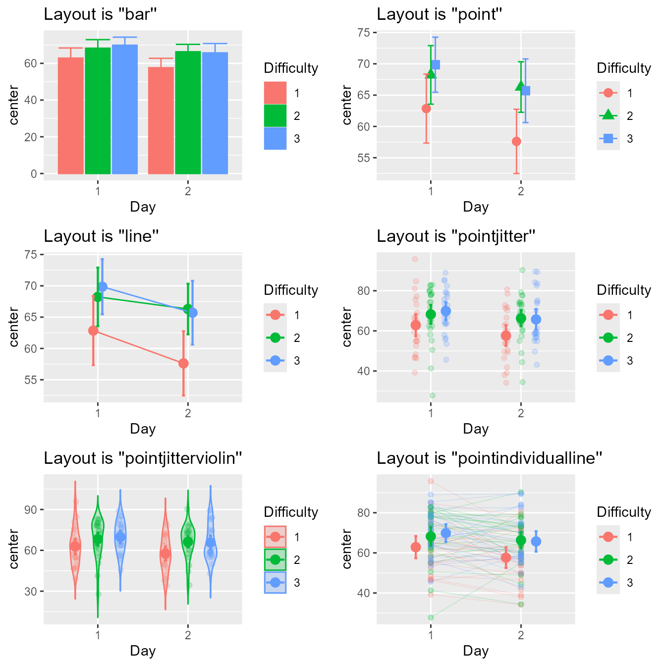
Figure 1a. Look of the six built-in layouts on the same random dataset
A cool format, a raincloud plot (Allen et al., 2021), is better seen with
coordinates flipped over:
mp(testdata, "raincloud") + coord_flip()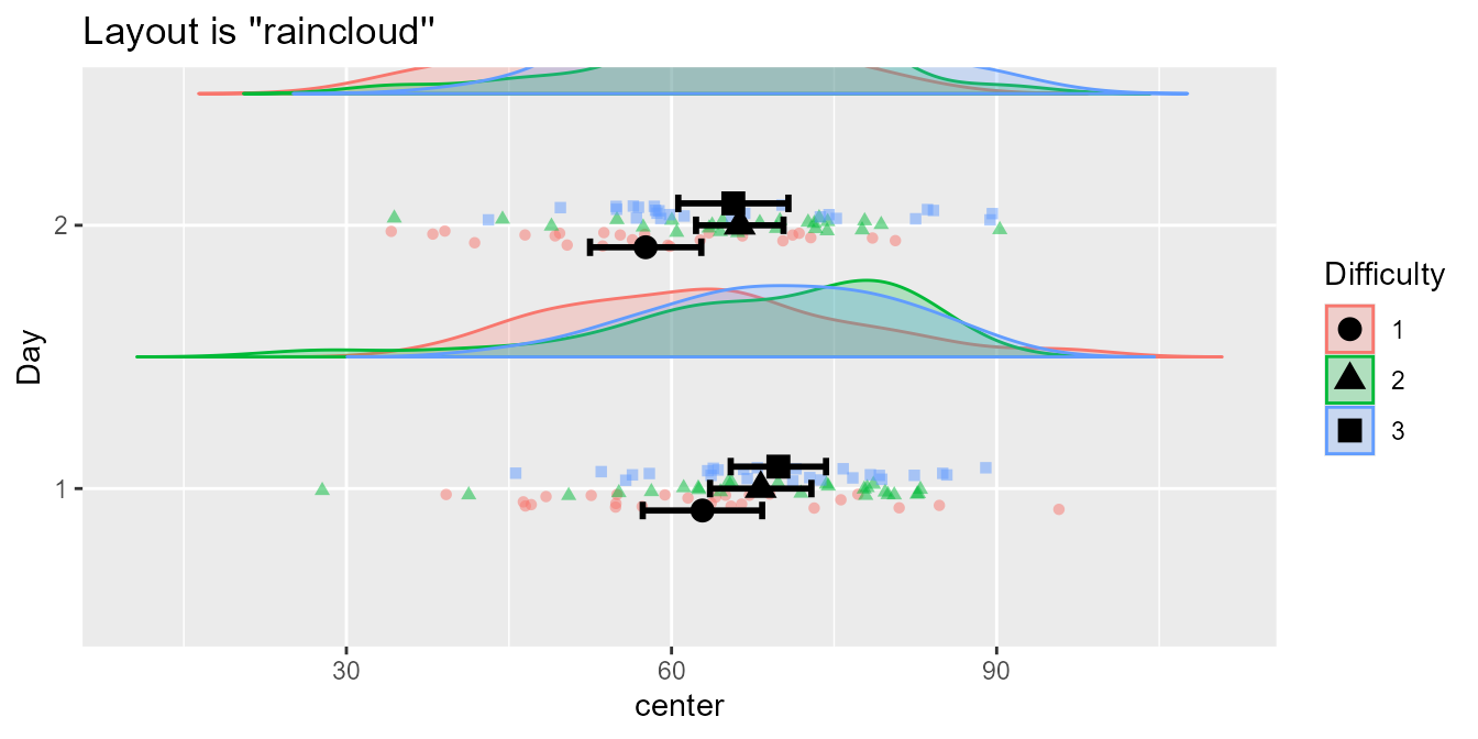
Figure 1b. The seventh layout, the raincloud
Finally, the following shows the latest layout, a box plot, better for showing median and confidence interval of the median, obtained with
mp(testdata, "boxplot", statistic = "median", pointParams = list(color="orange"))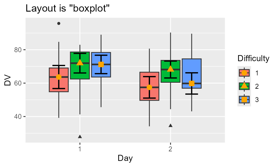
Figure 1c. Box plot of the data
For more controls, you can manually set the colors, the fills and/or the shapes, as done here in a list:
ornate = list(
    scale_colour_manual( name = "Difference",
        labels = c("Easy", "Hard", "Unthinkable"),
        values = c("blue", "black", "purple")) ,
    scale_fill_manual( name = "Difference",
        labels = c("Easy", "Hard", "Unthinkable"),
        values = c("blue", "black", "purple")) ,
    scale_shape_manual( name = "Difference",
        labels = c("Easy", "Hard", "Unthinkable") ,
        values = c(0, 10, 13)) ,
    theme_bw(base_size = 9) ,
    labs(x = "Days of test", y = "Score in points" ),
    scale_x_discrete(labels=c("1" = "Former day", "2" = "Latter day"))
)
library(gridExtra)
grid.arrange(
    p1+ornate, p2+ornate, p3+ornate,
    p4+ornate, p5+ornate, p6+ornate,
    ncol=2)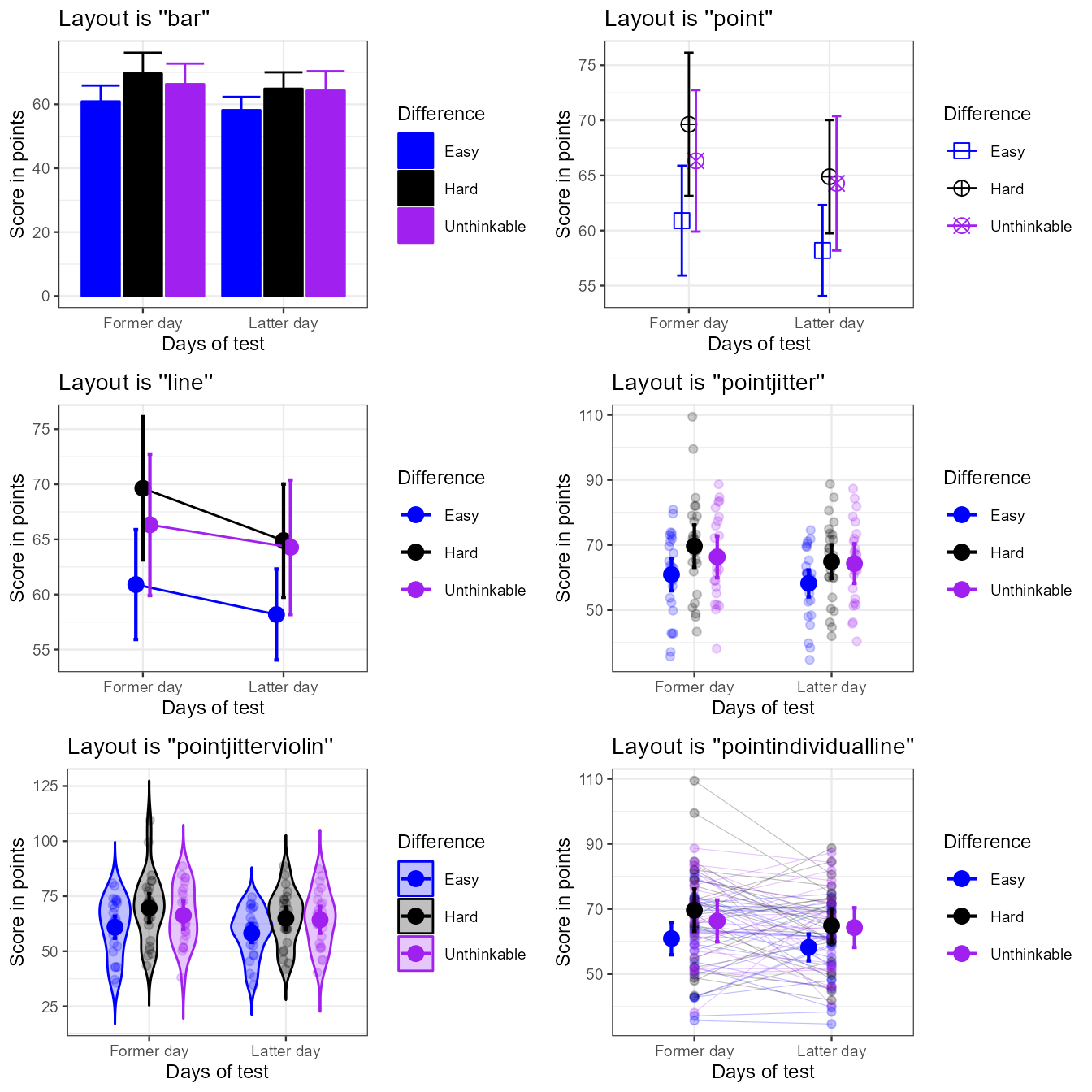
Figure 2a. The six built-in template with ornamental styling added.
These are just a few examples. However, if these layouts do not fit
yours needs, it is possible to devise a custom-made layout and inform
superbPlot to use it. To that end, see the instructions
below.
Devising a custom-made plot layout
In a nutshell, the purpose of superbPlot() is to
compile the summary information (location of the summary statistic, upper width and lower width of the interval) and that, for each level of the factors;
applies all the adjustments needed in producing the summary;
and finally, calls a plot function accepting pre-defined arguments
In devising your own plot function, it is important that (i) the
function name begins with superbPlot.; (ii) the function
accept very specific arguments with very precise names.
Here is the header for a function corresponding to a plot style
called, say, foo (plotLayout = "foo"):
superbPlot.foo <- function(
    summarydata,
    xfactor,
    groupingfactor,
    addfactors,
    rawdata
    # any optional argument you wish
) {
    plot <- ggplot() ## ggplot instructions...
    return(plot)
}
In what follow, it is assumed that one factor is placed on the
horizontal axis (xfactor), another one is used to group the
point (groupingfactor), and up to two additional factors
will results in columns and rows of panels (addfactors; of
course, in devising your own template, you may use different placement).
superbPlot() is restricted to a maximum of four
factors.
The arguments are:
summarydata: this data frame will contain the columncenterindicating the statistic’s value,lowerwidthandupperwidthindicating how many units below and abovecenterthe error bar extends. The data frame will also have columns for all the factors, and there will be as many lines as there are combinations of factors.xfactoris the factor to put on the horizontal axis;groupingfactoris the factor used to create groups of points;addfactorsare up to two additional factors to create the rows and columns of panels.addfactorsis formatted for facetting (e.g., for factors “A” and “B”,addfactorswould be “A~B”);rawdata: this data.frame contains the raw data with factors being transformedas.factorand the dependent column being renamedDV. When the data are in wide format,rawdatais reshaped to long format.{optional arguments}can be used. They must be named here; when callingsuperbPlot(), any argument whose name match your optional argument will be transmitted to your custom-made function.
The simplest example
What follow is a simple example that will design a template that we
will call simple. This layout will display the descriptive
statistics and error bars. Everything will be black and white (no color
instruction) and superimposed (no grouping instruction).
The result will be:
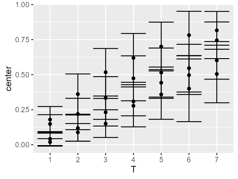
Figure 3. Mean score with 95% confidence interval using
the simple plot layout.
To make this plot, we design a function
superbPlot.simple as:
superbPlot.simple <- function(
    summarydata, xfactor, groupingfactor, addfactors, rawdata
) {
    plot <- ggplot(
        data = summarydata,
        mapping = aes( x = !!sym(xfactor), y = center, group = !!sym(groupingfactor) )
    ) +
    geom_point(  ) +
    geom_errorbar( mapping = aes(ymin = center + lowerwidth,
                                 ymax = center + upperwidth)  )+
    facet_grid( addfactors )

    return(plot)
}
The first instruction, ggplot defines the source data to
be summarydata with horizontal axis being in the string
xfactor (the piece of instructions !!sym( )
converts the string into a variable). The position of the descriptive
statistics is automatically computed and stored in a column called
center.
The second instruction put points for each center, and
the third instruction places error bars. In that case, the
ymin and ymax information are contained in
center+lowerwidth and center+upperwidth where
lowerwidth and upperwidth are automaticall
computed and stored in the summarydata dataframe.
The last instructions generates distinct panels for each level of the remaining factors.
You can check that this function is
superbPlot-compatible with:
superb:::is.superbPlot.function("superbPlot.simple")## [1] TRUEIf TRUE, then we are ready to use this layout, here with
the demo dataset TMB1964r whose result was shown above in
Figure 3:
superb(
    crange(T1,T7) ~ Condition,
    TMB1964r,
    WSFactors = "T(7)",
    plotLayout = "simple"
)
Optional arguments
The above simple layout does not accept optional
arguments. To integrate optional arguments, one method is to insert
graphic directives inside the layers, e.g., inside
geom_point.
A convenient method is with do.call and
modifyList, for example:
do.call( geom_point, modifyList(
   list( size= 3 ##etc., the default directives##
   ), myownParams
))
A full example it therefore
superbPlot.simpleWithOptions <- function(
    summarydata, xfactor, groupingfactor, addfactors, rawdata,
    myownpointParams = list(),  ## will be used to add the optional arguments to the function
    myownebParams    = list()  ## will be used to add the optional arguments to the function
) {
    plot <- ggplot(
        data = summarydata,
        mapping = aes( x = !!sym(xfactor), y = center, group=Condition)
    ) +
    do.call( geom_point, modifyList(
        list( color ="black" ),
        myownpointParams
    )) +
    do.call( geom_errorbar, modifyList(
        list( mapping = aes(ymin = center + lowerwidth,
                            ymax = center + upperwidth)  ),
        myownebParams
    )) +
    facet_grid( addfactors )

    return(plot)
}
superb:::is.superbPlot.function("superbPlot.simpleWithOptions")
## [1] TRUE
superb(
    crange(T1,T7) ~ Condition,
    TMB1964r,
    WSFactors = "T(7)",
    plotLayout = "simpleWithOptions",
    ## here goes the optional arguments
    myownpointParams = list(size=1, color="purple", position = position_dodge(width = 0.3) ),
    myownebParams = list(linewidth=1, color="purple", position = position_dodge(width = 0.3) )
)
In that example, the same parameters are sent to
geom_point and to geom_errorbar. It is left as
an exercice to the reader to use two distinct sets of optional
parameters, one for the points, the other for the error bars.
Getting feedback information
It is sometimes useful to extract variables out of the function when
debugging the code. A useful function is to use runDebug().
This function (shipped with suberb) will display text and
transfer any variables you want into the global environment.
options(superb.feedback = 'all')
runDebug( 'where are we?', "Text to show when we get there",
  c("variable1", "variable2", "etc"),
  list( "var1InTheFct", "var2InTheFct", "varetcInTheFct")
)
## ==> Text to show when we get there <==
## variables dumped in: variable1, variable2, etcFor example, the following will get the dataframes:
superbPlot.empty <- function(
    summarydata, xfactor, groupingfactor, addfactors, rawdata
) {
    runDebug( 'inempty', "Dumping the two dataframes",
        c("summary","raw"), list(summarydata, rawdata))

    plot <- ggplot() # an empty plot
    return(plot)
}
options(superb.feedback = 'inempty')  ## turn on feedback when reaching 'inempty'
superb(
    crange(T1,T7) ~ Condition,
    TMB1964r,
    WSFactors = "T(7)",
    plotLayout = "empty"
)
## ==> Dumping the two dataframes <==
## variables dumped in: summary, rawYou see Dumping the two dataframes followed by
summary and raw. These two variables are now
in the global environment and you can manipulate them. You can also use
them in testing your plotting functions, for example
superbPlot.simple(summary, "T", "Condition", ".~.", raw)An example
In what follow, we create a toy example where the raw data will be shown with smileys. Note that this example may not work in Rstudio (see “limitation” on emojifont page )
We first need the emojifont library
Then we define a "smiley" layout where the emojis are
shown with geom_text layer:
superbPlot.smiley <- function( summarydata, xfactor, groupingfactor, addfactors, rawdata ) {
    # the early part bears on summary data with variable "center"
    plot <- ggplot(
        data    = summarydata,
        mapping = aes(
            x      = !!sym(xfactor),
            y      = center,
            fill   = !!sym(groupingfactor),
            shape  = !!sym(groupingfactor),
            colour = !!sym(groupingfactor) )
    ) +
    geom_point(position = position_dodge(width = .95)) +
    geom_errorbar( width = .6, position = position_dodge(.95),
              mapping = aes(ymin = center + lowerwidth, ymax = center + upperwidth)
    )+
    # this part bears on the rawdata only with variable "DV"
    geom_text(data = rawdata,
              position = position_jitter(0.5),
              family   = "EmojiOne",
              label    = emoji("smile"),
              size     = 6,
              mapping  = aes(x = !!sym(xfactor), y = DV, group = !!sym(groupingfactor) )
    ) +
    facet_grid( addfactors )

    return(plot)
}
We check that it is a superbPlot-compatible
function:
superb:::is.superbPlot.function("superbPlot.smiley")## [1] TRUEIt is all we need! This layout can be inserted in a
superbPlot call:
superb(
    crange(T1,T7) ~ Condition,
    TMB1964r,
    WSFactors = "T(7)",
    plotLayout = "smiley"
)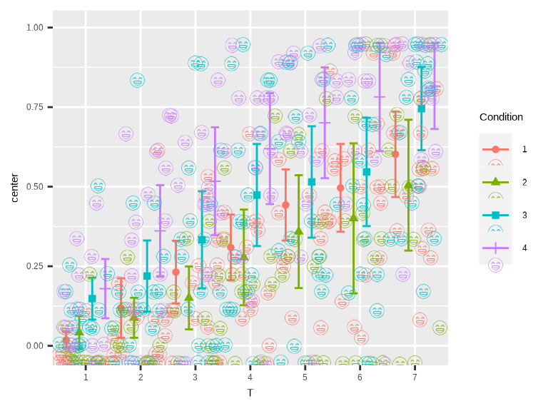
Figure 5. smile!