superbPlot point and individual-line layout for within-subject design
Source:R/functionsPlotting_moderate.R
superbPlot.pointindividualline.RdsuperbPlot comes with a few built-in templates for making the final plots. All produces ggplot objects that can be further customized. Additionally, it is possible to add custom-make templates (see vignette 6). The functions, to be "superbPlot-compatible", must have these parameters:
Arguments
- summarydata
a data.frame with columns "center", "lowerwidth" and "upperwidth" for each level of the factors;
- xfactor
a string with the name of the column where the factor going on the horizontal axis is given;
- groupingfactor
a string with the name of the column for which the data will be grouped on the plot;
- addfactors
a string with up to two additional factors to make the rows and columns panels, in the form "fact1 ~ fact2";
- rawdata
always contains "DV" for each participants and each level of the factors
- datapointParams
(optional) list of graphic directives that are sent to the geom_point layer of the individual lines
- pointParams
(optional) list of graphic directives that are sent to the geom_point layer
- lineParams
(optional) list of graphic directives that are sent to the geom_line layer; the parameter
colorizecan be used to obtain distinct colors for decreasing segments of line (colorize = "bySlope"), to obtain distinct colors for each participants (colorize = "byId"), or to have them all gray (default withcolorize = "none").- errorbarParams
(optional) list of graphic directives that are sent to the geom_superberrorbar layer
- facetParams
(optional) list of graphic directives that are sent to the facet_grid layer
Value
a ggplot object
Examples
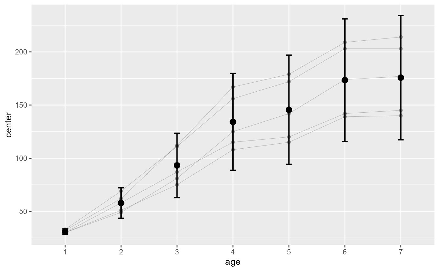
# This will make a plot with points and individual lines for each subject's scores

# we take the Orange built-in data.frame but shorten the names...
names(Orange) <- c("Tree","age","circ")
# Makes the plot:
 superb( circ ~ age | Tree,
   Orange,
   adjustments = list(purpose = "difference", decorrelation = "none"),
   plotLayout= "pointindividualline"
 )


# if you extract the data, you can
# run this layout directly
#processedData <- superb( circ ~ age | Tree,
#  Orange,
#  adjustments = list(purpose = "difference", decorrelation = "none"),
#)
#
#superbPlot.pointindividualline(processedData$summaryStatistic,
#   "age",
#   NULL,
#   ".~.",
#   processedData$rawData)
# if you extract the data, you can
# run this layout directly
#processedData <- superb( circ ~ age | Tree,
# Orange,
# adjustments = list(purpose = "difference", decorrelation = "none"),
#)
#
#superbPlot.pointindividualline(processedData$summaryStatistic,
# "age",
# NULL,
# ".~.",
# processedData$rawData)