Most studies examine the effect of a certain factor on a measure. However, very rarely do we have hypotheses stating what would be the expected result. Instead, we have a control group to which the results of the treatment group will be compared (Cousineau, 2017).
A paradoxical example
Imagine a study in a school examining the impact of playing collaborative games before beginning the classes. This study most likely will have two groups, one where the students are playing collaborative games and one where the students will have non- structured activities prior to classes. The objective of the study is to compare the two groups.
Consider the results obtained. The measurement instrument tends to return scores near 100.
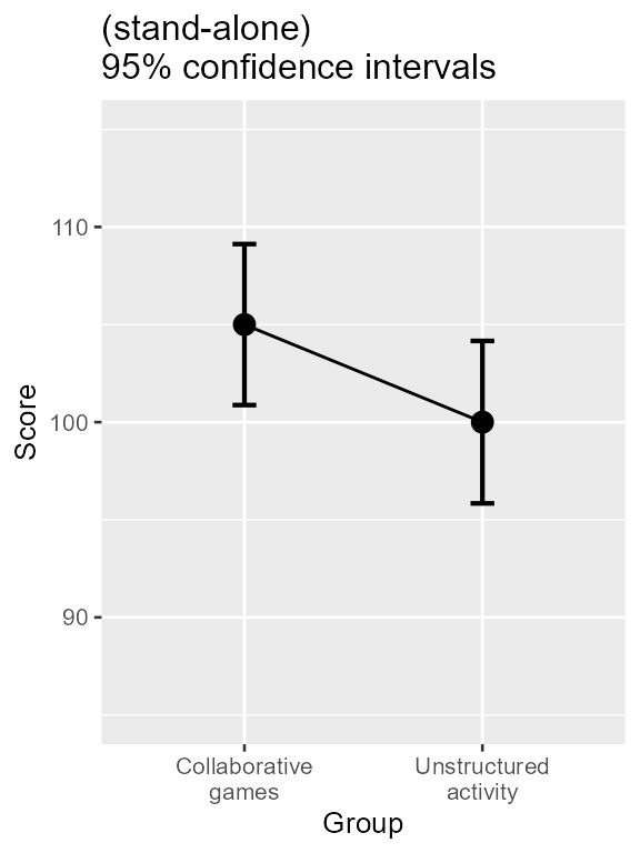
Figure 1. Mean scores along with 95% confidence interval for two groups of students on the quality of learning behavior.
As seen, there seems to be a better score for students playing collaborative games. Taking into account the confidence interval, the manipulation seems to improve significantly the learning behavior as the lower end of the Collaborative games interval is above the Unstructured activity mean (and vice versa).
What a surprise to discover that a t test will NOT confirm this impression (t(48) = 1.76, p = .085):
t.test(dataFigure1$score[dataFigure1$grp==1],
        dataFigure1$score[dataFigure1$grp==2],
        var.equal=T)
##
## Two Sample t-test
##
## data: dataFigure1$score[dataFigure1$grp == 1] and dataFigure1$score[dataFigure1$grp == 2]
## t = 1.7612, df = 48, p-value = 0.08458
## alternative hypothesis: true difference in means is not equal to 0
## 95 percent confidence interval:
## -0.7082201 10.7082201
## sample estimates:
## mean of x mean of y
## 105 100The origin of the paradox
The reason is that the confidence intervals used are “stand-alone”: They can be used to examine, say, the first group to the value 100. As this value is outside the interval, we are correct in concluding that the first group’s mean is significantly different from 100 (with level of .05) from 100, as confirmed by a single-group t test:
t.test(dataFigure1$score[dataFigure1$grp==1], mu=100)##
## One Sample t-test
##
## data: dataFigure1$score[dataFigure1$grp == 1]
## t = 2.5021, df = 24, p-value = 0.01956
## alternative hypothesis: true mean is not equal to 100
## 95 percent confidence interval:
## 100.8756 109.1244
## sample estimates:
## mean of x
## 105Likewise, the second group’ mean is significantly different from 105 (which happens to be the first group’s mean):
t.test(dataFigure1$score[dataFigure1$grp==2], mu=105)##
## One Sample t-test
##
## data: dataFigure1$score[dataFigure1$grp == 2]
## t = -2.4794, df = 24, p-value = 0.02057
## alternative hypothesis: true mean is not equal to 105
## 95 percent confidence interval:
## 95.83795 104.16205
## sample estimates:
## mean of x
## 100This is precisely the purpose of stand-alone confidence intervals: to compare a single result to a fix value. The fix value (here 100 for the first group and 105 for the second group) has no uncertainty, it is a constant.
In contrast, the two-group t test compares two means, the two of which are uncertain. Therefore, in making a confidence interval, it is necessary that the basic, stand-alone, confidence interval be informed that it is going to be compared —not to a fix value— to a second quantity which is itself uncertain.
Using the language of analyse of variances, we can say that when the purpose of the plot is to compare means to other means, there is more variances in the comparisons than there is in single groups in isolation.
Adjusting the error bars
Assuming that the variances are roughly homogeneous between group (an assumption made by the t test, but see below), there is a simple adjustment that can be brought to the error bars: just increase their length by . As it means increasing their length by 41%.
With superbPlot, this so-called difference
adjustment (Baguley, 2012) is
obtained easily by adding an adjustment to the list of adjustments with
adjustments = list(purpose = "difference"), as seen
below.
superb(
    score ~ grp,
    dataFigure1,
    adjustments= list(purpose = "difference"),  # the only new thing here
    plotLayout = "line" ) +
xlab("Group") + ylab("Score") +
labs(title="Difference-adjusted\n95% confidence intervals") +
coord_cartesian( ylim = c(85,115) ) +
theme_gray(base_size=10) +
scale_x_discrete(labels=c("1" = "Collaborative\ngames", "2" = "Unstructured\nactivity"))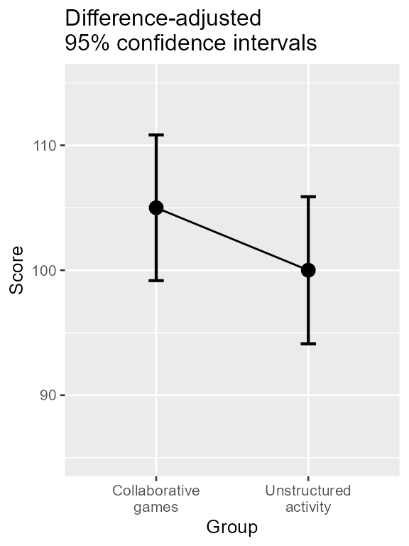
Figure 2. Mean scores along with difference-adjusted 95% confidence interval for two groups of students on the quality of learning behavior.
This is where the usefulness of superb is apparent: it
only required an option to mutate the plot from a plot showing means
with stand-alone confidence intervals to a plot showing means with
difference-adjusted confidence intervals (Cousineau, Goulet, & Harding, 2021).
Illustrating the impact of the adjustments
Just for comparison purposes, let’s show both plots side-by-side.
library(gridExtra)
plt1 <- superb(
    score ~ grp,
    dataFigure1,
    plotLayout = "line" ) +
xlab("Group") + ylab("Score") +
labs(title="(stand-alone)\n95% confidence intervals") +
coord_cartesian( ylim = c(85,115) ) +
theme_gray(base_size=10) +
scale_x_discrete(labels=c("1" = "Collaborative\ngames", "2" = "Unstructured\nactivity"))

plt2 <- superb(
    score ~ grp,
    dataFigure1,
    adjustments= list(purpose = "difference"),
    plotLayout = "line" ) +
xlab("Group") + ylab("Score") +
labs(title="Difference-adjusted\n95% confidence intervals") +
coord_cartesian( ylim = c(85,115) ) +
theme_gray(base_size=10) +
scale_x_discrete(labels=c("1" = "Collaborative\ngames", "2" = "Unstructured\nactivity"))

plt <- grid.arrange(plt1, plt2, ncol=2)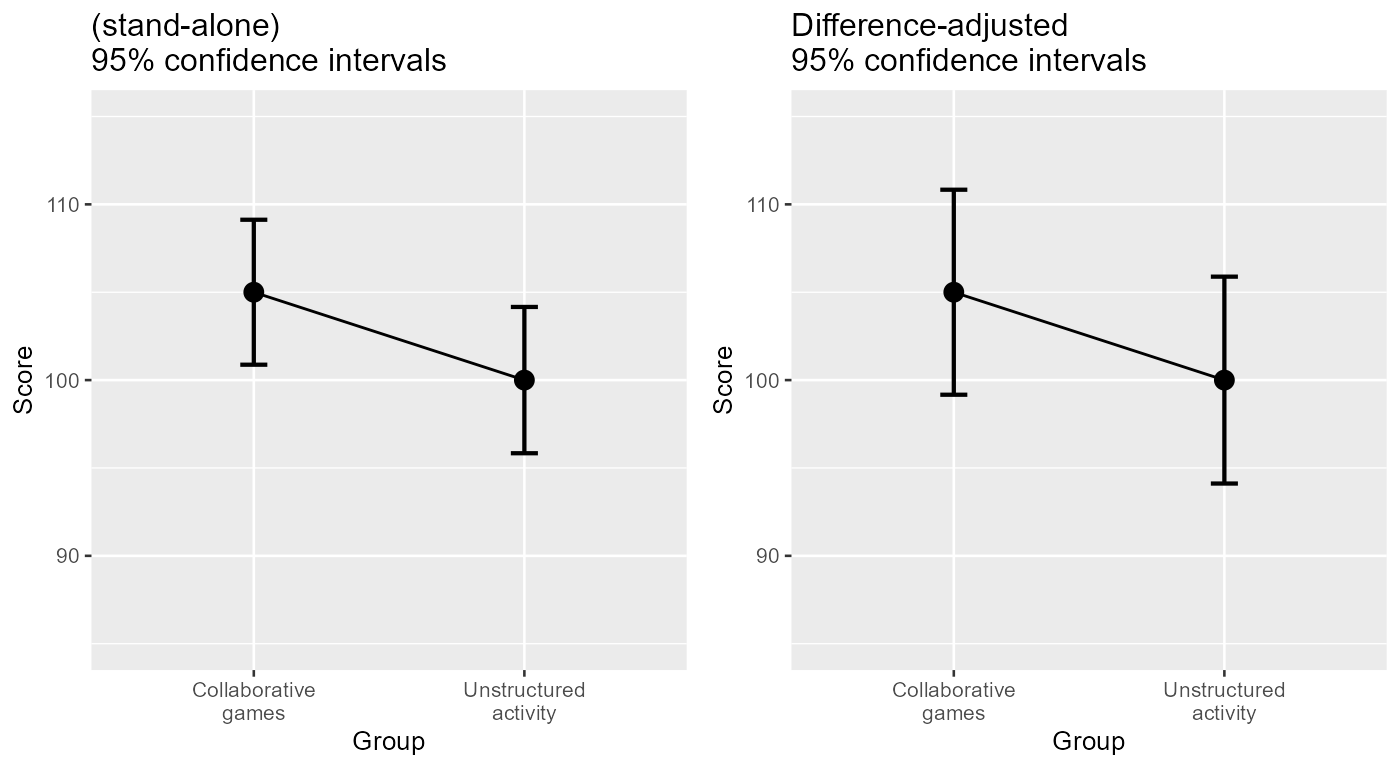
Figure 3. Two representation of the data with unadjusted (left) and adjusted (right) 95% confidence intervals
A second way to compare the two plots is to superimpose them, as in Figure 4:
# generate the two plots, nudging the error bars, using distinct colors, and
# having the second plot's background transparent (with ``makeTransparent()`` )
plt1 <- superb(
    score ~ grp,
    dataFigure1,
    errorbarParams = list(color="blue",position = position_nudge(-0.05) ),
    plotLayout = "line" ) +
xlab("Group") + ylab("Score") +
labs(title="(red) Difference-adjusted 95% confidence intervals\n(blue) (stand-alone) 95% confidence intervals") +
coord_cartesian( ylim = c(85,115) ) +
theme_gray(base_size=10) +
scale_x_discrete(labels=c("1" = "Collaborative\ngames", "2" = "Unstructured\nactivity"))


plt2 <- superb(
    score ~ grp,
    dataFigure1,
    adjustments=list(purpose = "difference"),
    errorbarParams = list(color="red",position = position_nudge(0.05) ),
    plotLayout = "line" ) +
xlab("Group") + ylab("Score") +
labs(title="(red) Difference-adjusted 95% confidence intervals\n(blue) (stand-alone) 95% confidence intervals") +
coord_cartesian( ylim = c(85,115) ) +
theme_gray(base_size=10) +
scale_x_discrete(labels=c("1" = "Collaborative\ngames", "2" = "Unstructured\nactivity"))

# transform the ggplots into "grob" so that they can be manipulated
plt1g <- ggplotGrob(plt1)
plt2g <- ggplotGrob(plt2 + makeTransparent() )

# put the two grob onto an empty ggplot (as the positions are the same, they will be overlayed)
ggplot() +
    annotation_custom(grob=plt1g) +
    annotation_custom(grob=plt2g)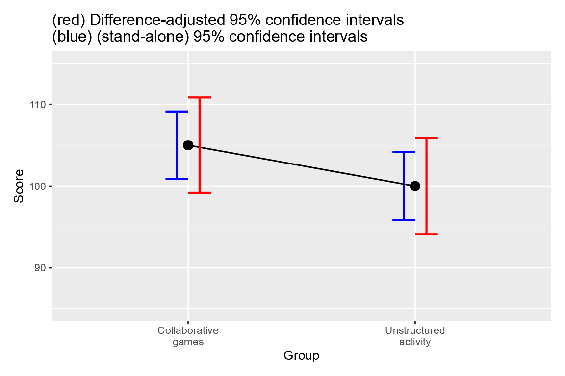
Figure 4. Two representations of the results with adjusted and unadjusted error bars on the same plot
As seen, the difference-adjusted error bars are wider.
This is to be expected: their purposes (comparing two means) introduces
more variability, and variability always reduces precision.
Two options
There are two methods to adjust for the purpose of the error bars:
"difference": This method is the simplest. It increases the error bars by a factor of on the premise that the variances are homogeneous"tryon": This method, proposed in Tryon (2001), is used when the variances are inhomogeneous. It replaces the correction factor by a factor based on the heterogeneity of the variances. In the case where the error bars are roughly homogeneous, there is no visible difference with"difference". See Vignette 7 for more
The option "single" is used if the purpose is obtain
“stand-alone” error bars or error bars that are to be compared to an
a priori determine value. Such error bars are inapt to perform
pair-wise comparisons.
In conclusion
Adjusting the confidence intervals is important to have coherence between the test and the figure. If you are to claim that there is no difference but show Figure 1, an examinator (you know, a reviewer) may raise a red flag and cast doubt on your conclusions (opening the door to many rounds of reviews or rejection if this is a submitted work).
Having coherence between the figures and the tests reported in your document is one way to improve the clarity of your work. Coherence here comes cheap: You just need to add in the figure caption “Difference-adjusted” before “95% confidence intervals”.