The decorrelation of the measures in repeated-measure designs is
meant to have error bars that are integrating the added power of using
repeated-measures over independent groups. In design with a few
measurements, the correlation between the pairs of measurements is
indicative of the gain in statistical power. However, in time series,
correlation is likely to vanish as measurements get further spaced in
time (the lag effect).
For example, consider a longitudinal study of adolescents over 10 years. The measurements that are 6-month apart may show some correlations, but the two most separated measurements (say the first at 8 years old and the second at 18 years old) are much less likely to preserve their correlations.
This vignette propose a solution. It is detailed in Cousineau, Proulx, Potvin-Pilon, & Fiset (2024).
The structure of correlations
When repeated measures are obtained, one may compute the correlation matrix. The correlation matrix is always composed of 1s along the main diagonal, as the correlation of a variable with itself is always 1. What is more interesting is what happen off the main diagonal.
In some situations, the correlations are fairly constant
(stationary). When the variance are further homogeneous, this
correlation structure is known as compound symmetry.
Compound symmetry is the simplest situation and also the easiest to
analyze (with e.g., ANOVAs, alghough ANOVA really requires
sphericity, a slightly different correlation
structure).
In other situations, we might see that correlations near the main
diagnonal are strong, but as we distance from the diagonal (either in
the upper-right or lower-left directions), the correlations slowly
vanishes, possibly reaching near-null values. This structure is known as
an autoregressive covariance structure of the first order
or AR(1). In time series, that would indicate that the correlation of a
measurement with the measurement just before or just after is high, but
that the correlation between a measurement and a distant measurement is
weak.
Implications for precision
Vanishing correlations means that comparing distant points in time will be performed with weaker statistical precision and comparisons of close-by measures will benefit from much correlation (correlation is your friend when it comes to statistical inference).
In plotting curves, our objective may be to see how the points evolves, which imply that we are making multiple comparisons of close-by points. If so, our visual tools should be based on the correlation (presumably high) between these nearby points. If our objective is instead to compare far-distance points, the visual tools should incorporate the correlations of these distant points (presumably weak).
How is correlation assessed then?
There are a few techniques to estimate the correlation in a correlation matrix. When it is assumed compound symmetric, the average of the pairwise correlations is satisfactory. When it is AR(1) however, the average won’t do as the correlation is varying based on the lag.
We argue that a fit technique is to average the correlations using
weights that are reducing with distance (excluding the main diagonal
whose weight is set to 0). Any kernel (for example a gaussian kernel)
can be used to that end, as long as the width is kept smaller than the
number of variables. We implemtented this technique in
superb.
Illustration with fMRI data
Waskom, Frank, & Wagner (2017) examined the finite impulse response obtained from an fMRI for two sites (frontal and parietal) and two event conditions (a cue-only condition and a cue+stimulus condition). The responses are obtained over 19 time points (labeled 0 to 18) in these four conditions, resulting in 76 measurements. There are 14 participants.
We first fetch the data from the main author’s GitHub repository:
fmri <- read.csv(url("https://raw.githubusercontent.com/mwaskom/seaborn-data/de49440879bea4d563ccefe671fd7584cba08983/fmri.csv"))We are ready to make plots!
A plot without decorrelation
The first plot is done without adjustments. By default, it shows the standalone 95% confidence interval. The formula uses the long data format but specifies that the observations are nested with subject numbers:
superb(
    signal ~ timepoint + region + event | subject,
    fmri,
    plotLayout = "lineBand",
    pointParams = list(size=1,color="black"),
    lineParams = list(color="purple")
) + scale_x_discrete(name="Time", labels = 0:18) +
scale_discrete_manual(aesthetic =c("fill","colour"),
                      labels = c("frontal","parietal"),
                      values = c("red","green")) +
theme_bw() + ylim(-0.15, +0.35) 
Figure 1. Plot of the fMRI data with standalone confidence intervals.
The scale_x_discrete is done to rename the ticks from 0
to 18 (they would start at 1 otherwise). The
scale_discrete_manual changes the color of the band (I hope
you are color-blind, colors is not my thing). The
plotLayout = "lineBand" displays the confidence intervals
as a band rather than as error bars.
Plots with decorrelation
The decorrelation technique was first proposed by Loftus & Masson (1994). Alternatives
approaches were developped in Cousineau
(2005) with Morey (2008; also see
Cousineau, 2019). They are known in superbPlot() as
"LM" and "CM" respectively.
If you add this adjustment with this command, you get the following plot:
superb(
    signal ~ timepoint + region + event | subject,
    fmri,
    adjustments = list(decorrelation = "CM"), ## only new line
    plotLayout = "lineBand",
    pointParams = list(size=1,color="black"),
    lineParams = list(color="purple")
) + scale_x_discrete(name="Time", labels = 0:19) +
scale_discrete_manual(aesthetic =c("fill","colour"),
                      labels = c("frontal","parietal"),
                      values = c("red","green"))+
theme_bw() + ylim(-0.15, +0.35) +
showSignificance(c(6,7)+1, 0.305, -0.02, "n.s.?", panel=list(event=2))
## superb::FYI: The HyunhFeldtEpsilon measure of sphericity per group are 0.052## superb::FYI: All the groups' data are compound symmetric. Consider using CA or UA.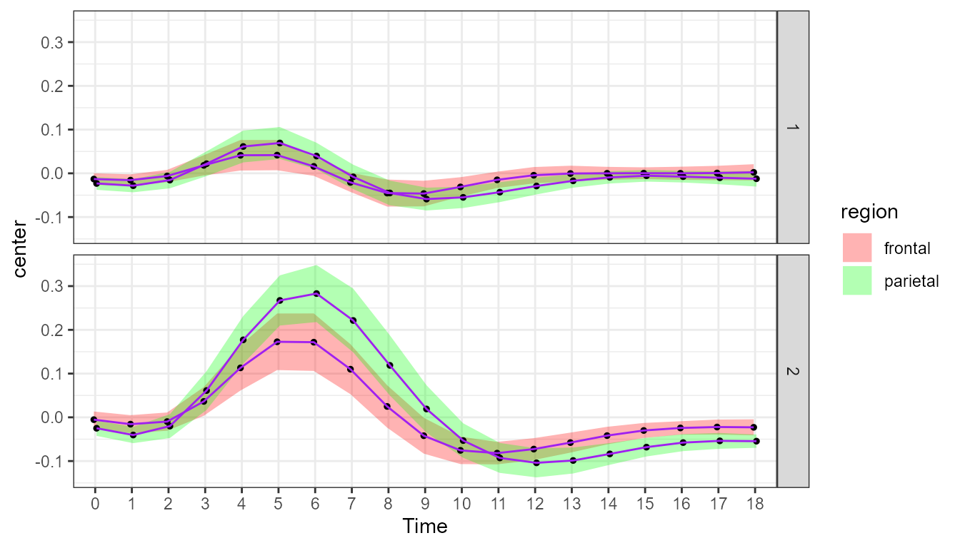
Figure 2. Plot of the fMRI data with Cousineau-Morey decorrelation.
As you may see, this plot and the previous one are nearly identical! This is because the average correlation involving close-by and far-distant points is very weak (close to zero; replace CM with CA and a message will return the average correlation in addition to a plot).
Because fMRI points are separated by time, close-by points ought to show some correlation. This is where local decorrelation may be useful.
We repeat the above command, but this time ask for a local average of
the correlation. We need to specify the radius of the kernel, which we
do by adding an integer after the letters “LD”. Here, we show the
results with a narrow kernel, weighting far more adjacent points than
points 3 time points appart, obtained with "LD2":
superb(
    signal ~ timepoint + region + event | subject,
    fmri,
    adjustments = list(decorrelation = "LD2"),  ## CM replaced with LD2
    plotLayout = "lineBand",
    pointParams = list(size=1,color="black"),
    lineParams = list(color="purple")
) + scale_x_discrete(name="Time", labels = 0:19) +
scale_discrete_manual(aesthetic =c("fill","colour"),
                      labels = c("frontal","parietal"),
                      values = c("red","green"))+
theme_bw() + ylim(-0.15, +0.35) +
showSignificance(c(6,7)+1, 0.305, -0.02, "**!", panel=list(event=2))
## superb::FYI: The average correlation per group is 0.3653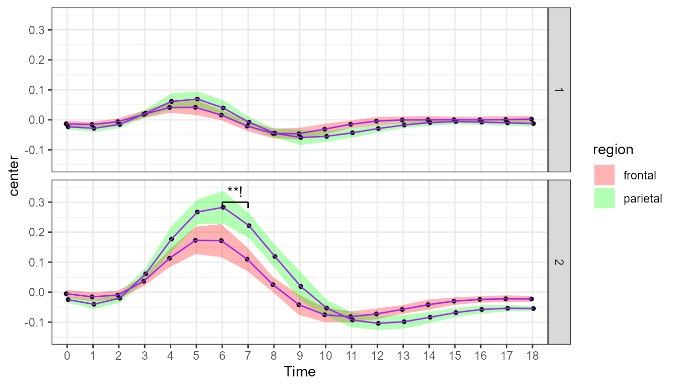
Figure 3. Plot of the fMRI data with local decorrelation.
As seen from the message, the correlations in nearby time points is about .40. It explains why the precision of the measures improved notably (seen with confidence intervals that are much narrower). You can pick any two nearby points and run a paired t-test, the chances are high that you get a significant result.
As an example, consider the green curve, in condition cue+stimuli (i.e., bottom panel), for time points 6 and 7. The confidence band suggest that these two points differ when you examine the locally-decorrelated confidence intervals, but not when you examine the previous two plots. Which is true? Let’s run a t-test on paired sample.
# First, extract the two sets of data, ordered by subject identifier:
d1 <- dplyr::filter(fmri, event=="stim" & region=="parietal" & timepoint==6)
d1 <- d1[order(d1$subject),]
d2 <- dplyr::filter(fmri, event=="stim" & region=="parietal" & timepoint==7)
d2 <- d2[order(d2$subject),]

# Second, run a paired t-test
t.test(d1$signal, d2$signal, paired=TRUE)
##
## Paired t-test
##
## data: d1$signal and d2$signal
## t = 3.8818, df = 13, p-value = 0.00189
## alternative hypothesis: true mean difference is not equal to 0
## 95 percent confidence interval:
## 0.02729823 0.09581713
## sample estimates:
## mean difference
## 0.06155768The radius parameter
You can vary the radius from 1 and above. The larger the radius, the smallest will be the benefit of correlation in the assessment of precision. In the extreme, if you use a very large radius (e.g., “LD10000”), you will get the exact same average correlation as with “CA” as now all the correlations are weighted almost identically.
Note that in the above computations, I reduced the number of messages
displayed by superb() using
options("superb.feedback" = "warnings" ).
Difference adjustments
In all three figures, we did not use the difference adjustment. Recall that this adjustment is needed when the objective of the error bars (or error bands) is to perform comparisons between pairs of conditions.
In the present example, the reader is very likely to perform
comparisons between curves so that the difference adjustment is very
much needed. Simply add purpose = "difference" in the
adjustments list of the three examples above. You will see
that of the three plots above, only the locally-decorrelated one
suggests significant differences between the bottom curves on some time
points, which is indeed what format tests indicate.
In summary
Local decorrelation is a tool adapted to time series where nearby measurements are expected to show greater correlations than measurements separated by large amount of time. This is applicable among other to time series, longitudinal studies, fMRI studies (as the example above) and EEG studies (as the application described in Cousineau et al. (2024)).