Using a custom statistic with its error bar
within superb
Source: vignettes/Vignette4.Rmd
Vignette4.RmdBy default, superbPlot generates mean plots along with
95% confidence intervals of the mean. However, these choices can be
changed.
To change the summary statistics, use the argument
statistic =;To change the interval function, use the argument
errorbar =. The abbreviationCIstands for confidence interval;SEstands for standard error.With
CI, to change the confidence level, use the argumentgamma =;
The defaults are
statistic = "mean", errorbar = "CI", gamma = 0.95. For
error bar functions that accept a gamma parameter (e.g.,
CI, the gamma parameter is automatically transfered to the
function). For other functions that do not accept a gamma parameter
(e.g., SE), the gamma parameter is unused.
Changing the summary function to be plotted
In what follow, we use GRD() to generate a random
dataset with an interaction (see Vignette
6) then make plots varying the statistics displayed.
# shut down 'warnings', 'design' and 'summary' messages
options(superb.feedback = 'none')

# Generate a random dataset from a (3 x 2) design, entirely within subject.
# The sample size is very small (n=5) and the correlation between scores is high (rho = .8)
dta <- GRD(
    WSFactors  = "Moment(3): Dose(2)",
    Effects    = list("Dose*Moment"=custom(0,0,0,1,1,3)),
    SubjectsPerGroup = 50,
    Population = list( mean=10, stddev = 5, rho = .80)
)

# a quick function to call superbPlot
makeplot <- function(statfct, errorbarfct, gam, rg, subttl) {
    superb(
        crange(DV.1.1,DV.3.2) ~ .,
        dta,
        WSFactors  = c("Moment(3)","Dose(2)"),
        statistic  = statfct,
        errorbar   = errorbarfct,
        gamma      = gam,
        plotLayout = "line",
        adjustments = list(purpose="difference", decorrelation="CM")
    ) + ylab(subttl) + coord_cartesian( ylim = rg )
}

p1 <- makeplot("mean",      "CI", .95, c(6,14), "Mean +- 95% CI of the mean")
p2 <- makeplot("mean",      "SE", .00, c(6,14), "Mean +- SE of the mean")
p3 <- makeplot("median",    "CI", .95, c(6,14), "Median +- 95% CI of the median")
p4 <- makeplot("fisherskew","CI", .95, c(-2,+2), "Fisher skew +- 95% CI")

library(gridExtra)
p <- grid.arrange(p1,p2,p3,p4, ncol=2)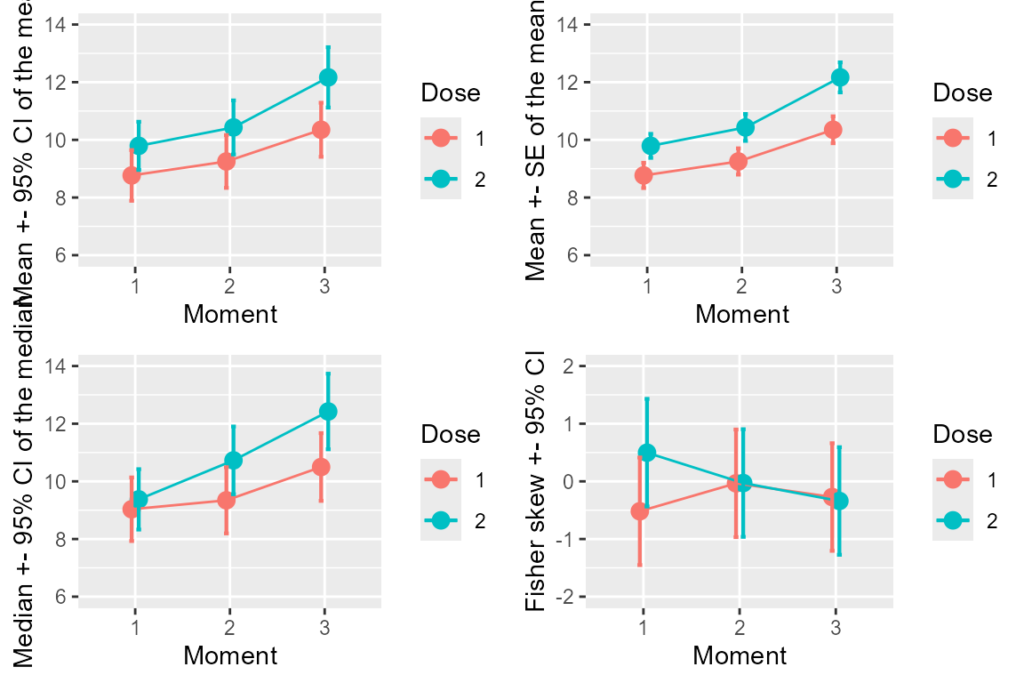
Figure 1. Various statistics and various measures of precisions
Determining that a summary function is valid to use in superbPlot
Any summary function can be accepted by superbPlot, as
long as it is given within double-quote. The built-in statistics
functions such as mean and median can be
given. Actually, any descriptive statistics, not just central tendency,
can be provided. That includes IQR, mad, etc.
To be valid, the function must return a number when given a vector of
numbers.
In doubt, you can test if the function is valid for
superbPlot with (note the triple colon):
superb:::is.stat.function("mean")## [1] TRUELikewise, any error bar function can be accepted by
superbPlot. These functions must be named with two part,
separated with a dot
"interval function"."descriptive statistic". For example,
the function CI.mean is the confidence interval of the
mean. Other functions are SE.mean, SE.median,
CI.fisherskew, etc. The superb library
provides some 20+ such functions. Harding,
Tremblay, & Cousineau (2014) and Harding, Tremblay, & Cousineau (2015)
reviewed some of these functions.
The error bar functions can be of three types:
a function that returns a width. Standard error functions are example of this type of function. With width function, the error bar extend plus and minus that width around the descriptive statistics.
an interval function. Such functions returns the actual lower and upper limits of the interval and therefore are used as is to draw the bar (i.e., they are not relative to the descriptive statistics). Confidence interval functions are of this type.
"none". This keyword produces an error bar of null width.
The interval function can be tested to see if it exists:
superb:::is.errorbar.function("SE.mean")## [1] TRUETo see if a gamma is required for a certain interval function, you can try
superb:::is.gamma.required("SE.mean")## [1] FALSECreating a custom-made descriptive statistic function to be used in superbPlot
As an example, we create from scratch a descriptive statistic
function that will be fed to superbPlot. Following Wilcox (2011) , we implement the 20% trimmed
mean. This descriptive statistic is used to estimate the population
mean. However, it is said to be a robust statistic as it is less
affected by suspicious data. Herein, we use the data from
dataFigure1.
    # create a descriptive statistics, the 20% trimmed mean
    trimmedmean    <- function(x) mean(x, trim = 0.2)

    # we can test it with the data from group 1...
    grp1 <- dataFigure1$score[dataFigure1$grp==1]
    grp2 <- dataFigure1$score[dataFigure1$grp==2]
    trimmedmean(grp1)
## [1] 106.2667
    # or check that it is a valid statistic function
    superb:::is.stat.function("trimmedmean")
## [1] TRUEOnce we have the function, we can ask for a plot of this function with
superb(
    score ~ grp,
    dataFigure1,
    statistic = "trimmedmean", errorbar = "none", #HERE the statistic name is given
    plotLayout = "line",
    adjustments = list(purpose = "difference"),
    errorbarParams = list(width=0) # so that the null-width error bar is invisible
)+ ylab("20% trimmed mean") +
theme_gray(base_size=10) +
labs(title="20% trimmed mean with \nno error bars") +
coord_cartesian( ylim = c(85,115) ) 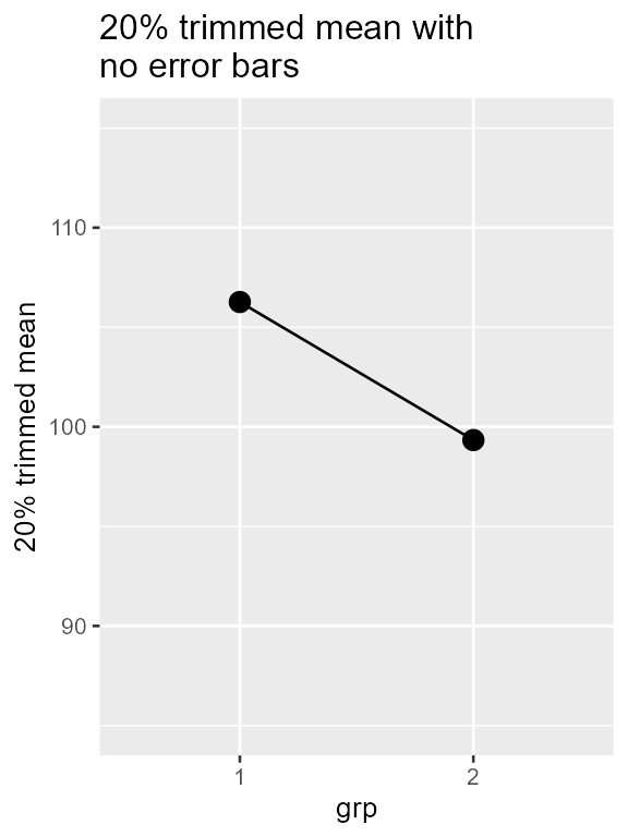
Figure 2. superbPlot with a custom-made
descriptive statistic function
Creating a custom-made interval function to be used in
superbPlot
It is also possible to create custom-made confidence interval functions.
Hereafter, we add a confidence interval for the 20% trimmed mean. We
use the approach documented in Wilcox (Wilcox,
2011) which requires computing the winsorized standard deviation
winsor.sd as available in the psych library
(Revelle, 2020).
library(psych)      # for winsor.sd

CI.trimmedmean <- function(x, gamma = 0.95){
    trim <- 0.2
    g    <- floor(length(x) * 0.4)
    tc   <- qt(1/2+gamma/2, df=(length(x)-g-1) )
    lo   <- tc * winsor.sd(x, trim =0.2) / ((1-2*trim)*sqrt(length(x)))
    c(trimmedmean(x) -lo, trimmedmean(x)+lo)
}

# we test as an example the data from group 1
CI.trimmedmean(grp1)
## [1] 101.7281 110.8052
# or check that it is a valid interval function
superb:::is.errorbar.function("CI.trimmedmean")
## [1] TRUEWe have all we need to make a plot with error bars!
superb(
    score ~ grp,
    dataFigure1,
    statistic = "trimmedmean", errorbar = "CI",
    plotLayout = "line",
    adjustments = list(purpose = "difference"),
)+ ylab("20% trimmed mean") +
theme_gray(base_size=10) +
labs(title="20% trimmed mean with \n95% confidence interval of 20% trimmed mean") +
coord_cartesian( ylim = c(85,115) ) 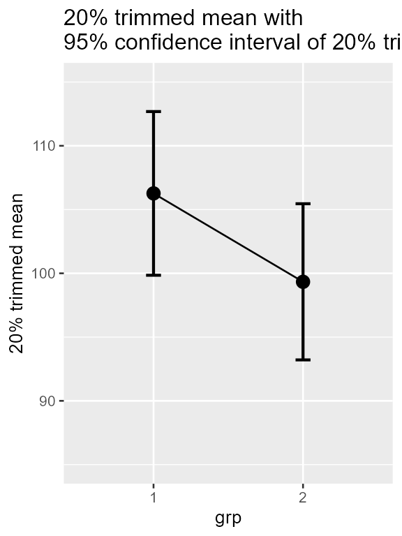
Figure 3. superbPlot with a custom-made
descriptive sttistic function
The advantage of this measure of central tendancy is that it is a robust estimator. Robust measures are less likely to be adversly affected by suspicious data such as outliers. See Wilcox (2011) for more on robust estimation.
Creating bootstrap-based confidence intervals
It is also possible to create bootstrap estimates of confidence
intervals and integrate these into superb.
The general idea is to subsample with replacement the sample and compute on this subsample the descriptive statistics. This process is repeated a large number of times (here, 10,000) and the quantiles containing, say, 95% of the results is a 95% precision interval (we call it a precision interval as bootstrap estimates the sampling variability, not the predictive variability).
Here, we illustrate this process with the mean. The function must be
name “interval function.mean”, so we choose to call it
myBootstrapCI.mean.
# we define myBootstrapPI which subsample the whole sample, here called X
myBootstrapPI.mean <- function(X, gamma = 0.95) {
  res = c()
  for (i in 1:10000) {
    res[i] <- mean(sample(X, length(X), replace = T))
  }
  quantile(res, c(1/2 - gamma/2, 1/2 + gamma/2))
}

# we check that it is a valid interval function
superb:::is.errorbar.function("myBootstrapPI.mean")
## [1] TRUEThis is all we need to make the plot which we can compare with the parametric CI
plt1 <- superb(
    score ~ grp,
    dataFigure1,
    plotLayout = "line",
    statistic = "mean", errorbar = "CI",
    adjustments = list(purpose = "difference")
) +
xlab("Group") + ylab("Score") +
labs(title="means and difference-adjusted\n95% confidence intervals") +
coord_cartesian( ylim = c(85,115) ) +
theme_gray(base_size=10) +
scale_x_discrete(labels=c("1" = "Collaborative games", "2" = "Unstructured activity"))

plt2 <- superb(
    score ~ grp,
    dataFigure1,
    plotLayout = "line",
    statistic = "mean", errorbar = "myBootstrapPI",
    adjustments = list(purpose = "difference")
) +
xlab("Group") + ylab("Score") +
labs(title="means and difference-adjusted\n95% bootstrap confidence intervals") +
coord_cartesian( ylim = c(85,115) ) +
theme_gray(base_size=10) +
scale_x_discrete(labels=c("1" = "Collaborative games", "2" = "Unstructured activity"))

library(gridExtra)
plt <- grid.arrange(plt1, plt2, ncol=2)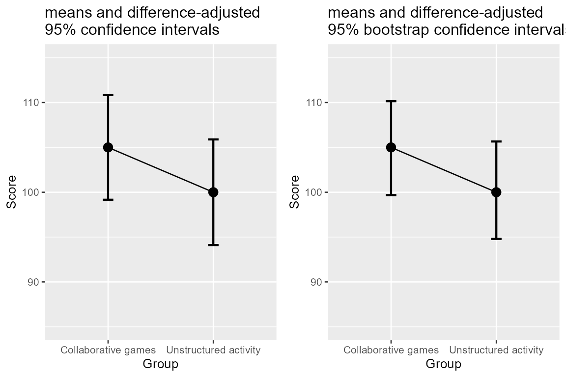
Figure 4. superbPlot with a custom-made
interval function.
As seen, there is not much difference between the two. This was expected: when the normality assumption is not invalid, the parametric confidence intervals of the mean (based on this assumption) is identical on average to the bootstrap approach.
In summary
The function superbPlot() is entirely customizable: you
can put any descriptive statistic function and any interval function
into superbPlot(). In a sense, superbPlot() is
simply a proxy that manage the dataset and produces standardized
dataframes apt to be transmitted to a ggplot()
specification. It is also possible to obtain the summary dataframe by
issuing the argument showPlot = FALSE or by using the
related function superbData().
The function superbPlot is also customizable with
regards to the plot produced. Included in the package are
superbPlot.line: shows the results as points and lines,superbPlot.point: shows the results as points only,superbPlot.bar: shows the results using bars,superbPlot.pointjitter: shows the results with points, and the raw data with jittered points,superbPlot.pointjitterviolin: also shows violin plot behind the jitter points, andsuperbPlot.pointindividualline: show the results with fat points, and individual results with thin lines,superbPlot.raincloud: show the results along with clouds (violin distributions) and rain drops (jittered raw data),
Vignette 5 shows how to create new layouts. Proposals are welcome!