In this vignette, we show how to plot proportions. Proportions is one way to summarize observations that are composed of succes and failure. Success can be a positive reaction to a drug, an accurate completion of a task, a survival after a dangerous ilness, etc. Failure are the opposite of success.
A proportion is the number of success onto the total number of trials. Similarly, if the success are coded with “1”s and failure, with “0”s, then the proportion can be obtained indirectly by computing the mean.
An example
Consider an example where three groups of participants where examined. The raw data may look like:
| Group | Score | |
|---|---|---|
| subject 1 | 1 | 1 |
| subject 2 | 1 | 1 |
| … | … | … |
| subject n1 | 1 | 0 |
| subject n1+1 | 2 | 0 |
| … | … | … |
| subject n1+n2 | 2 | 1 |
| subject n1+n2+1 | 3 | 1 |
| … | … | … |
| subject n1+n2+n3 | 3 | 0 |
in which there is participant in Group 1, in Group 2, and in Group 3. The data can be compiled by reporting the number of success (let’s call them ) and the number of participants.
One example of results could be
| s | n | proportion | |
|---|---|---|---|
| Group 1 | 10 | 30 | 33.3% |
| Group 2 | 18 | 28 | 64.3% |
| Group 3 | 10 | 26 | 38.5% |
Although making a plot of these proportions is easy, how can you plot error bars around these proportions?
The arcsine transformation
First proposed by Fisher, trigonometric transformation is one way to
represent proportions (Fisher proposed cosine transform,
but later Zubin proposed the arcsine transform). This
transformation stretches the extremities of the domain (near 0% and near
100%) so that the sampling variability is constant for any observed
proportion. Also, this transformation make the sampling distribution
nearly normal so that
test can be used.
An improvement over the Fisher transformation was proposed by Anscombe (1948). It is given by
The variance of such transformation is also theoretically given by
As such, we have all the ingredients needed to make confidence intervals!
Defining the data
In what follows, we assume that the data are available in compiled
form, as in the second table above. Because superb() only
takes raw data, we will have to convert these into a long sequence of
zeros and ones.
# enter the compiled data into a data frame:
compileddata <- data.frame(cbind(
    s = c(10, 18, 10),
    n = c(30, 28, 26)
))
The following converts the compiled data into a long data frame
containing ones and zeros so that superb() can be fed raw
data:
Defining the transformation in R
In the following, we define the A (Anscombe) transformation, the standard error of the transformed scores, and the confidence intervals:
# the Anscombe transformation for a vector of binary data 0|1
A <-function(v) {
    x <- sum(v)
    n <- length(v)
    asin(sqrt( (x+3/8) / (n+3/4) ))
}
SE.A <- function(v) {
    0.5 / sqrt(length(v+1/2))
}
CI.A <- function(v, gamma = 0.95){
    SE.A(v) * sqrt(qchisq(gamma, df=1))
}
This is all we need to make a basic plot with
superb()
… but we need a few libraries, so let’s load them here:
Here we go:
# ornate to decorate the plot a little bit...
ornate = list(
    theme_bw(base_size = 10),
    labs(x = "Group" ),
    scale_x_discrete(labels=c("Group A", "Group B", "Group C"))
)
superb(
    scores ~ group,
    dta,
    statistic = "A",
    error     = "CI",
    adjustment = list( purpose = "difference"),
    plotLayout = "line",
    errorbarParams = list(color="blue") # just for the pleasure!
) + ornate + labs(y = "Anscombe-transformed scores" )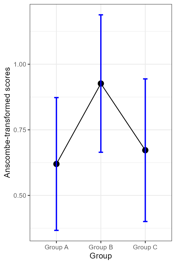
Figure 1. Anscombe-transformed scores as a function of group.
Reversing the transformation to see proportions.
The above plot shows Anscombe-transform scores. This may not be very intuitive. It is then possible to undo the transformation so as to plot proportions instead. The complicated part is to undo the confidence limits.
# the proportion of success for a vector of binary data 0|1
prop <- function(v){
    x <- sum(v)
    n <- length(v)
    x/n
}
# the de-transformed confidence intervals from Anscombe-transformed scores
CI.prop <- function(v, gamma = 0.95) {
    y     <- A(v)
    n     <- length(v)
    cilen <- CI.A(v, gamma)
    ylo   <- y - cilen
    yhi   <- y + cilen
    # reverse arc-sin transformation: naive approach
    cilenlo <- ( sin(ylo)^2 )
    cilenhi <- ( sin(yhi)^2 )

    c(cilenlo, cilenhi)
}
Nothing more is needed. We can make the plot with these new functions:
superb(
    scores ~ group,
    dta,
    statistic = "prop",
    error     = "CI",
    adjustment = list( purpose = "difference"),
    plotLayout = "line",
    errorbarParams = list(color="blue")
) + ornate + labs(y = "Proportions" ) +
    scale_y_continuous(trans=asn_trans())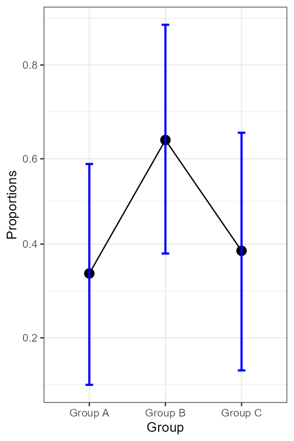
Figure 2. Proportion as a function of group.
This new plot is actually identical to the previous one as we plotted
the proportions using a non-linear scale (the asn_trans()
scale for arcsine). However, the vertical axis is now showing
graduations between 0% and 100% as is expected of proportions.
Returning to the example
What can we conclude from the plot? You noted that we plotted difference-adjusted confidence intervals. Hence, if at least one result is not included in the confidence interval of another result, then the chances are good that they differ significantly.
Running an analysis of proportions, it indicates the presence of a
main effect of Group
().
How to perform an analysis of proportions (ANOPA) is explained in Laurencelle & Cousineau (2023). Analysis of
proportion is now implemented in R with the package
ANOPA.
We see from the plot that the length of the error bars are about all the same, suggesting homogeneous variance (because all the sample are of comparable size). This is always the case as Anscombe transform is a ‘variance-stabilizing’ transformation in the sense that it makes all the variances identical.
In summary
The superb framework can be used to display any summary
statistics. Here, we showed how superb() can be used with
proportions. For within-subject designs involving proportions, it is
also possible to use the correlation adjustments (as demonstrated in Laurencelle & Cousineau,
2023).