In this vignette, we show how to illustrate reference intervals using
superb. We also show how the precision of this interval
limits could be illustrated. See NCCLS
(2000) for a definition of reference intervals. In what follows,
we use the package referenceIntervals from Finnegan (2020).
What is a reference interval?
The reference interval is a description of the whole population. This is in contrast with other error bar functions who are associated with a specific statistics. For example, there exists the standard error of the mean, or the confidence interval of the median. The reference interval on the other hand, is an interval of all the individuals in the sample, and it aims at illustrating the normal range of individuals in the studied population. It is therefore much wider than say, the confidence interval of the mean because the mean is not interested with the whole sample, only with the center of the sample.
As an example, in a pharmacological cross-over study, five drug concentrations A through E are tested for their effect on glucose level (in mg/dL). The authors might be interested in knowing whether the glucose levels are different. In that case, a confidence interval for the five mean glucose level might be useful.
However, the research may also want to indentify the “normal range”
of values of glucose levels with either of the concentrations. Note tha
“normal range” is a misnomer creating confusions with the “normal
distribution”. Instead, we stick to the expression
Reference interval (as promoted by many, e.g., NCCLS (2000)).
This interval is meant to capture a given fraction of the population individuals. These individuals are variable, but this variability is ok (I don’t want to say normal). This range could be “associated with good health” for example (NCCLS, 2000, p. 3).
Herein, we show how to illustrate reference intervals.
To make the relation with the individuals more evident, we will also
present these intervals in conjunction with alternative
representations.
Displaying a reference interval
To accomplish the basic computations, we rely on the excellent
referenceIntervals from Finnegan
(2020). This package offers many more options that will not be
explored herein.
Before we begin, let’s load the needed libraries…
library(ggplot2)            # for the graphing commands
library(superb)             # for superbPlot and GRD
library(referenceIntervals) # for computing reference intervals
(if some of these packages are not on your computer, first install it
with for example install.packages("referenceIntervals")
)
… then let’s create a ficticious data set on the fly:
glucoselevels <- GRD(BSFactors = "concentration(A,B,C,D,E)",
                    SubjectsPerGroup = 100,
                    RenameDV = "gl",
                    Effects = list("concentration" = extent(10) ),
                    Population = list(mean = 100, stddev = 20) )
This dataset will generate 100 individuals randomly for each of the
five concentrations (column concentration, with levels from
A to E). The dependent variable, glucose level, is abbreviated
to gl.
Here is a snapshot of it:
head(glucoselevels)## id concentration gl
## 1 1 A 66.99913
## 2 2 A 100.10634
## 3 3 A 46.25473
## 4 4 A 94.88857
## 5 5 A 107.43105
## 6 6 A 117.96823A simple plot could show the mean for each concentration along with the 95% confidence interval of the means, with e.g.,
superb(
    gl ~ concentration,
    glucoselevels,
    statistic = "mean",
    errorbar  = "CI",
    gamma     = 0.95,
    plotLayout = "line")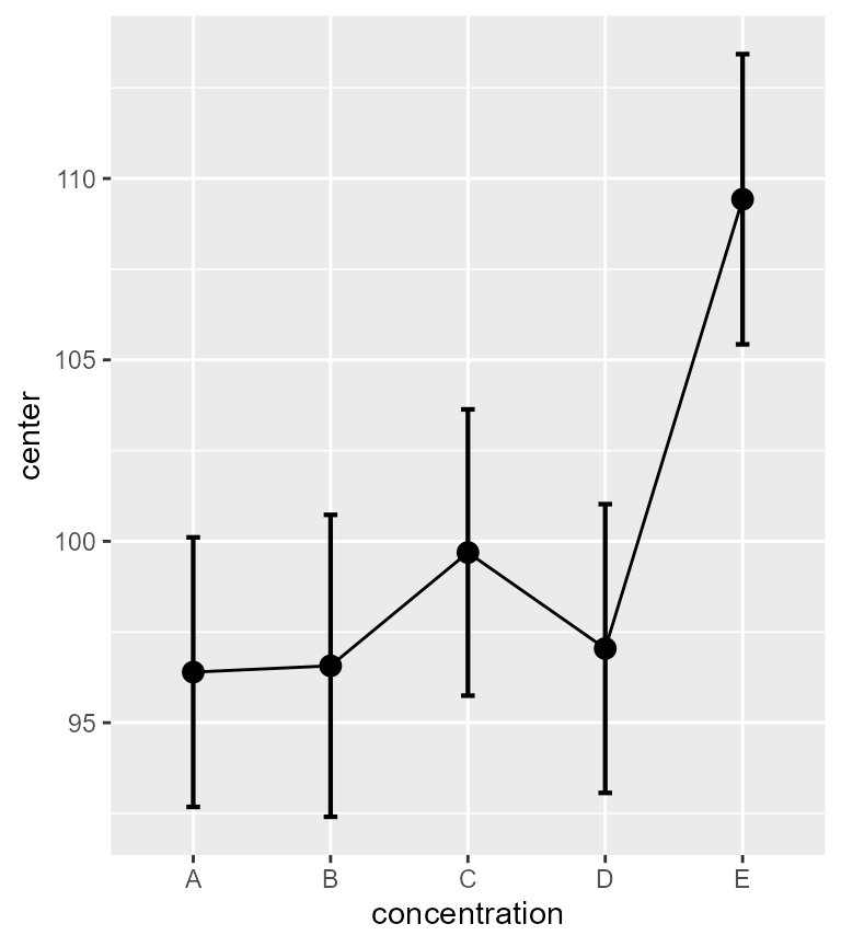
Figure 1. Mean glucose level as a function of concentration.
As seen, glucose level means are affected by the concentration (that
effect was requested in the GRD() command above). Also note
the vertical scale: it is very restricted around the means, yet,
individuals are often much outside the visible part of the scale.
To convince yourself of that, ask for the smallest glucose level and the highest:
min(glucoselevels$gl)## [1] 42.75331
max(glucoselevels$gl)## [1] 152.9786Instead of asking for an error bar representing a confidence interval (CI), let’s ask for error bar representing the reference intervals (RI).
Reference intervals are not (at this time) shipped with
superb. Let’s define a short-name version of this with
RI.mean <- function(data, gamma = 0.95) {
    refLimit(data, refConf = gamma)$Ref_Int
}
We actually use the function refLimit() from the
referenceIntervals package. There are many options in that
function; please consult the documentation for that package. We only
preserve the reference interval limits with $Ref_Int (that
function outputs other information, as we will see below).
The one argument that we use is the confidence level of the reference
interval, refConf (recommended is 95%, which is the default
if none is specified).
As you may note, the RI function is attached to
the mean. This is arbitrary: in superb, error bars must be
error bars of a summary statistic. You could have used any function,
that won’t change the position of the interval.
This is all we need to make our first reference interval plots:
superb(
    gl ~ concentration,
    glucoselevels,
    statistic = "mean", # mean is what RI is attached to
    errorbar  = "RI",   # RI calls the function above
    gamma     = 0.95,   # select the coverage desired
    plotLayout = "line" )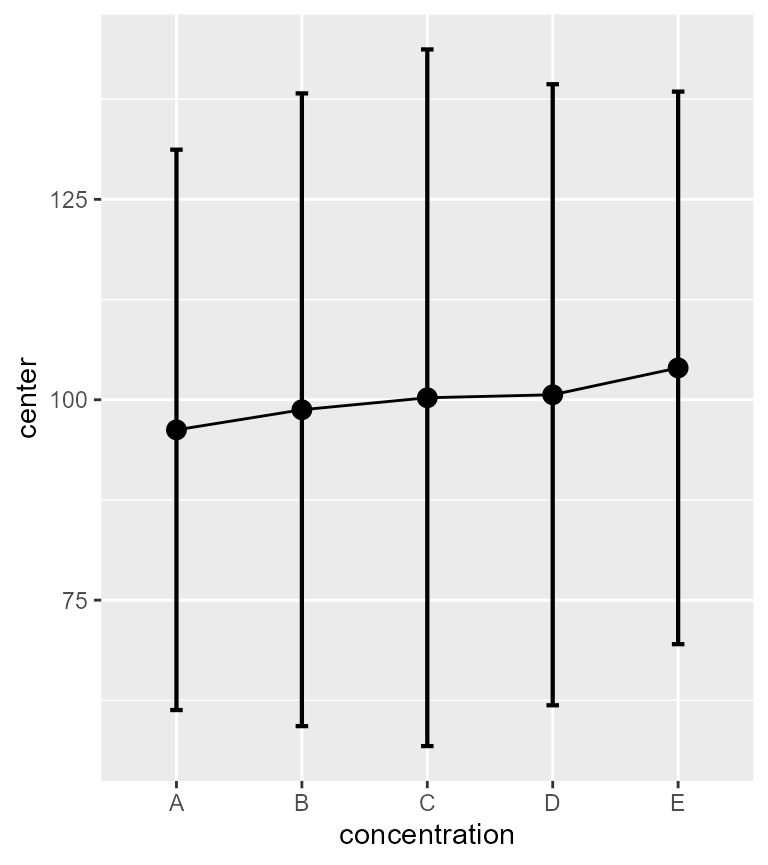
Figure 2. Mean glucose level and 95% reference intervals as a function of concentration.
You can see that the vertical range is much wider now than in Figure 1. It is ok, as these intervals cover most of the individuals in the samples.
Uncertainty in the reference interval limits
The plot from Figure 2 shows the estimated range of individuals from a sample, and therefore has some uncertainty in the exact location of the tips. It is possible to add some indication of the width of uncertainty regarding these tips by estimating a confidence interval for each extremity.
The exact computation is based on the uncertainty of quantiles [e.g., the 2.5% quantile for the lower limit of the population as infered from the 2.5% quantile of the sample, when 95% RI are plotted; see e.g., NCCLS (2000); Harding, Tremblay, & Cousineau (2014)].
In the packge referenceIntervals, the function
refLimit() also produces this information by default. The
novelty is that the confidence level of the confidence interval for the
tips of the RI may be different from the reference interval level.
As an example, the RI coverage interval might be a 95%, so as to include a wide proportion of the population, and the certainty on the tip positions of that RI might be low, e.g., 80%, because we fear that the sample is not the most representative.
To acheive this, we wrap the refLimit() function in a
shorter name function, ciloRI for the confidence intervals
of the lower part of the RI, and cihiRI for the confidence
intervals of the upper part of the RI. This function requires two
gammas, one for the RI level, and the second for the CI level. Thus, we
get:
ciloRI.mean <- function(data, gamma = c(0.95, 0.90) ) {
    refLimit(data, refConf = gamma[1], limitConf = gamma[2] )$Conf_Int[1:2]
}
cihiRI.mean <- function(data, gamma = c(0.95, 0.90) ) {
    refLimit(data, refConf = gamma[1], limitConf = gamma[2] )$Conf_Int[3:4]
}
Again, this is all we need. We can for example use the following to see the uncertainty in the top tips of all the RI:
superb(
    gl ~ concentration,
    glucoselevels,
    statistic = "mean", errorbar = "cihiRI",
    gamma     = c(0.95, 0.90),
plotLayout = "line" ) 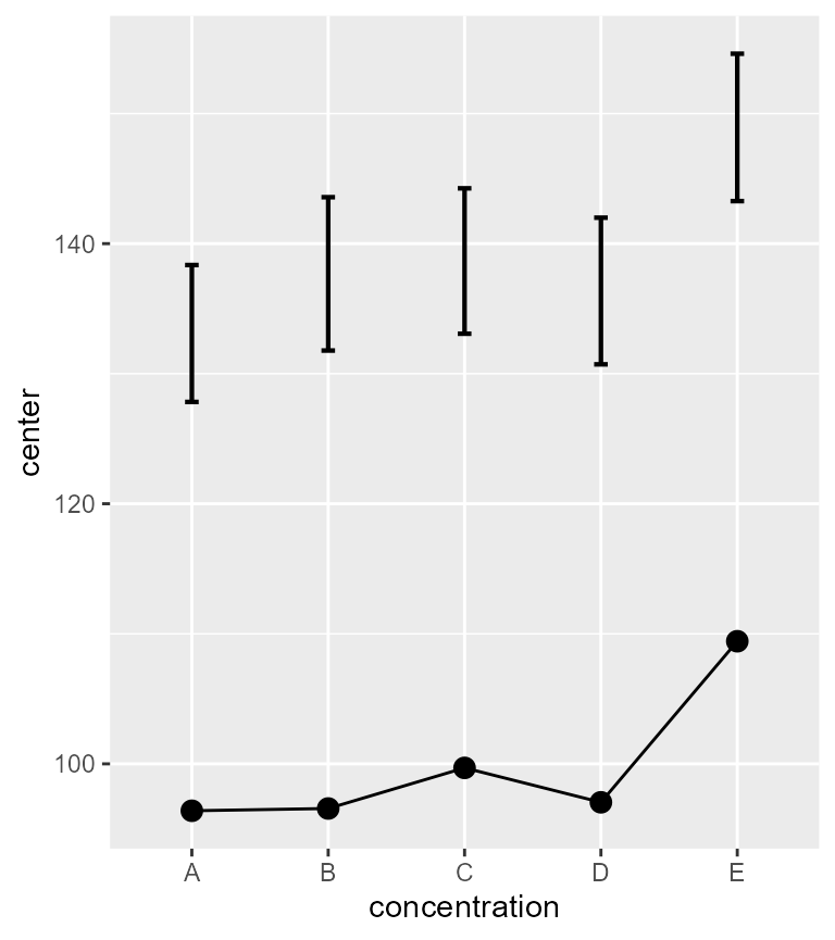
Figure 3. Mean glucose level and 90% confidence intervals of the upper RI tips.
Well, that is weird because now, we only see an error bar way up
there. The RI error bar is no longer visible because
superbPlot() can only show one sort of error bar at a
time.
Lets correct this. The gist of the following is to perform three plots, one showing the RI intervals (as Figure 2 above), a second showing the confidence interval of the RI top tips (as Figure 3 just above), and one last plot showing the confidence interval of the RI bottom tips. Plots 2 and 3 must be transparent so that they can be superimposed on top of plot 1.
To that end, we use a set of graphic directives that makes the plot
transparent. It will be appplied to plots 2 and 3 (it hides the grid (if
any) and set the background of the whole plot and of the panel to
transparent). This operation is made with the function
makeTransparent().
It is also necessary that all plots have the same range, so that they align correctly when superimpose. To do so, we set the vertical range from 0 to 200. We also add a description in the title of the plot. These are all grouped in a list:
ornate = list(
        labs(title =paste("(tick)     95% reference intervals (RI)",
                        "\n(red)      90% confidence intervals of upper 95% RI",
                        "\n(purple) 90% confidence intervals of lower 95% RI",
                        "\n(blue)    95% confidence intervals of the mean")),
        coord_cartesian( ylim = c(000,200) ),
        theme_light(base_size=10) # smaller font
)
Now that these are dealt with, let’s do our three plots:
plt1 <- superb(
    gl ~ concentration,
    glucoselevels,
    statistic = "mean",
    errorbar  = "RI",
    gamma     = 0.95,
    errorbarParams = list(width = 0.0, linewidth = 1.5,
                          position = position_nudge( 0.0) ),
    plotLayout = "line" ) + ornate
plt2 <- superb(
    gl ~ concentration,
    glucoselevels,
    statistic = "mean",
    errorbar  = "cihiRI",
    gamma     = c(0.95, 0.90),
    errorbarParams = list(width = 0.2, linewidth = 0.2, color = "red",
                          direction = "left",
                          position = position_nudge(-0.15) ),
    plotLayout = "line" ) + ornate + makeTransparent()
plt3 <- superb(
    gl ~ concentration,
    glucoselevels,
    statistic = "mean",
    errorbar  = "ciloRI",
    gamma     = c(0.95, 0.90),
    errorbarParams = list(width = 0.2, linewidth = 0.2, color = "purple",
                          direction = "left",
                          position = position_nudge(-0.15) ),
    plotLayout = "line" ) + ornate + makeTransparent()
Things to note: (1) only the second and third uses the transparent
directives; (2) the confidence levels (gamma) have two
numbers in plots 2 and 3: the first for the RI, the second for the CI of
the RI; (3) with errorbarParams, we gave different
attributes to the various error bars (purple color for the lower CI, for
example) and moved them sligtly to the left (position).
Almost there. Lets turn these plots into graphic objects
(grob), then superimpose them onto an empty plot:
# transform the three plots into visual objects
plt1 <- ggplotGrob(plt1)
plt2 <- ggplotGrob(plt2)
plt3 <- ggplotGrob(plt3)

# superimpose the grobs onto an empty ggplot
ggplot() +
    annotation_custom(grob=plt1) +
    annotation_custom(grob=plt2) +
    annotation_custom(grob=plt3)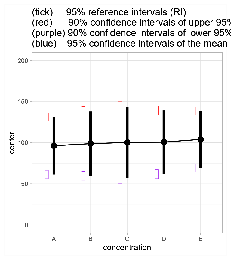
Figure 3a. Mean glucose level and 95% reference intervals with 95% confidence intervals.
Is that it?
Well, we are just begining! The whole point of the reference intervals is to provide an indication of the individuals in the population. It would be great if we could see these, don’t you think?
There are multiple ways to illustrate the individuals from a sample. One is using jittered dots: each member of the sample is illustrated with a small dot whose horizontal position can be jittered randomly to avoid that many dots superimposes and no longer be visible.
These is a layout in superb that achieve exacly that,
pointjitter. You can for example redo plot 1 but changing
the layout, then superimpose the plots again, as in
# redo plt1; the other 2 are still in memory
plt1 <- superb(
    gl ~ concentration,
    glucoselevels,
    statistic = "mean",
    errorbar  = "RI",
    gamma     = 0.95,
    errorbarParams = list(width = 0.0, linewidth = 1.5,
                          position = position_nudge( 0.0) ),
    plotLayout = "pointjitter" ) + ornate

# transform the new plot into a visual object
plt1 <- ggplotGrob(plt1)

# superimpose the grobs onto an empty ggplot
ggplot() +
    annotation_custom(grob=plt1) +
    annotation_custom(grob=plt2) +
    annotation_custom(grob=plt3)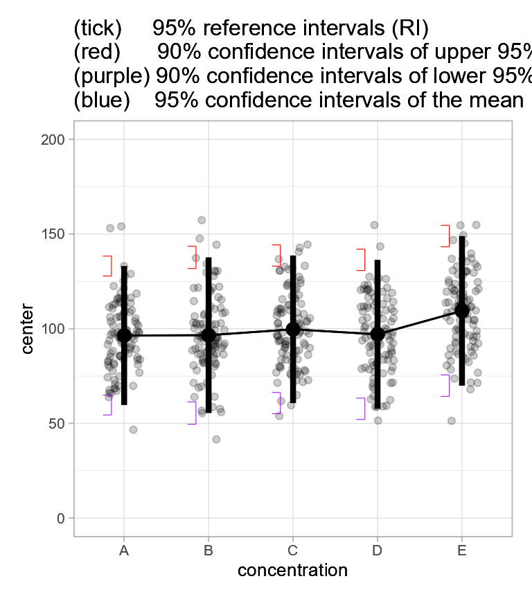
Figure 3b. Jittered dots showing mean glucose level and 95% reference intervals with 95% confidence intervals.
As seen, it is now easy to see the individuals from the sample and that most of them are indeed within the reference intervals.
A more elaborate layout, although maybe redundant with the RI, is the
pointjitterviolin as done in the next example.
# redo plt1; the other 2 are still in memory
plt1 <- superb(
    gl ~ concentration,
    glucoselevels,
    statistic = "mean",
    errorbar  = "RI",
    gamma     = 0.95,
    errorbarParams = list(width = 0.0, linewidth = 1.5,
                          position = position_nudge( 0.0) ),
    plotLayout = "pointjitterviolin" ) + ornate

# transform the three plots into visual objects
plt1 <- ggplotGrob(plt1)

# you may superimpose the grobs onto an empty ggplot
ggplot() +
    annotation_custom(grob=plt1) +
    annotation_custom(grob=plt2) +
    annotation_custom(grob=plt3)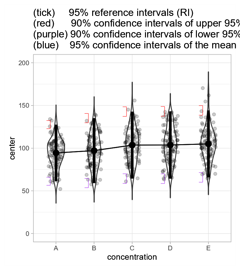
Figure 3c. Jittered dots and violins showing mean glucose level and 95% reference intervals with 95% confidence intervals of the tips’ position.
Reference intervals vs. confidence intervals of the means
As one last example, we want to show the difference between the reference intervals and the confidence intervals of a summary statistic, here the mean.
To that end, we can create a fourth plot showing the confidence interval of the means with
plt4 <- superb(
    gl ~ concentration,
    glucoselevels,
    statistic = "mean",
    errorbar  = "CI",  # just the regular CI of the mean
    errorbarParams = list(width = 0.2, linewidth = 1.5, color = "blue",
                          position = position_nudge( 0.00) ),
    gamma     = 0.95,
    plotLayout = "line" ) + ornate + makeTransparent()
This plot also has transparent theme as it will superimposed on the previous three plots:
# transform that plot too into visual objects
plt4 <- ggplotGrob(plt4)

# superimpose the grobs onto an empty ggplot
ggplot() +
    annotation_custom(grob=plt1) +
    annotation_custom(grob=plt2) +
    annotation_custom(grob=plt3) +
    annotation_custom(grob=plt4)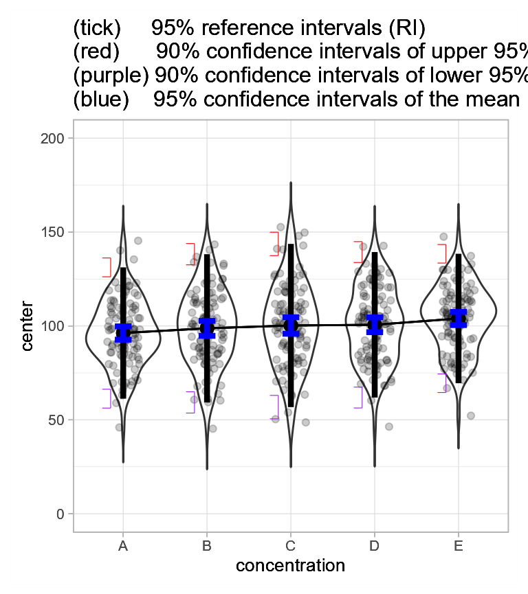
Figure 3d. Jittered dots and violins showing mean glucose level +-95% confidence intervals of the mean, and 95% reference intervals with 95% confidence intervals.
As seen in blue, the confidence interval of the means have much shorter intervals than the reference interval. This is ok (or should I say, normal): Both intervals represent very different things. Also, the interval widths of the CI of the mean are shorter than the interval widths of the CI or the RI tips for two reasons: (1) the RI tips are based on 90% confidence levels; (2) a central tendency statistic is easier to estimate than an extreme quantile statistic.
In summary
Reference intervals are useful to depict the population as a whole. It is not an error bar in the sense that it does not represent the error for the estimation of a statistic. Instead, it is an illustration of the individuals’ possible scores.
Note that Reference intervals must not be used in conjunction with adjustments. These adjustments are used when conditions are compared to other conditions. Reference intervals are not comparative statistics, they show the extend of the sample, irrespective of what the other samples might look like.