In paired-sample designs —also called within-subject designs— the same participants are measured more than once. In that case, asking whether a factor influenced the scores is the same as asking if the factor influenced all the participants. If all the participants turn out to be influenced in the same manner, it can be safely concluded that the factor influenced the group of participants.
An example
Consider a study trying to establish the benefit of using exercises to improve visuo-spatial abilities onto scores in statistics reasoning, as measured by a standardized test with scores ranging from 50 to 150. The design is a within-subject design, specifically a pre-exercises measure and a post-exercises measure of statistics reasoning.
The data are available in dataFigure2; here is a
snapshot of it
head(dataFigure2)## id pre post
## 1 1 105 128
## 2 2 96 96
## 3 3 88 102
## 4 4 80 88
## 5 5 90 83
## 6 6 86 99There is a large variation in the scores obtained and as such a t test where the scores are treated as independent will fail to detect a difference:
t.test(dataFigure2$pre, dataFigure2$post, var.equal=TRUE)##
## Two Sample t-test
##
## data: dataFigure2$pre and dataFigure2$post
## t = -1.1741, df = 48, p-value = 0.2462
## alternative hypothesis: true difference in means is not equal to 0
## 95 percent confidence interval:
## -13.562724 3.562724
## sample estimates:
## mean of x mean of y
## 100 105However, when the proper, paired-sample t-test is used, we find that the difference is quite important:
t.test(dataFigure2$pre, dataFigure2$post, var.equal=TRUE, paired = TRUE)##
## Paired t-test
##
## data: dataFigure2$pre and dataFigure2$post
## t = -2.9046, df = 24, p-value = 0.007776
## alternative hypothesis: true mean difference is not equal to 0
## 95 percent confidence interval:
## -8.552864 -1.447136
## sample estimates:
## mean difference
## -5What is going on? how can we make a plot that properly display this difference?
A few words on the underlying theory (optional)
Let’s examine the data using a plot in which each participant’s scores are shown with a line. We get the following:
library(reshape2)

# first transform the data in long format; the pre-post scores will go into column "variable"
dataFigure2long <- melt(dataFigure2, id="id")

# add transparency when pre is smaller or equal to post
dataFigure2long$trans = ifelse(dataFigure2$pre <= dataFigure2$post,0.9,1.0)

# make a plot, with transparent lines when the score increased
ggplot(data=dataFigure2long, aes(x=variable, y=value, group=id, alpha = trans)) +
    geom_line( ) +
    coord_cartesian( ylim = c(70,150) ) +
    geom_abline(intercept = 102.5, slope = 0, colour = "red", linetype=2)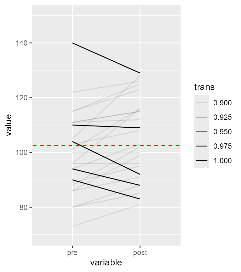
Figure 1. Representation of the individual participants
As seen, except for 5 participants, a vast majority of the participants have an upward trend in their results. Thus, this upward trend is probably a reality in this dataset.
Centering the participants to better see the trend
One solution used in Cousineau (2005) is to center the participants’ data on the participants’ mean. It consists in computing for each participant their mean score and replace that participant’s mean score with the overall mean. With this manipulation, all the participants will now hover around the overall mean (here 102.5, shown with a red dashed line).
The following realizes this subject-centered plot for each participant.
# use subjectCenteringTransform function
library(superb)
df2 <- subjectCenteringTransform(dataFigure2, c("pre","post"))

# tranform into long format
library(reshape2)
dl2 <- melt(df2, id="id")

# make the plot
ggplot(data=dl2, aes(x=variable, y=value, colour=id, group=id)) + geom_line()+
    coord_cartesian( ylim = c(70,150) ) +
    geom_abline(intercept = 102.5, slope = 0, colour = "red", size = 0.5, linetype=2)
## Warning: Using `size` aesthetic for lines was deprecated in ggplot2 3.4.0.
## ℹ Please use `linewidth` instead.
## This warning is displayed once every 8 hours.
## Call `lifecycle::last_lifecycle_warnings()` to see where this warning was
## generated.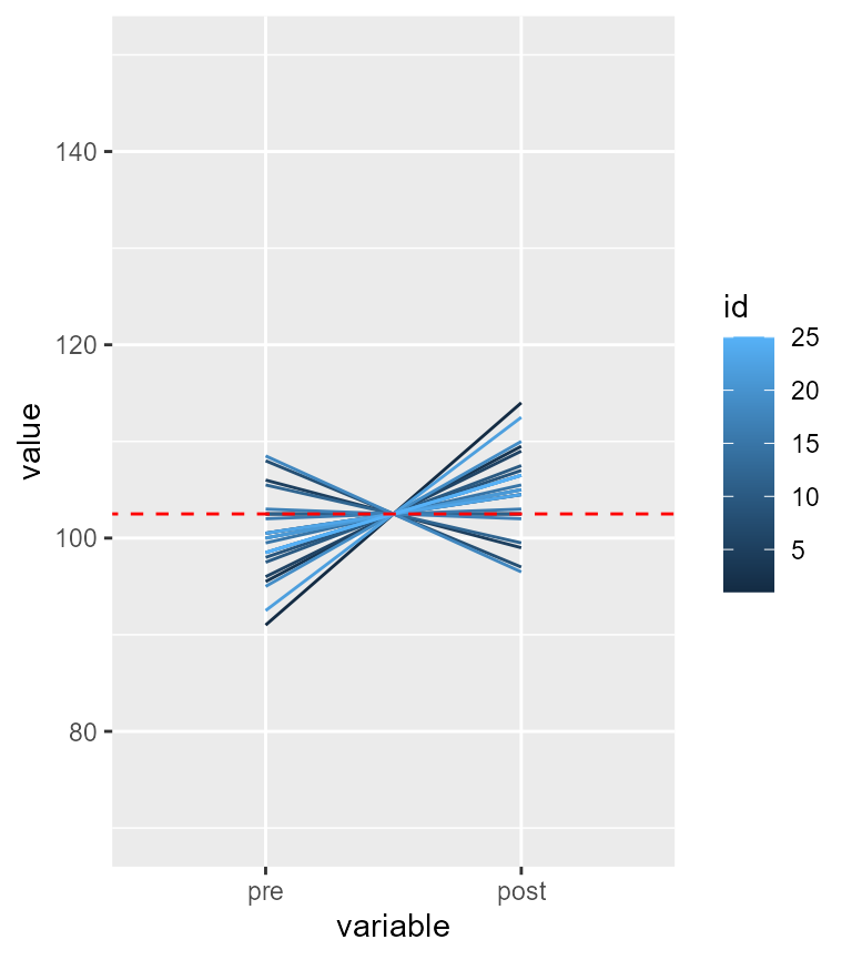
Figure 2. Representation of the subject-centered individual participants
Here again, we see that for 5 participants, their scores went down. For the 20 remaining ones, the trend is upward. Thus, there is clear tendency for the exercices to be beneficial.
Running the adequate paired t test, we find indeed that the difference is strongly significant (t(24) = 2.9, p = .008):
t.test(dataFigure2$pre, dataFigure2$post, paired=TRUE)##
## Paired t-test
##
## data: dataFigure2$pre and dataFigure2$post
## t = -2.9046, df = 24, p-value = 0.007776
## alternative hypothesis: true mean difference is not equal to 0
## 95 percent confidence interval:
## -8.552864 -1.447136
## sample estimates:
## mean difference
## -5What is the impact on confidence intervals?
The above suggests that within-subject designs can be much more powerful than between- subject design. As long as there is a general trend visible in most participants, the paired design will afford more statistical power. How to we know that there is a general trend? An easy solution is to compute the correlation across the pairs of scores.
In R, you can run the following:
cor(dataFigure2$pre, dataFigure2$post)## [1] 0.836611and you find out that in the present dataset, correlation is actually quite high, with . Whenever correlation is positive, statistical power benefits from correlation.
Because increased power means higher level of precision, the error bars should be shortened by positive correlation. Estimating the adjusted length of the error bars from correlation is a process called decorrelation (Cousineau, 2019).
To this date, three techniques have been proposed to decorrelate the measures.
CM: This method uses subject-centering followed by a bias-correction step (otherwise the error bars are slightly overestimated) (Cousineau, 2005; Morey, 2008).LM: This method also uses subject-centering and bias-correction but when there are more than two measurements, it also equalizes the length of the error bars using a technique akin to pooled standard deviation measure (Loftus & Masson, 1994).CA: this is the newest proposal. It directly uses the correlation (or the mean pairwise correlation when there are more than two measurement) to adjust the error bar length. In a nutshell, the error bar length are adjusted using a multiplicative term . As an example, when $ r = .8$, the adjustment is . That means that the error bars are 44% the length of the unadjusted error bars (that is, less than half).
Whichever method you choose have very little bearing on the actual result. As shown in Cousineau (2019), all three methods are based on the same general concepts and they generate very little difference in the amount of adjustments.
In the present dataset, the error bar are more than shorten by half! which clearly shows the benefit of the within-subject design on precision.
Getting a plot
Making it simple
With suberb, all the decorrelation techniques are
available using the adjustment decorrelation (Cousineau, Goulet, & Harding, 2021).
The simplest code is the following:
superb(
    cbind(pre, post)~ ., # no between-group factor
    dataFigure2,
    WSFactors    = "Moment(2)",
    adjustments = list(
                    purpose = "difference",
                    decorrelation = "CA"    ## NEW! use a decorrelation technique
    ),
    plotLayout  = "line" )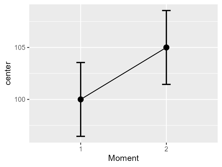
Figure 3a. Means and difference and correlation-adjusted 95% confidence intervals
Alternatively, if the data are available in long form, you can
specify that the measurements are nested within a subject identifier,
here the id columm, with
superb(
    value ~ variable | id, # id identifies the within-subject measurements
    dataFigure2long,
    adjustments = list(
                    purpose = "difference",
                    decorrelation = "CA"    ## NEW! use a decorrelation technique
    ),
    plotLayout  = "line" )
This will result in a basic plot, but what matters is that the confidence intervals are adjusted so that you can compare bars even if they are repeated measures. Note that the confidence interval of one point does not contain the other point, suggesting, as it should be, a significant differencee.
Refining the plots
With the following code, we can decorate the plot a little bit, and show side-by-side both the unadjusted plot (which give an erroneous result) and the adjusted plot.
options(superb.feedback = 'none') # shut down 'warnings' and 'design' interpretation messages
library(gridExtra)

## realize the plot with unadjusted (left) and ajusted (right) 95\% confidence intervals
plt2a <- superb(
        cbind(pre, post) ~ .,
        dataFigure2,
        WSFactors    = "Moment(2)",
        adjustments = list(purpose = "difference"),
        plotLayout  = "line" ) +
    xlab("Group") + ylab("Score") +
    labs(title="Difference-adjusted\n95% confidence intervals") +
    coord_cartesian( ylim = c(85,115) ) +
    theme_gray(base_size=10) +
    scale_x_discrete(labels=c("1" = "Collaborative games", "2" = "Unstructured activity"))
plt2b <- superb(
        cbind(pre, post) ~ .,
        dataFigure2,
        WSFactors    = "Moment(2)",
        adjustments = list(purpose = "difference", decorrelation = "CA"),  #only difference
        plotLayout  = "line" ) +
    xlab("Group") + ylab("Score") +
    labs(title="Correlation and difference-adjusted\n95% confidence intervals") +
    coord_cartesian( ylim = c(85,115) ) +
    theme_gray(base_size=10) +
    scale_x_discrete(labels=c("1" = "Collaborative games", "2" = "Unstructured activity"))
plt2  <- grid.arrange(plt2a,plt2b,ncol=2)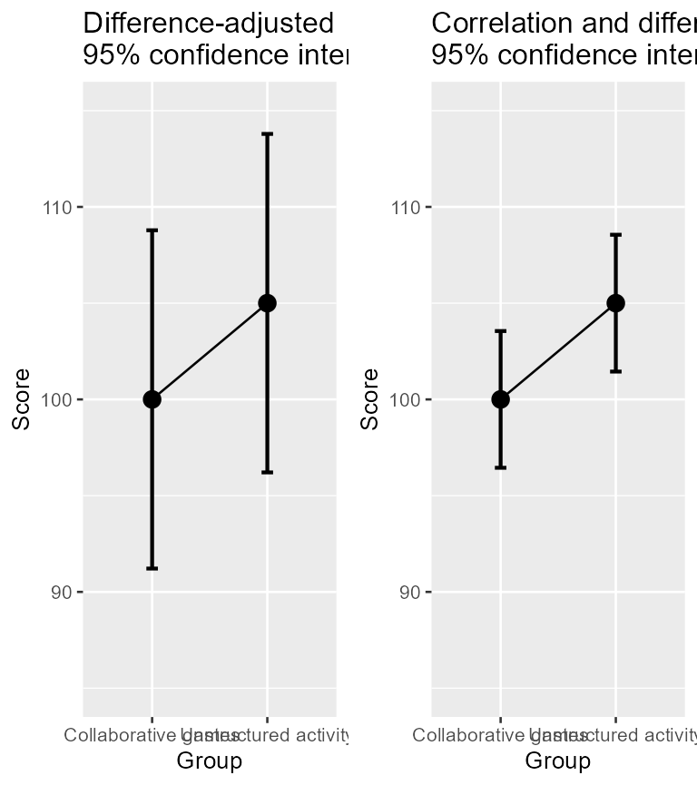
Figure 3b. Means and 95% confidence intervals on raw data (left) and on decorrelated data (right)
In the above plot, I used decorrelation = "CA".
Alternatively, you could use decorrelation = "UA" or
``decorrelation = “CM”). When there is only two conditions, all the
techniques return identical error bars.
Illustrating the various decorrelatin techniques.
As another example illustrating the differences between the techniques, I generated random data for 5 measures with an amount of correlation of 0.8 in the population. In Figure 4 below, all error bars are superimposed on the same plot. As seen, there is only minor differences between the three techniques. The green lines all have the same length; this is the main characteristic of the Loftus and Masson approach, in contrast with the other two techniques.
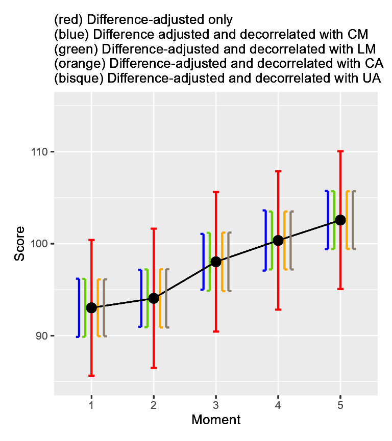
Figure 4. All three decorelation techniques on the same plot along with un-decorrelated error bars
Illustrating individual differences
In superb, it is possible to ask a certain type of plot.
The plotLayout used so far is "line" (the
default is "bar"). Another basic style is
"point" (no line connecting the means).
Other types of plot exists that are apt at showing the summary
statistics but also the individual scores (the 6th
Vignette shows how to develop custom-made layouts). For illustrating
individual differences, a style proposed is
pointindividualline which — as per Figure 1— will show the
individual scores along with the summary statistics and the error bars.
For example:
superb(
    cbind(pre, post) ~ .,
    dataFigure2,
    WSFactors   = "Moment(2)",
    adjustments = list(purpose = "difference", decorrelation = "CM"),
    plotLayout  = "pointindividualline" ) +
xlab("Group") + ylab("Score") +
labs(subtitle="Correlation- and Difference-adjusted\n95% confidence intervals") +
coord_cartesian( ylim = c(70,150) ) +
theme_bw(base_size=10) +
scale_x_discrete(labels=c("1" = "Collaborative games", "2" = "Unstructured activity"))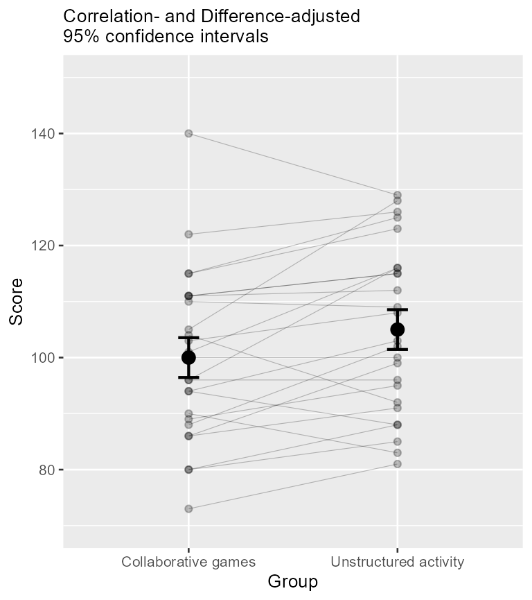
Figure 5. Means and 95% confidence intervals along with individual scores depicted as lines
When the repeated-measure design involves only two measurements, a
nice plot is a corset plot, which is a mixture of violin plot and
individuallines plot. You can add the option colorize=TRUE
to discriminate the participants whose score decreased from those whose
score remained flat or increased. It is obtained with
superb(
    cbind(pre, post) ~ .,
    dataFigure2,
    WSFactors   = "Moment(2)",
    adjustments = list(purpose = "difference", decorrelation = "CM"),
    plotLayout  = "corset",
    lineParams = list(colorize="bySlope"),
    violinParams = list(fill="green", alpha = .2)
) +
xlab("Group") + ylab("Score") +
labs(subtitle="Correlation- and Difference-adjusted\n95% confidence intervals") +
coord_cartesian( ylim = c(70,150) ) +
theme_bw(base_size=10) +
scale_x_discrete(labels=c("1" = "Collaborative games", "2" = "Unstructured activity")) +
scale_color_manual('Direction\n of change', values=c("blue","red"), labels=c('decreasing', 'increasing')) +
theme(legend.position=c(0.5,0.8), panel.border = element_blank(), legend.background = element_blank() ) 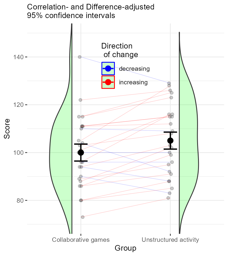
Figure 5. Means and 95% confidence intervals along with individual scores depicted as lines
In conclusion
The major obstacle to the use of adjusted error bars was the difficulty to obtain them. None of the statistical software (e.g., SPSS, SAS) provide these adjustments. A way around is to compute these manually. Although not that complicated, it requires manipulations, whether they are done in EXCEL, or through macros (e.g., WSPlot, O’Brien & Cousineau, 2014).
The present function renders all the adjustments a mere option in a function.