Adding labels to your superb plot
It is possible to add labels to your plot. For example, adding the
score above a bar. This is done using the geom_text()
graphic directive from ggplot2 library.
Two situations are possible: 1- the labels are actually summary statistics computed by superb 2- the labels are other information not contained in the summary statistics.
1- the labels are actually summary statistics computed by superb
When processing the data, superb is actually building a data frame with only the relevant statistics that are named internally “center”, “lowerwidth” and “upperwidth”. The first is the statistic to be displayed (e.g., the mean), the other two are the lower and upper limit of the error bar, relative to center.
Hence, if you want to show the summary statistic, you can build you summary plot, e.g.,
then add to t the labels with

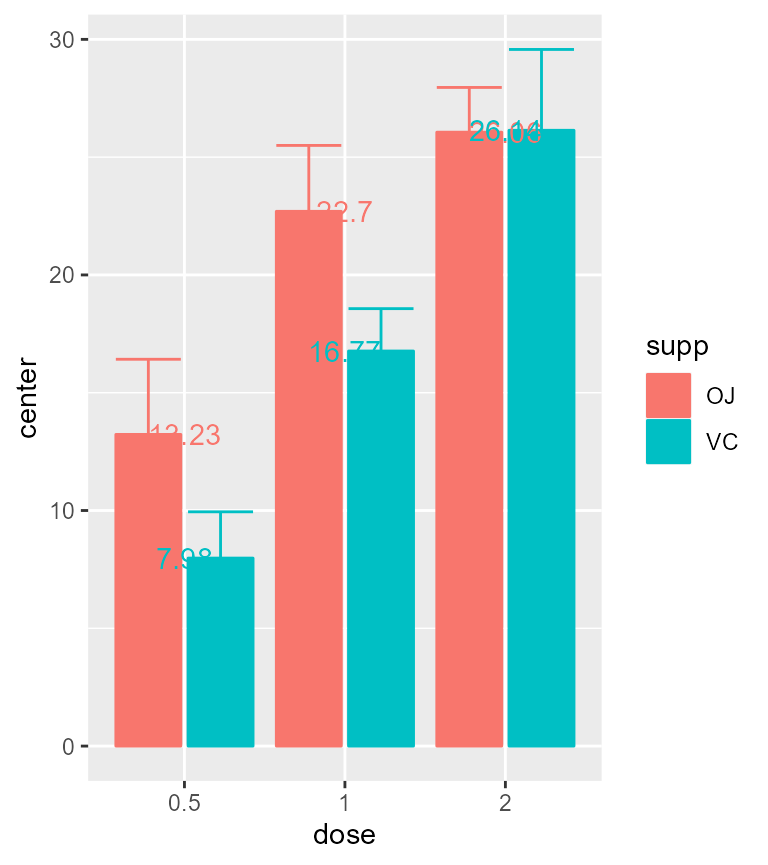
Figure 1: A basic plot
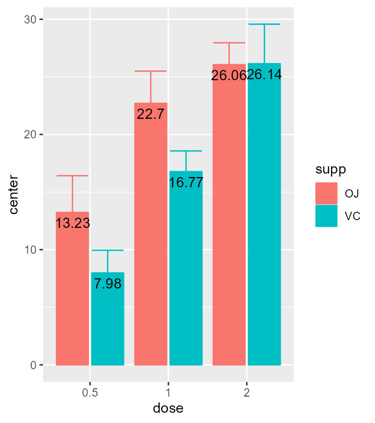
The labels will be poorly placed, so you can adjust their position with
t + geom_text(aes(x=dose, y=center, label=center),
      position = position_dodge(0.9),
      vjust = 1.5,color = "black" )
Figure 2: A better-looking plot
You can round, or format or color, the statistics, with e.g.,
t + geom_text(aes(x=dose, y=center, label=round(center)),
      position=position_dodge(0.9),vjust=1.5,color="black")
t + geom_text(aes(x=dose, y=center, label=sprintf('%.1f', center)),
      position=position_dodge(0.9),vjust=1.5,color="black")
t + geom_text(aes(x=dose, y=center, label=sprintf('%.1f', center), color=supp),
      position=position_dodge(0.9), vjust=-1.5)
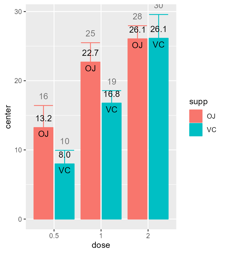
You can also show the factor names rather than the summary statistics, as they are contained in the summary statistics data frame. For example:
t + geom_text(aes(x=dose, y=center, label=supp), # changed "label"
      position=position_dodge(0.9),
      vjust=1.5,color="black")
Figure 3: A plot with conditions on the bars
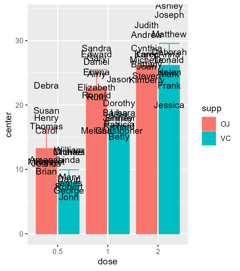
Finally, multiple labels can be added if desired:
t + geom_text(aes(x=dose, y=center, label=sprintf('%.1f', center)), color="black", position=position_dodge(0.9), vjust=-1) +
 geom_text(aes(x=dose, y=center,label=supp), position=position_dodge(0.9), vjust=1.5, color="black") +
geom_text(aes(x=dose, y=center+upperwidth, label=round(center+upperwidth)), position=position_dodge(0.9), vjust=-1, color="gray43") 
Figure 4: A plethora of labels
At any time, you can consult what is the summary statistics data
frame produced by replacing superbPlot() with
superbData()
d <- superb(
    len ~ dose + supp,
    ToothGrowth,
    showPlot = FALSE
)
d$summaryStatistics
## dose supp center lowerwidth upperwidth
## 1 0.5 OJ 13.23 -3.190283 3.190283
## 2 0.5 VC 7.98 -1.964824 1.964824
## 3 1 OJ 22.70 -2.797727 2.797727
## 4 1 VC 16.77 -1.799343 1.799343
## 5 2 OJ 26.06 -1.899314 1.899314
## 6 2 VC 26.14 -3.432090 3.4320902- the labels are other information not contained in the summary statistics.
If your labels are not compiled in the summary statistics data frame, you can still connect to the original data frame and use its content. For example, lets’ suppose we have the names of the rats in the ToothGrowth data frame (I de-anonymize them, but they won’t object to this as they are rats, and dead by now!)
# taken from library(babynames)
# head(unique(babynames[order(-babynames$prop),]$name),60)
firstnames=c(
 "John",        "William",     "Mary",        "Robert",      "James",
 "Linda",       "Michael",     "Charles",     "George",      "David",
 "Jennifer",    "Shirley",     "Richard",     "Barbara",     "Jason",
 "Lisa",        "Betty",       "Christopher", "Dorothy",     "Patricia",
 "Helen",       "Jessica",     "Ashley",      "Donald",      "Anna",
 "Joseph",      "Deborah",     "Frank",       "Mark",        "Matthew",
 "Thomas",      "Debra",       "Susan",       "Margaret",    "Carol",
 "Amanda",      "Brian",       "Joshua",      "Henry",       "Harry",
 "Ruth",        "Amy",         "Emma",        "Edward",      "Ronald",
 "Daniel",      "Gary",        "Elizabeth",   "Melissa",     "Sandra",
 "Michelle",    "Karen",       "Kimberly",    "Joan",        "Brittany",
 "Judith",      "Larry",       "Cynthia",     "Andrew",      "Steven")
# append the names as the last columns of ToothGrowth
ToothGrowth$firstnames <- firstnames

head(ToothGrowth)
## len supp dose firstnames
## 1 4.2 VC 0.5 John
## 2 11.5 VC 0.5 William
## 3 7.3 VC 0.5 Mary
## 4 5.8 VC 0.5 Robert
## 5 6.4 VC 0.5 James
## 6 10.0 VC 0.5 Linda
t + geom_text(aes(x=factor(dose), y=len, label=firstnames),
      data = ToothGrowth, # new: I add the original data frame
      color = "black",
      position = position_dodge(0.9),
      vjust = -1.,
      inherit.aes = FALSE
) 
Figure 5: Individual cases’ labels
In summary
Labels can be added with the usual geom_text() graphic
directives. Additional information can be found regarding this
method.