superbPlot comes with a few built-in templates for making the final plots. All produces ggplot objects that can be further customized. Additionally, it is possible to create custom-make templates (see vignette 5). The functions, to be "superbPlot-compatible", must have these parameters:
Arguments
- summarydata
a data.frame with columns "center", "lowerwidth" and "upperwidth" for each level of the factors;
- xfactor
a string with the name of the column where the factor going on the horizontal axis is given;
- groupingfactor
a string with the name of the column for which the data will be grouped on the plot;
- addfactors
a string with up to two additional factors to make the rows and columns panels, in the form "fact1 ~ fact2";
- rawdata
always contains "DV" for each participants and each level of the factors;
- pointParams
(optional) list of graphic directives that are sent to the geom_bar layer;
- errorbarParams
(optional) list of graphic directives that are sent to the geom_superberrorbar layer;
- facetParams
(optional) list of graphic directives that are sent to the facet_grid layer;
- boxplotParams
(optional) list f graphic directives that are sent to the geo_boxplot layer;
- xAsFactor
(optional) Boolean to indicate if the factor on the horizontal should continuous or discrete (default is discrete).
Value
a ggplot object
Examples
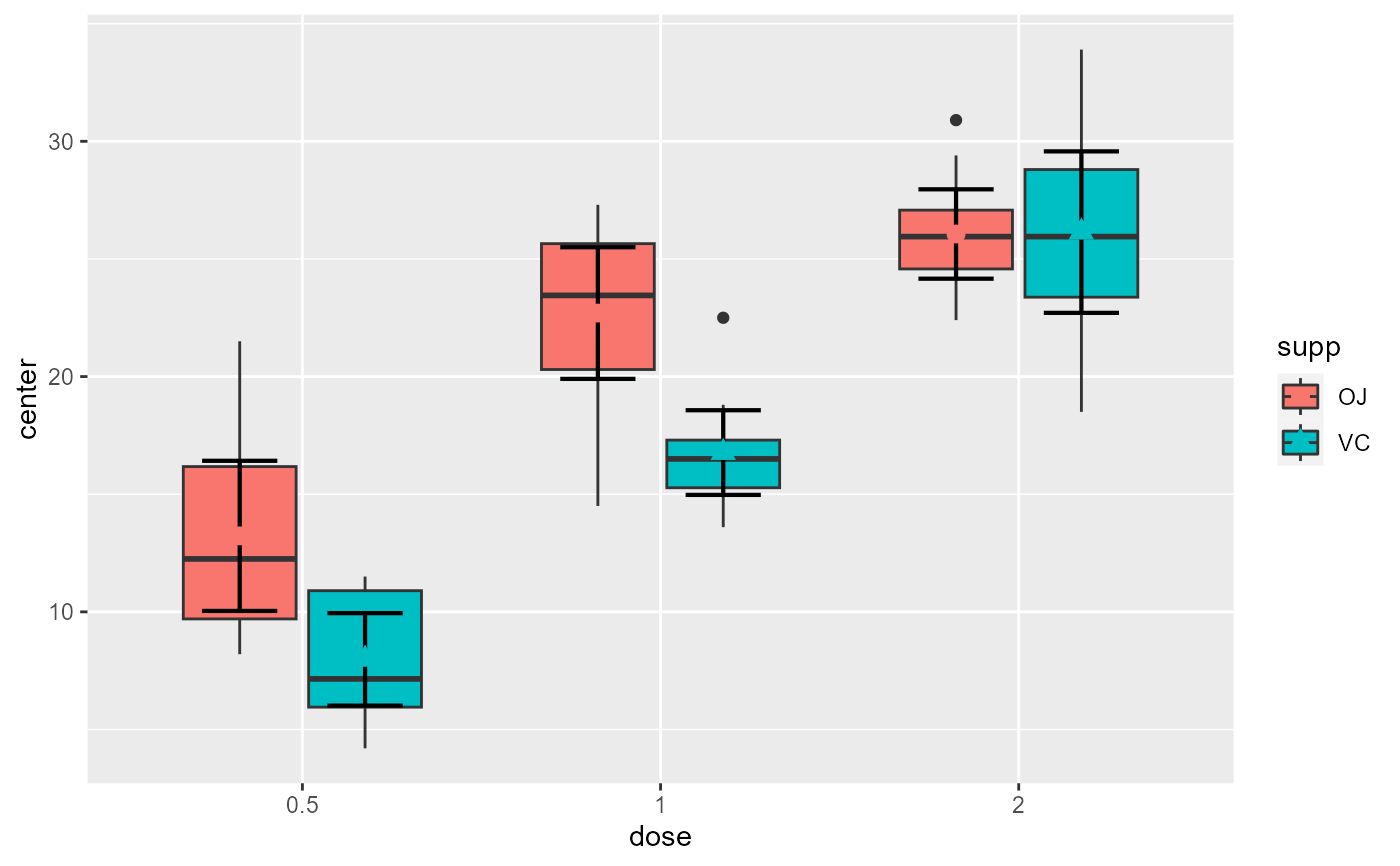
# This will make a plot with boxes for interquartile (box), median (line) and outliers (whiskers)
superb(
len ~ dose + supp,
ToothGrowth,
plotLayout = "boxplot"
)
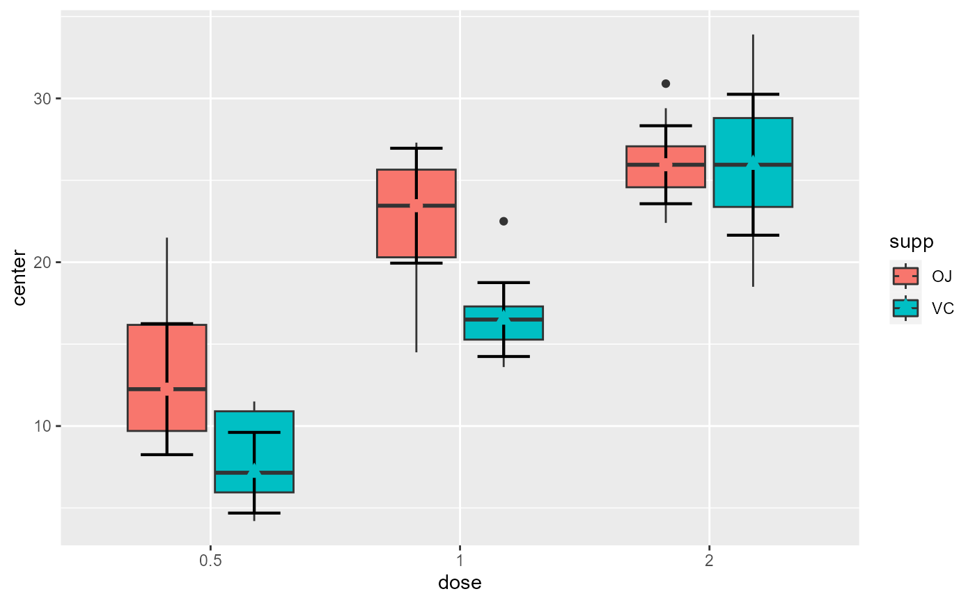
 # This layout of course is more meaningful if the statistic displayed is the median
superb(
len ~ dose + supp,
ToothGrowth,
statistic = "median",
plotLayout = "boxplot"
)
# This layout of course is more meaningful if the statistic displayed is the median
superb(
len ~ dose + supp,
ToothGrowth,
statistic = "median",
plotLayout = "boxplot"
)
 # if you extracted the data with superbData, you can
# run this layout directly
processedData <- superb(
len ~ dose + supp,
ToothGrowth,
statistic = "median",
showPlot = FALSE
)
superbPlot.boxplot(processedData$summaryStatistic,
"dose", "supp", ".~.",
processedData$rawData)
# if you extracted the data with superbData, you can
# run this layout directly
processedData <- superb(
len ~ dose + supp,
ToothGrowth,
statistic = "median",
showPlot = FALSE
)
superbPlot.boxplot(processedData$summaryStatistic,
"dose", "supp", ".~.",
processedData$rawData)
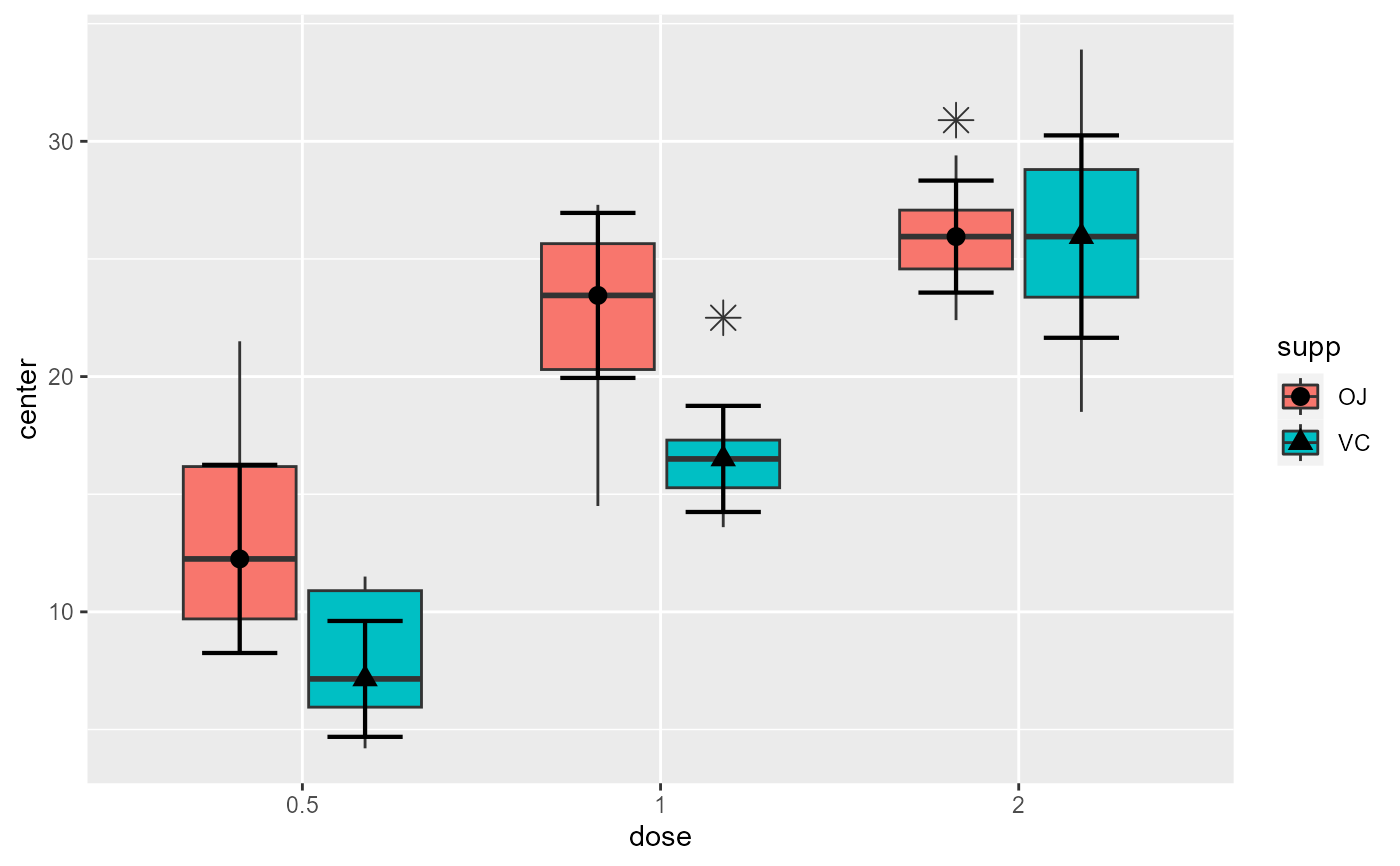
 # This will make a plot with customized boxplot parameters and black dots
superb(
len ~ dose + supp,
ToothGrowth,
statistic = "median",
plotLayout = "boxplot",
boxplotParams = list( outlier.shape=8, outlier.size=4 ),
pointParams = list(color="black")
)
# This will make a plot with customized boxplot parameters and black dots
superb(
len ~ dose + supp,
ToothGrowth,
statistic = "median",
plotLayout = "boxplot",
boxplotParams = list( outlier.shape=8, outlier.size=4 ),
pointParams = list(color="black")
)
 # You can customize the plot in various ways, e.g.
plt3 <- superb(
len ~ dose + supp,
ToothGrowth,
statistic = "median",
plotLayout = "boxplot",
pointParams = list(color="black")
)
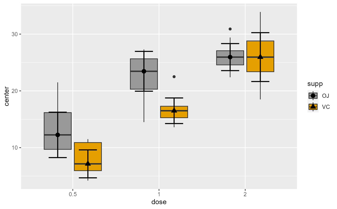
# ... by changing the colors of the fillings
library(ggplot2) # for scale_fill_manual, geom_jitter and geom_dotplot
plt3 + scale_fill_manual(values=c("#999999", "#E69F00", "#56B4E9"))
# You can customize the plot in various ways, e.g.
plt3 <- superb(
len ~ dose + supp,
ToothGrowth,
statistic = "median",
plotLayout = "boxplot",
pointParams = list(color="black")
)
# ... by changing the colors of the fillings
library(ggplot2) # for scale_fill_manual, geom_jitter and geom_dotplot
plt3 + scale_fill_manual(values=c("#999999", "#E69F00", "#56B4E9"))
 # ... by overlaying jittered dots of the raw data
plt3 + geom_jitter(data = processedData$rawData, mapping=aes(x=dose, y=DV),
position= position_jitterdodge(jitter.width=0.5 , dodge.width=0.8 ) )
# ... by overlaying jittered dots of the raw data
plt3 + geom_jitter(data = processedData$rawData, mapping=aes(x=dose, y=DV),
position= position_jitterdodge(jitter.width=0.5 , dodge.width=0.8 ) )
 # ... by overlaying dots of the raw data, aligned along the center of the box
plt3 + geom_dotplot(data = processedData$rawData, mapping=aes(x=dose, y=DV), dotsize=0.5,
binaxis='y', stackdir='center', position=position_dodge(0.7))
#> Bin width defaults to 1/30 of the range of the data. Pick better value with
#> `binwidth`.
# ... by overlaying dots of the raw data, aligned along the center of the box
plt3 + geom_dotplot(data = processedData$rawData, mapping=aes(x=dose, y=DV), dotsize=0.5,
binaxis='y', stackdir='center', position=position_dodge(0.7))
#> Bin width defaults to 1/30 of the range of the data. Pick better value with
#> `binwidth`.
