superbPlot 'circularlineBand' layout
Source:R/functionsPlotting_circular.R
superbPlot.circularlineBand.Rdsuperb comes with a few circular layouts for making plots. It produces ggplot objects that can be further customized.
It has these parameters:
Arguments
- summarydata
a data.frame with columns "center", "lowerwidth" and "upperwidth" for each level of the factors;
- xfactor
a string with the name of the column where the factor going on the horizontal axis is given;
- groupingfactor
a string with the name of the column for which the data will be grouped on the plot;
- addfactors
a string with up to two additional factors to make the rows and columns panels, in the form "fact1 ~ fact2";
- rawdata
always contains "DV" for each participants and each level of the factors
- pointParams
(optional) list of graphic directives that are sent to the
geom_bar()layer- lineParams
(optional) list of graphic directives that are sent to the
geom_line()layer- errorbandParams
(optional) list of graphic directives that are sent to the
geom_ribbon()layer- facetParams
(optional) list of graphic directives that are sent to the
facet_grid()layer- radarParams
(optional) list of arguments to the radar coordinates (seel
coord_radial()).- xAsFactor
(optional) Boolean to indicate if the factor on the horizontal should continuous or discrete (default is discrete)
Value
a ggplot object
Examples
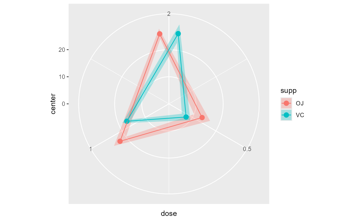
# This will make a plot with points
superbPlot(ToothGrowth,
   BSFactors = c("dose","supp"), variables = "len",
   plotLayout = "circularlineBand"
)


# if you extract the data with superbData, you can
# run this layout directly
#processedData <- superbData(ToothGrowth,
# BSFactors = c("dose","supp"), variables = "len"
#)
#
#superbPlot.circularlineBand(processedData$summaryStatistic,
#   "dose",
#   "supp",
#   ".~.",
#   processedData$rawData)
# if you extract the data with superbData, you can
# run this layout directly
#processedData <- superbData(ToothGrowth,
# BSFactors = c("dose","supp"), variables = "len"
#)
#
#superbPlot.circularlineBand(processedData$summaryStatistic,
# "dose",
# "supp",
# ".~.",
# processedData$rawData)